Toronto Scotiabank Arena Renovations | ?m | ?s | MLSE | BBB

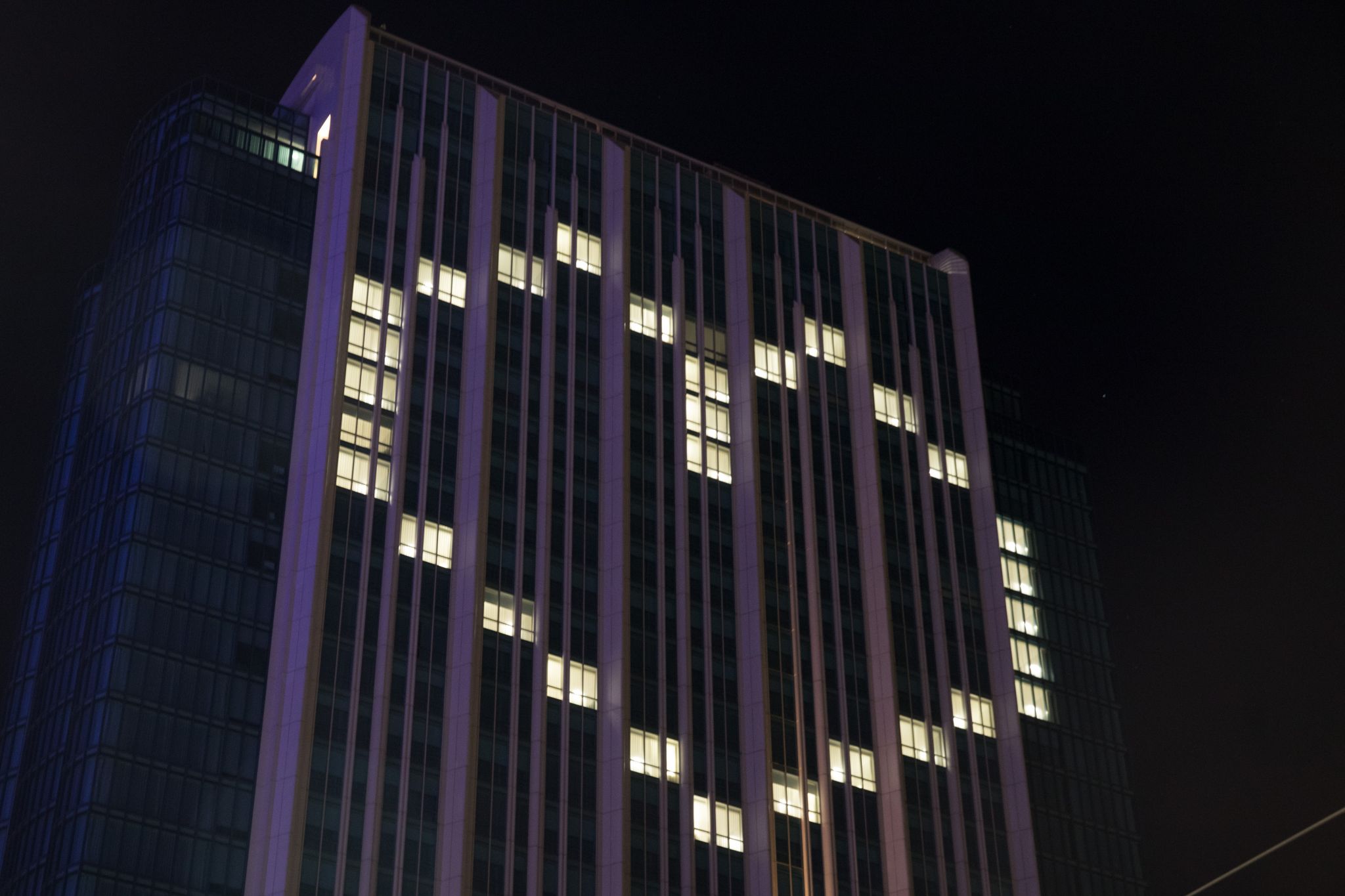
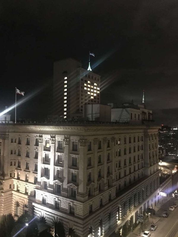
I think so - this is here in San Fran


1024x1024.jpg
 
Lipstick on a Pig

Well, they've taken down the last of the hoarding around the 'Big Ass S' leaving an unfinished section of original cladding that will annoy me every time I look out the window. Up close, this black cladding looks really cheap, although it may look better after someone decides to wash it down.

IMG_2756.jpeg


This Scotiabank Arena Sign, facing the Gardiner, is complete but also has 'peek-a-boo' aluminium cladding exposed on either side of the sign

IMG_2757.jpeg


Fortunately, they have removed the pedestrian safety fence along Bay St which now looks a lot better.

IMG_2758.jpeg
 
Indeed. Parts of it look marginally less shit. That's about as eloquent a critique I can come up with for this.
 
^ I thought the cement blocks were just leftovers from the scaffolding base, but I could be mistaken.
 
Looking in the Canadian Trademarks Database, Sonoco filed the trademark for their logo in 1964, registered in 1965, and renewed in 2010. Scotiabank filed theirs in 2019 and has not registered it yet. If Sonoco sues Scotiabank, they will almost certainly win at this point. I noticed that many Scotiabank branches (in my area of Ontario at least) have not had their signage updated yet. Compare this to CIBC, which updated pretty much everything as quickly as possible. Makes me wonder if something is going on with it behind the scenes.
 
We are a relatively small company...but about 8 years ago we hired (at a relatively large expense for us) a company to rebrand and change our logo....the meetings were always in the evening to keep the project underwraps....a good friend of mine was on the rebrand committee......anyway, on decision night i happened to be working late....so when the deal was done he ran out all excited and gave me the first peak at the new logo....my first reaction was "we paid all that money to have "X"s logo paiinted blue"....it took the air out of his tires and he was sad, then moved to denial....until i visited the "our clients" page on the marketing company's web page and, sure enough, their biggest client was "X"......these companies know exactly how much the bare minimum they have to change in a logo for it to be considered a different logo....doubt there is much to see here. (by the way "X" in this case is a huge company and a very well known logo in the Canadian marketplace).
 

Back
Top