You are using an out of date browser. It may not display this or other websites correctly.
You should upgrade or use an alternative browser.
You should upgrade or use an alternative browser.
Toronto SCOOP | 22.86m | 6s | Graywood | CMV
- Thread starter Froggy
- Start date
AlbertC
Superstar
iDANIEL
Active Member
Next door at 1745 St Clair Ave West:
'Site Plan Approval application to facilitate the development of an 11-storey mixed use building comprised of 389 square metres of non-residential gross floor area and 65 residential dwelling units (5475 square metres of residential gross floor area). '
See below:
'Site Plan Approval application to facilitate the development of an 11-storey mixed use building comprised of 389 square metres of non-residential gross floor area and 65 residential dwelling units (5475 square metres of residential gross floor area). '
See below:
AlbertC
Superstar
Our thread for that is here.Next door at 1745 St Clair Ave West:
'Site Plan Approval application to facilitate the development of an 11-storey mixed use building comprised of 389 square metres of non-residential gross floor area and 65 residential dwelling units (5475 square metres of residential gross floor area). '
See below:
42
iDANIEL
Active Member
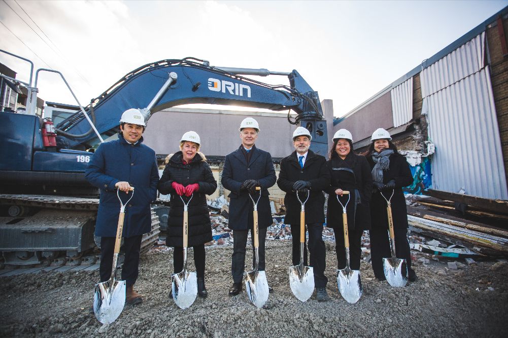
as per urban toronto, the sales office for 'scout condos' will temporarily be housed within this building soon. see link below:

 urbantoronto.ca

Graywood Celebrates Construction Start for Scout Condos | UrbanToronto
Graywood Developments is starting construction on Scout Condos on St Clair Avenue West near Weston Road in Toronto's Carleton Village area. The new condo is Graywood's second to sell well and bring reinvestment to the area.
AlbertC
Superstar
Lenser
Senior Member
That colour scheme is both anemic and blandly institutional. No sex appeal whatsoever.
Midtown Urbanist
Superstar
Where do I sign the petition to have City Planning add sex appeal to their midrise design guidelines?That colour scheme is both anemic and blandly institutional. No sex appeal whatsoever.
Lenser
Senior Member
Not sure you can mandate that sort of thing, sadly.
Downtown Toronto
Active Member
Member Bio
- Joined
- Oct 19, 2016
- Messages
- 536
- Reaction score
- 1,554
- Location
- Yorkville/Downtown Toronto
Looks so gloomy. Soviet Russia era architects would be proud.
Lenser
Senior Member
Lots of us here clamour for colour but I believe that developers tend to aim straight down the middle, erring on the side of comfortable sameness and inoffensive colour schemes. Colour is risky and not without controversy. You'd think this city, as grey as it is in the winter especially, would welcome some bright spots of colour and daring colour combinations. But apparently not!
AlbertC
Superstar
The architecture is up for debate, but on a positive note the second phase will be using warmer red brick tones on its cladding.
 urbantoronto.ca
Scout Condos | 38.65m | 12s | Graywood | CMV
http://app.toronto.ca/DevelopmentApplications/associatedApplicationsList.do?action=init&folderRsn=4113882&isCofASearch=false 1779 ST CLAIR AVE W Ward 17 - Etob. York District Proposal for a 12 storey mixed use development containing a total of 274 residential units with a total gross floor...
Berlin
New Member
Lots of us here clamour for colour but I believe that developers tend to aim straight down the middle, erring on the side of comfortable sameness and inoffensive colour schemes. Colour is risky and not without controversy. You'd think this city, as grey as it is in the winter especially, would welcome some bright spots of colour and daring colour combinations. But apparently not!
Developers are in the business of making money and the city is not interested in forcing developers to think outside the box unfortunately. However, I don't quite agree with your assessment as you are only looking at the colour not the actual texture and overall design of the building in terms of integration. If you look at this particular design it is actually quite refreshing texture compared to the standard glass box and concrete which provides no feel along as a skyline. I think, this design actually blends quite nicely to the area much better than a random floor to ceiling glass facades and the terrace design in the rear of the buildings actually creates a connection with the surrounding area. However, I do agree that we certainly need way more flair and risk in terms of design/colour all throughout the city it really depends on what part of the city this it is but I think these two phases, SCOOP and SCOUT, actually provide refreshing design that makes sense in this particular area.
Lenser
Senior Member
Developers are in the business of making money and the city is not interested in forcing developers to think outside the box unfortunately.
Again, I don't know how the city can force developers to do just that - I'm not even sure I think it would be a wise course of action to begin with. I'd love to see a watchdog committee try that, however. They'd probably bog down in bureaucratic squabbling almost immediately.
I just don't know how you can mandate good taste or a flair for innovation. I'm not saying it can't be done, mind you. I just don't see it being at all easy or straightforward. It's not something you can effectively conjure up by way of bylaws or a city committee, however well qualified or zealous - although that kind of inspiration can certainly be informally encouraged.
In my view there is no magic bullet to impose aesthetic grace on a development process.