Toronto Royal Ontario Museum | ?m | ?s | Daniel Libeskind

The merit of the original public plaza aside - I have a feeling the austerity of the space is more of Libeskind's design intention. Going through his body of works, one'd notice he isn't exactly big on creating warm, cozy spaces.

AoD
 
Looking at it yesterday, it's a pretty small area to work with. What they could do is get rid of the parking on the north side of Bloor between the Park Hyatt and the Intercontinental and then extend the plaza out an entire lane into Bloor.
 
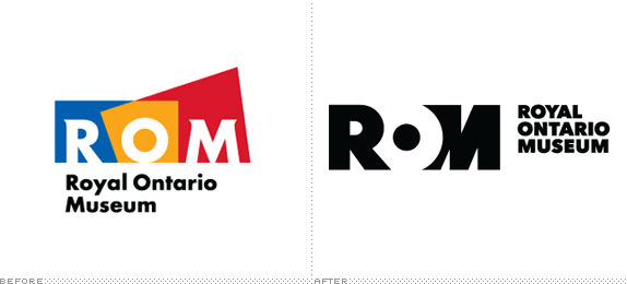
Re the new logo
rom_logo.gif


I've read of someone noticing its resemblance to this

eaton.jpg
 
I wonder how much was spent on that new Logo. I much prefer the "old" one with color.

As far as the public space in front of the Crystal, perhaps they can dig down and create a terrace that steps down into the ground, with a small green lawn and windows into the large basement spaces of the museum. The crystal is a great concept, but there are a number of flaws in its execution, and inherent challenges in displaying specimens...but the circulation of the new museum is vastly superior to the old, and C5 is one of our favorite place to eat. It's cool that our son can see the dinosaurs from his carseat on the drive to daycare.
 
pony:

Hopefullly not too much. Actually I prefer the really old one before the crystal - it got a certain degree of class that the new multicoloured crystal logo wasn't able to provide.

What I would really love to see is continued gallery expansion and renewal - there was supposed to be an "early life" (Burgess Shale and other non-dinosaur fossils) gallery in the 1932 wing that never came to be; and the Ancient Greece gallery can still use a complete redo.

AoD
 
AoD: What I would really love to see is continued gallery expansion and renewal - there was supposed to be an "early life" (Burgess Shale and other non-dinosaur fossils) gallery in the 1932 wing that never came to be; and the Ancient Greece gallery can still use a complete redo.

Agreed. The Egyptian galleries could use a refresh as well. And they're still not using the old dino space for anything, are they?
 
I can't agree for a minute that it's appropriate to pour your money into a building and simply overlook the public space you create out front of it. The open and outdoor spaces in any project are part-and-parcel of the entire design. The failure in the design of the public space out front of the ROM reinforces for me just how out-of-whack the priorities in this project were. They wanted a flashy BUILDING but overlooked the space around it.

Maybe the people behind the Renaissance ROM truly did want a high-quality public space to be part of the design. Perhaps they were just star-struck by Libeskind and entrusted that his plaza space would turn out to be an interesting and engaging space that the public would want to spend time in... something that would give back to the city. In any case, I don't see many positive qualities about the space they created there, and apart from some darker shapes set into the paving, it doesn't seem to relate to the building in any way.

I basically agree with everything you're saying, however I think the (previous) ROM administration would argue that they DID make the public square a priority. Thorsell wanted a square designed around the same kind of minimalism one finds inside the galleries. He wanted the pure form of the crystal to be the main attraction, unblocked by trees or other structures. He had new minimalist light poles installed. He lobbied the city to remove all the newspaper stands and hotdog carts. I even heard rumours that he wanted to get rid of the trees in front of the Queen's Park facade. I don't personally think the end result works that well, but I think the result is true to the original intention rather than being an oversight.

In my view, a major priority should be to deal with the fencing they have to put up every winter under the points of the crystal. If they really must block people from walking under those points, then perhaps they should install sculptures or something to occupy that space. The fencing is terrible. Nathan Phillips Square terrible.
 
Agreed. The Egyptian galleries could use a refresh as well. And they're still not using the old dino space for anything, are they?

I think Egypt is suppsoed to get a makeover, just not sure when. In regard to the dino area, that's going to be geology/creation of the earth/local geology/ice age stuff gallery, which is supposed to the the link between the mineralogy gallery and the dinosaurs. Hopefully that starts soon!

I like that the M in the new logo still references the crystal.

42
 
How about going back to the previous logo? Much classier compared to these lowest common denominator Disney-esque ones.

Rom-logo-39137C58B6-seeklogo.com.gif
 

Attachments

  • Rom-logo-39137C58B6-seeklogo.com.gif
    Rom-logo-39137C58B6-seeklogo.com.gif
    2 KB · Views: 1,045

Back
Top