Toronto Ripley's Aquarium of Canada | 13.11m | 2s | Ripley Entertainment | B+H

Some concrete benches I saw in SF. The "freshness" is gone, and it's a bit dirty, but with the lights there's some extra visual interest.
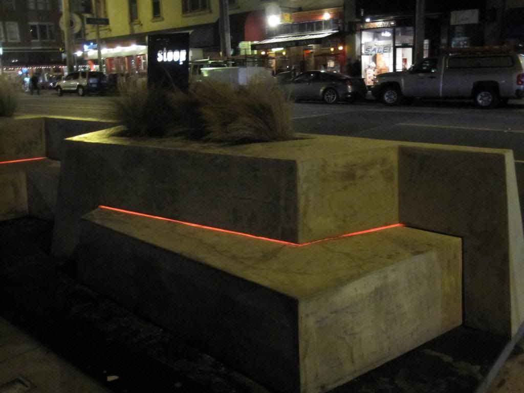
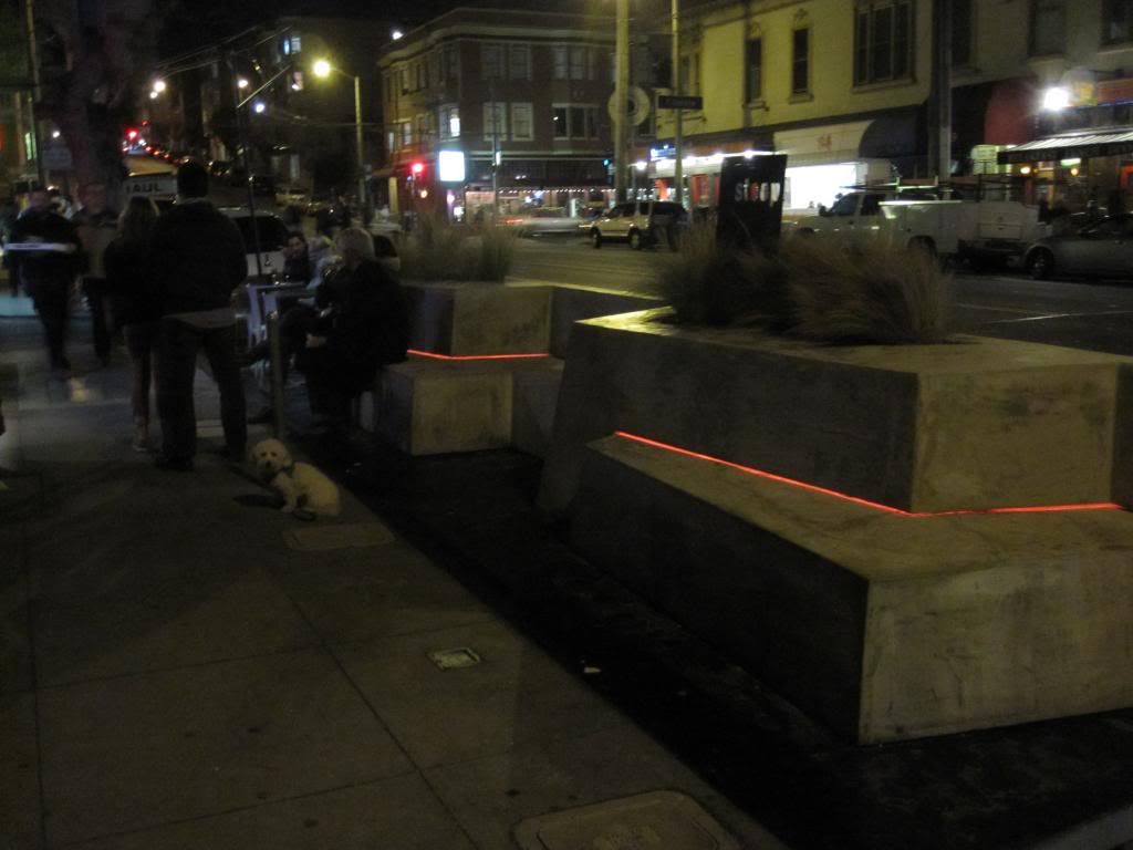


Painted concrete can look quite good. I noticed that many under passes in and around Finnish cities were painted a pale blue. It largely mitigated against the grey dreariness of the concrete. I'm not suggesting that pale blue is the answer here, but one could certainly employ paint to make some of these features look more inviting.
 
...as the large and aging concrete structure in behind aptly demonstrates.

I have sometimes thought (at the risk of being labeled a heretic) that the CN Tower would be greatly improved if the bare concrete were covered with a pure white cladding of some sort, perhaps ceramic tiles.
 
I like that idea but the outer edges of the towers " fins " be covered in a reflective silver panel. Ill try to do something up in photoshop and post it in an appropriate thread.
 
I have sometimes thought (at the risk of being labeled a heretic) that the CN Tower would be greatly improved if the bare concrete were covered with a pure white cladding of some sort, perhaps ceramic tiles.

I've thought the same thing about the Skydome. I like the roof but the concrete bottom, is just ugly. The CN Tower's concrete is also starting to look badly discoloured. It looks like a few, bad patch-up jobs took place.
 
The CN Tower's concrete is also starting to look badly discoloured. It looks like a few, bad patch-up jobs took place.

From afar the tower looks alright, but once you're up close to it the tower really looks like crap. And you're right, the patches look horrible.
 
Sandblast it clean.

Or let it be taken over by nature - imagine the CN tower partially covered by moss or ivy - a la Japan's abandoned Shime mining tower:

zombie_tower_1a.jpg

courtesy of Wikimedia

p5
 

Attachments

  • zombie_tower_1a.jpg
    zombie_tower_1a.jpg
    30.8 KB · Views: 780
I just don't understand the shape. It's awkward (not in an interesting way) makes no sense to me, the digital display doesn't look good, and the logos are crammed in awkwardly at the top.
 

Back
Top