Toronto Pinnacle Centre Condos | 161.84m | 55s | Pinnacle | P + S / IBI

Once people move in, it will end up being the exact same colour as Success Tower.

It's disappointing that blinds will have some impact on the look of the building, but I actually like the colour of Success Tower as well. It looks really modern to me.


20110312130.jpg
 
Absent mirrored glass, a tint like the green tint on these towers provides a unifying colour theme once the blinds are installed.
The unfortunate alternative is untinted or e-coated or some other types of clearer looking glass which look a lot worse when the window coverings are installed.
 
Wow, some really crisp shots today!

i agree. and especially that first shot. I love the sense of scale these towers have when you're walking to the ACC. they look absolutely massive. nice to see this Pinnacle Centre nearing completion. these are the only condos near the lake that i feel are real "skyscrapers by the lake". even though they're just a bit further inland.
 
i agree. and especially that first shot. I love the sense of scale these towers have when you're walking to the ACC. they look absolutely massive. nice to see this Pinnacle Centre nearing completion. these are the only condos near the lake that i feel are real "skyscrapers by the lake". even though they're just a bit further inland.

Don't forget Palace Pier and Palace Place!
 
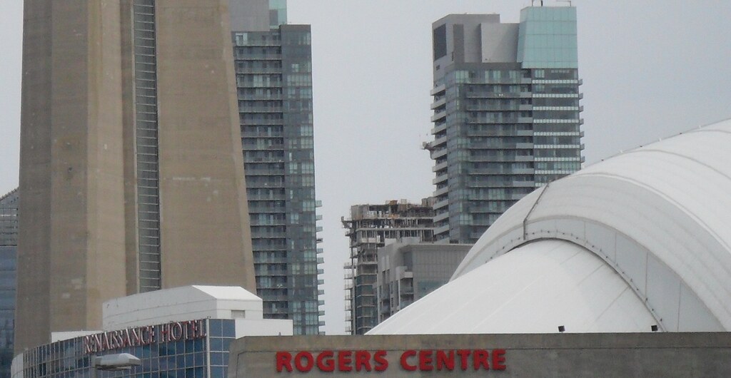
I hope we have all learned how NOT to design/plan an empty city block from this development. The towers by themselves are bland, but at least the roof of Success1 has something going for it. Ill wait and see for success2. But the general plan for the whole block is absolute shit. It was designed for maximum views from the units, therefore more value or whatever. But just look at Redroom's first shot... absolutely no consideration given to order or relationship between the towers. I'll ignore the design for a second and give a planning alternative.

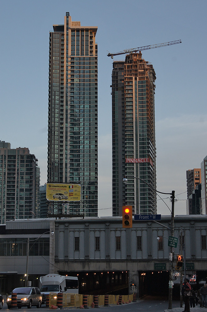
The two Success towers should have both been along Bay st, and the units could have been organized to still allow for precious views from all four sides of each tower. The podium should be higher on this street, and along Harbour as well. The driveway should have gone under the podium into an interior courtyard. Phase 1 and 2 could be mirror images on Bay and Yonge streets. If pinnacle wanted, they could fit a fifth tower in the middle of the block too. Profit!

And about the actual design, well, they should have used warm colours like brick, wood, metal cladding like copper, or whatever (not bright primary colours, ffs) on the podium at the very least. When building a new development with very little around it (or especially buildings that are green and gray) dont use green and gray. Theres nothing more depressing than a giant sea of pale green, gray, beige, blah. This minimalistic glass design works only when it contrasts something historic like in the distillery, not when theres nothing else around. But the towers must be glass because thats what sells and the developer wants it, so whatever they just have to be better designed. Emphasize the corners of the block, the top of the tower, and have the shaft of the tower emphasize vertical lines rather than horizontal like we see too much of in this town. Horizontal lines make the tower look more squat and messy, why would you want that? Vertical lines bring out the height and make it look cleaner. Problem solved!

Sorry about the super long post, but I cant stand to hear people praise this crap anymore. The funny thing is, most of what I said is common sense to an architect or planner or even anyone interested in this stuff. So I have to ask myself what happened here? I suppose its nothing more than a cheap developer being cheap.
 
I think now that these are nearing completion it ain't no sin to weigh in on their good and bad points.

The good is that I think the height, massing and density are a good move. These towers really connect the city to the lakeside buildings south of them in a forceful way. The Yonge side of the sidewalk has been treated really well, with widening and plantings. Walking through here previously was lousy. Now, it's a whole different feeling. The Bay Street and Harbour Street side aren't as well treated, but are OK.

I think the worst news is in the materials used to finish the buildings.
Putting four green glass towers in the immediate company of three more (World Trade Centre, 18 Yonge), create an acreage of seriously off-putting monotony. The deficit of imagination on permanent display here feels a bit insulting. All six of these towers together create an effect akin to the 1970's megaprojects that individual condo planning, and new planning, was meant to far steer clear of. You'd never think the buildings that face each other across Harbour were built about twenty years apart - they are vapidly identical. A zone has been created that says "no intrigue here". The buildings certainly seem like a bit of a joke on the marketing.

I don't think we needed "showoff" buildings here. But it would have been nice to have buildings that showed up well. Surely there must have been a way to put this together in a way that wasn't too much more expensive, but would have brought a little vitality and variety into view?

Let's hope whatever goes up on the west side of Bay or the east side of Yonge is exceptional, gracious at partially blocking it's neighbours...and for f***'s sake, not green!
 
Last edited:
wicked photos Redroom Studios!
it sucks that toronto has so many green condos that people become sick of them, even if they are good ones like these!
 

Back
Top