You are using an out of date browser. It may not display this or other websites correctly.
You should upgrade or use an alternative browser.
You should upgrade or use an alternative browser.
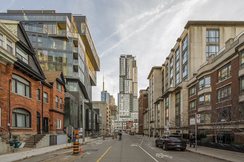
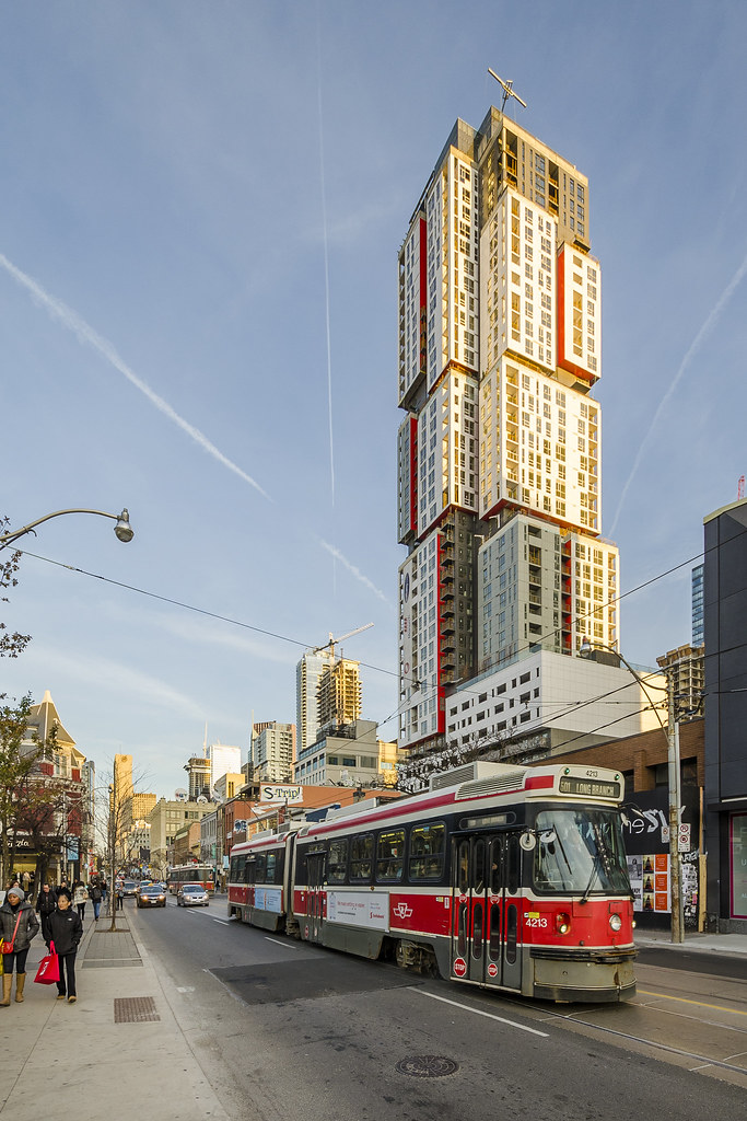
Toronto Picasso Condos | 128.62m | 39s | Mattamy Homes | Teeple Architects
- Thread starter maestro
- Start date
GeneralGrievance
Active Member
Our recent story provides a look at the project's interior:http://urbantoronto.ca/news/2015/11/touring-diverse-interior-layouts-picasso-condos
urbandreamer
recession proof
Marcanadian
Moderator
Last week:
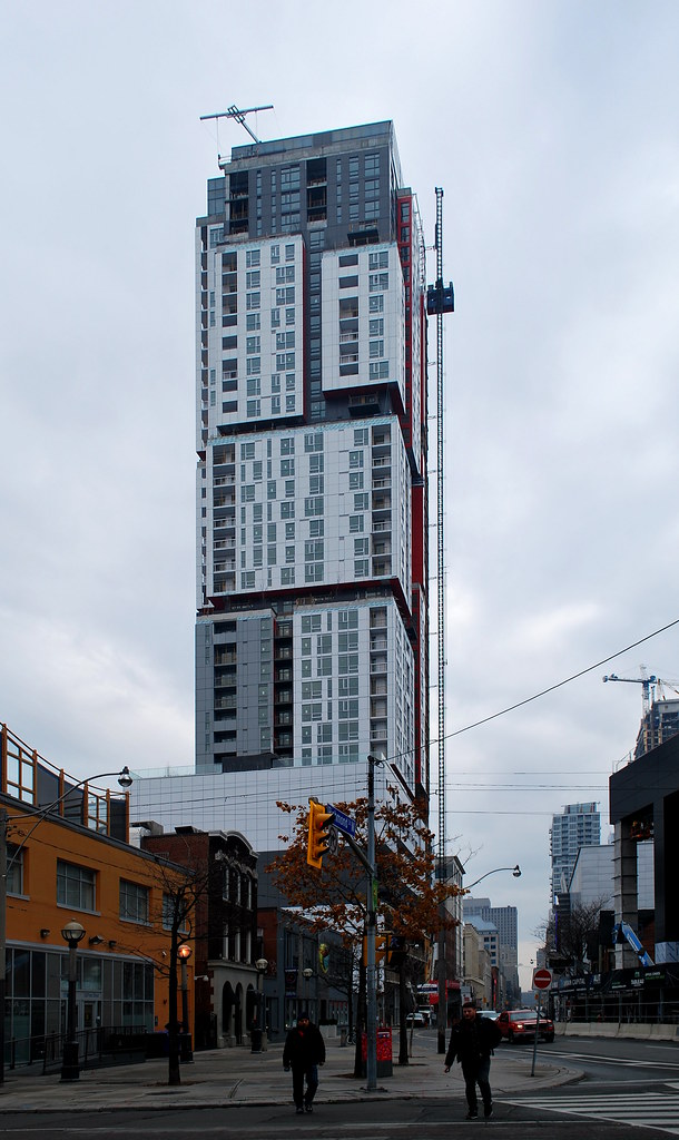 Picasso Tour by Marcus Mitanis, on Flickr
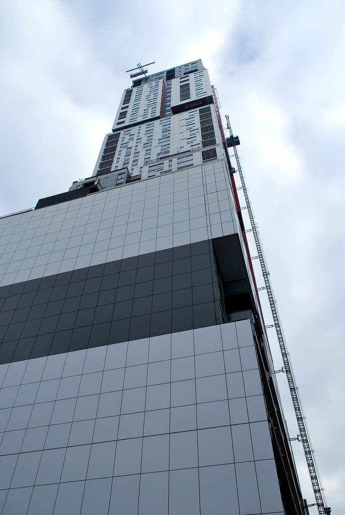 Picasso Tour by Marcus Mitanis, on Flickr
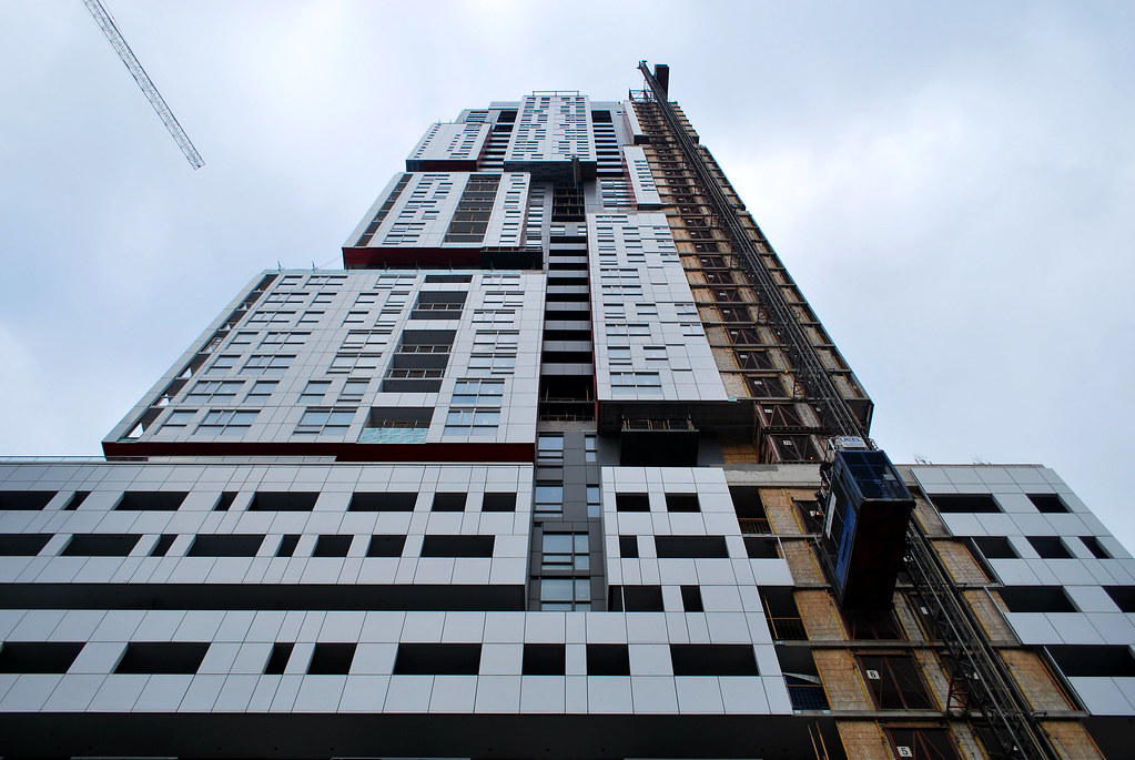 Picasso Tour by Marcus Mitanis, on Flickr
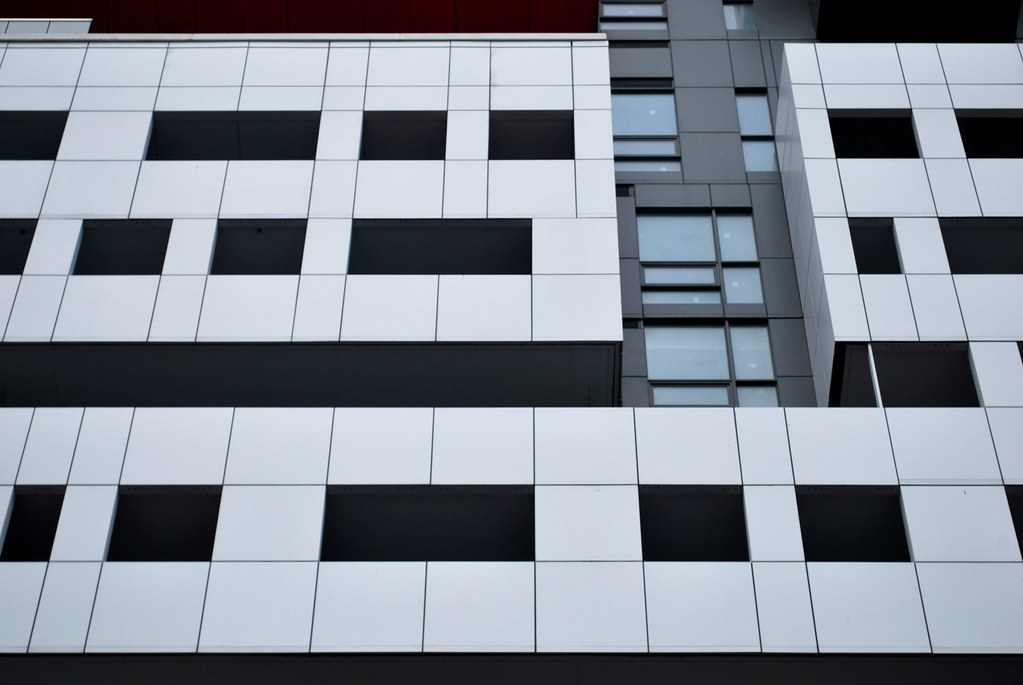 Picasso Tour by Marcus Mitanis, on Flickr
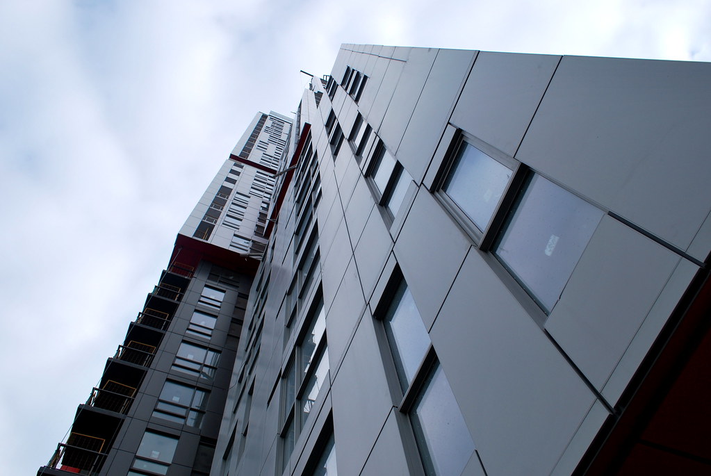 Picasso Tour by Marcus Mitanis, on Flickr
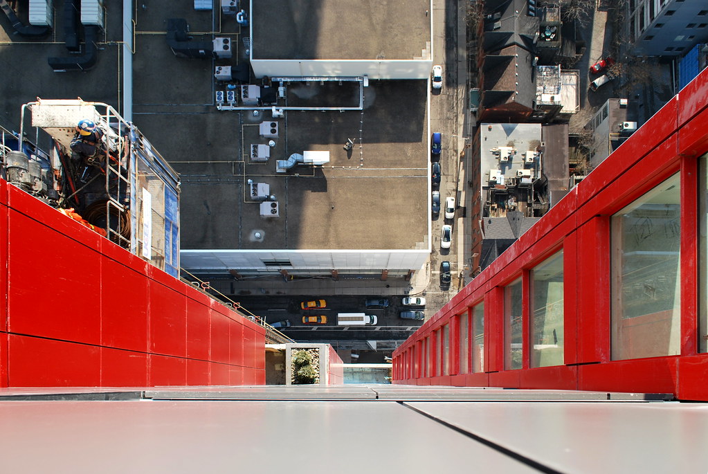 Picasso Tour by Marcus Mitanis, on Flickr
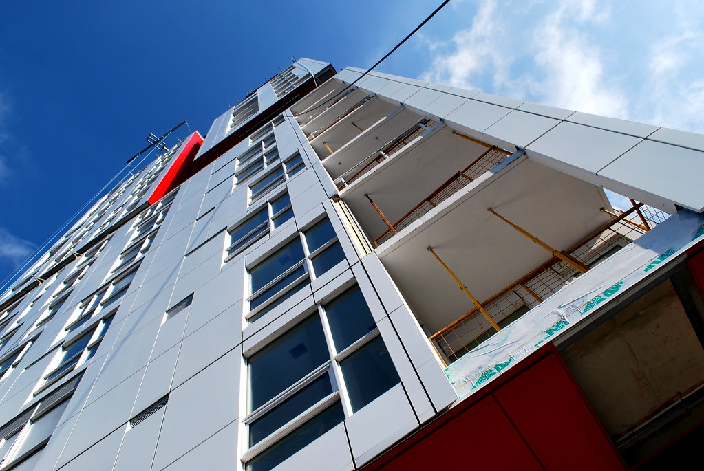 Picasso Tour by Marcus Mitanis, on Flickr
 Picasso Tour by Marcus Mitanis, on Flickr
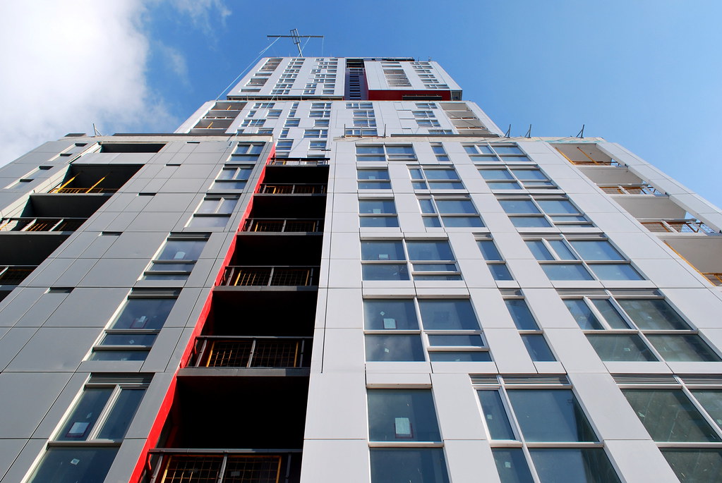 Picasso Tour by Marcus Mitanis, on Flickr
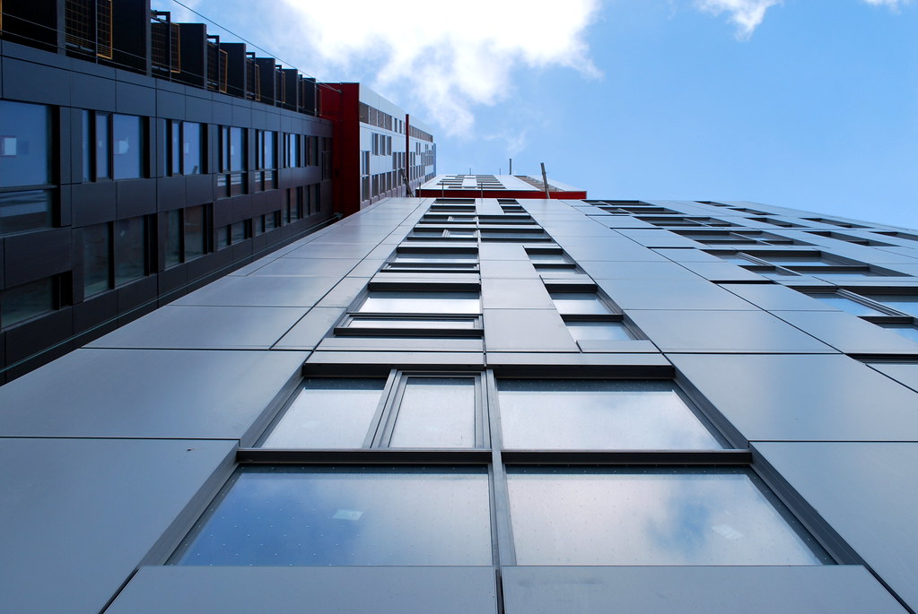 Picasso Tour by Marcus Mitanis, on Flickr
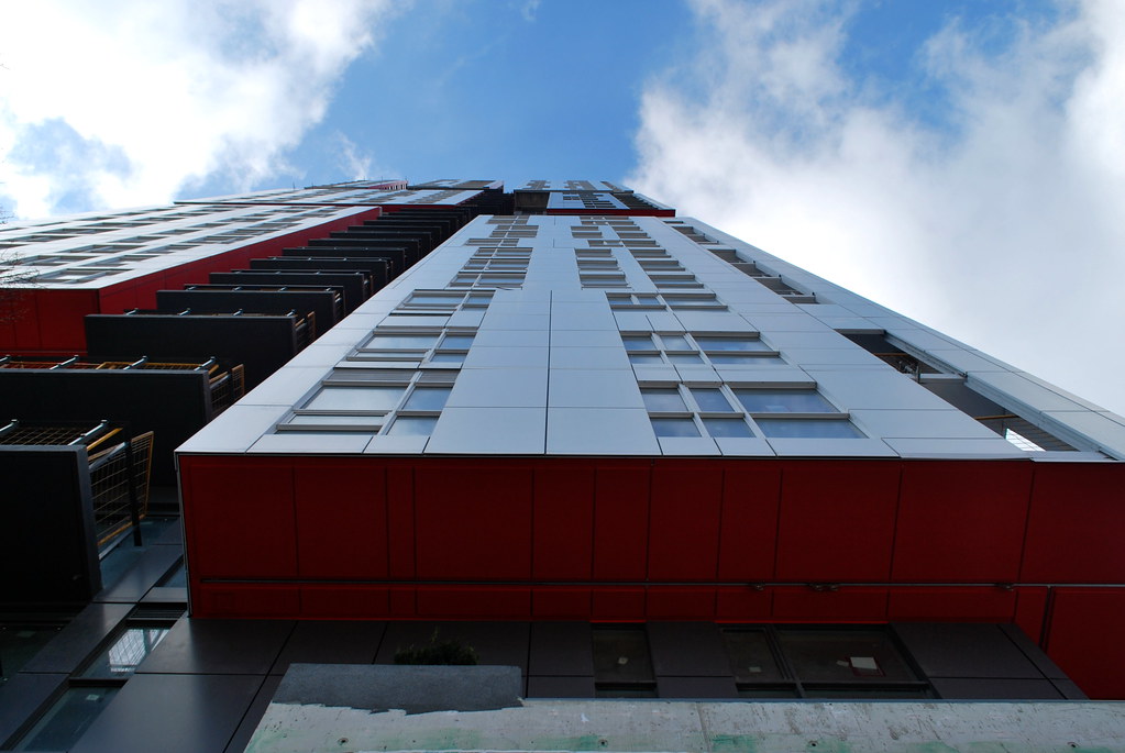 Picasso Tour by Marcus Mitanis, on Flickr
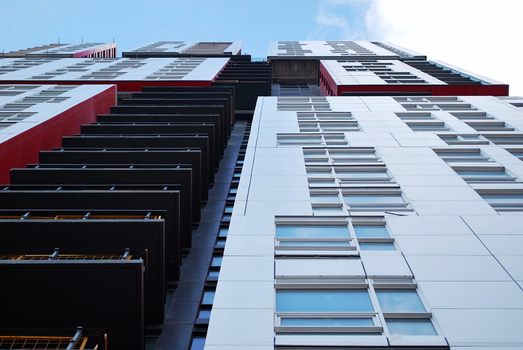 Picasso Tour by Marcus Mitanis, on Flickr
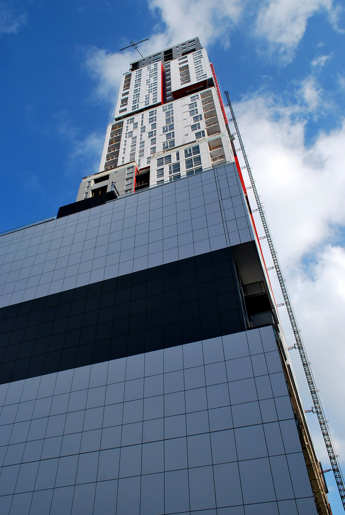 Picasso Tour by Marcus Mitanis, on Flickr
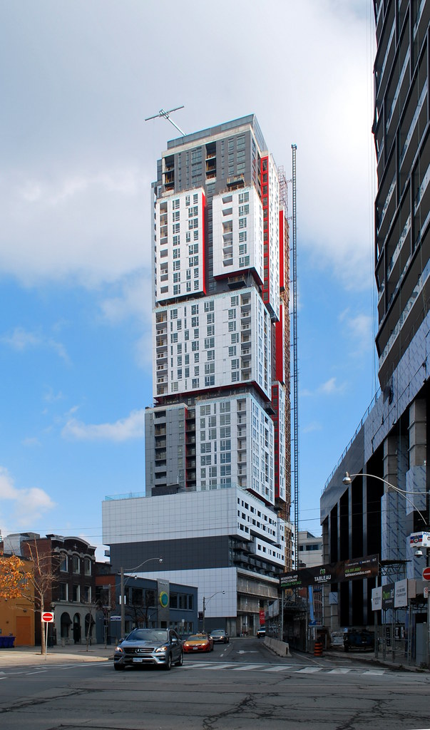 Picasso Tour by Marcus Mitanis, on Flickr
 Picasso Tour by Marcus Mitanis, on Flickr
 Picasso Tour by Marcus Mitanis, on Flickr
 Picasso Tour by Marcus Mitanis, on Flickr
 Picasso Tour by Marcus Mitanis, on Flickr
 Picasso Tour by Marcus Mitanis, on Flickr
 Picasso Tour by Marcus Mitanis, on Flickr
 Picasso Tour by Marcus Mitanis, on Flickr
 Picasso Tour by Marcus Mitanis, on Flickr
 Picasso Tour by Marcus Mitanis, on Flickr
 Picasso Tour by Marcus Mitanis, on Flickr
 Picasso Tour by Marcus Mitanis, on Flickr
 Picasso Tour by Marcus Mitanis, on Flickr
 Picasso Tour by Marcus Mitanis, on Flickr
 Picasso Tour by Marcus Mitanis, on Flickr
GeneralGrievance
Active Member
And now for a story about the views (they are nice):http://urbantoronto.ca/news/2015/12/picasso-condos-gifts-panoramic-downtown-views
Automation Gallery
Superstar
For some reason this bldg. looks a lot taller than the 124 meters stated above
Tewder
Senior Member
I really do not like the blank wall of cladding on the east side. I'd rather see billboards or something. Does that happen on buildings anymore?
Automation Gallery
Superstar
East side or west side?, cause if its the west side it wont be long before its covered...........http://urbantoronto.ca/database/projects/330-richmond-was-gloss-condos
am29
Active Member
I think I may have seen half of Picasso's roof lit while I was walking south from campus today.
Marcanadian
Moderator
I think I may have seen half of Picasso's roof lit while I was walking south from campus today.
Here's a shot from the Entertainment District webcam:
I think this is just construction lighting of the mechanical penthouse though, not anything formal.
Attachments
4grand
Active Member
Absolute Hideous Monstrosity. This is experimental art, which should be miniaturized in a gallery somewhere. This is not architecture which will stand the test of time. This will be a pathetic blight on our skyline for the next two centuries.
Colour should never go on a building. Especially bright red metallic panels. The red, black, white and grey make this building look like a PlayMobil Toy, not a structure which will stand for 200 years.
Metal Sheet siding as the exterior cladding? kill me now. Brick, Limestone, Plaster, Moulded Concrete - these are what buildings should be made of.
Awkward angles, overhanging pop-outs? Jesus, this is nasty.
All it is, is "car-crash" architecture. The kind of insane architecture that makes you take your eyes off the road as you stare in bewilderment...
Last edited by a moderator:
stjames2queenwest
Senior Member
I feel like that comment is too unintelligent to not be a joke.
Tewder
Senior Member
How can someone hate colour? Were they beaten with a box of crayons at some point??
I do love the tower. The podium is a hulking mess though, it looks like it could be a factory along the 427.
I do love the tower. The podium is a hulking mess though, it looks like it could be a factory along the 427.
greenleaf
Senior Member
Absolute Hideous Monstrosity. This is experimental art, which should be miniaturized in a gallery somewhere. This is not architecture which will stand the test of time. This will be a pathetic blight on our skyline for the next two centuries.
Colour should never go on a building. Especially bright red metallic panels. The red, black, white and grey make this building look like a PlayMobil Toy, not a structure which will stand for 200 years.
Metal Sheet siding as the exterior cladding? kill me now. Brick, Limestone, Plaster, Moulded Concrete - these are what buildings should be made of.
Awkward angles, overhanging pop-outs? Jesus, this is nasty.
All it is, is "car-crash" architecture. The kind of insane architecture that makes you take your eyes off the road as you stare in bewilderment...
Your comments on this building and this type of architecture read like the "old stock Canadians" of architecture.
Miscreant
Senior Member
Member Bio
- Joined
- Oct 9, 2011
- Messages
- 3,625
- Reaction score
- 1,808
- Location
- Where it's urban. And dense.
Eh. Good art is destined to rabble-rouse.
