Toronto Panda Condominiums | 107.59m | 30s | Lifetime | Turner Fleischer

Just a couple of barely there, peek-a-boo shots from today, Sept. 18th, 2021:

First, from Dundas, approaching Chestnut.

1631987908744.png


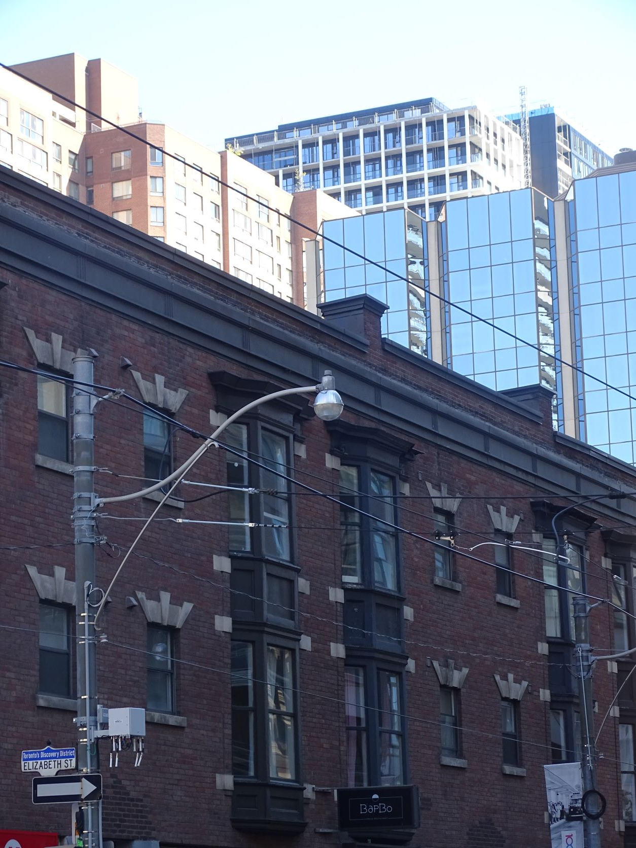
Then, much less showing from Dundas at Elizabeth:

1631987943797.png
 
I'm feeling mostly generous, so breaking down the grading of this project as: A- on the western white grid half, B on most of the darker cladding eastern half. Apart from slight deductions on the east facing side closest to Yonge, which that alone could be a B-. Although, a bit understanding if the detailing there is lower where they may anticipate for that side to be blocked by any potential future redevelopment of properties along Yonge.
 
I just saw 357 King West on the street and for some reasons, condos that have these black and white exteriors don't look good. They're just so different from the brochure. Maybe that's why developer goes with all glass condo.

Why would you conclude that an entire colour palette looks bad when it's obviously due to poor material choices on one building, 357 King West? If some auto body shop bungled a job using low grade black spray paint would you then conclude that no cars should be black because black looks bad?

You realize TD Centre is black and FCP is white, right?
 
Last edited:
Apologies if my post seemed like critizing the color palette itself. I'm more criticizing condo developers that selected black/white exterior but then ended up using cheap materials or didn't pay attention to details and the building looks very different from what's on the brochure. TD centre and FCP are not condos and they're well built. if condo developers are constructing black/white buildings with the same level of finishes and details as TD/FCP, I would love to see more condos with black/white exteriors because that will add more characters to the city compared to 100% glass building. but if developers can't do it properly, I think it's better for them not to try it in the first place. I went to eaton centre and passed by this building and although it's not terrible, it's definitely not at the same level as TD building/FCP and the same goes for 357 King W/Theory and maybe Nobu not just Panda.
Panda is definitely ahead of 357 King West with that building's oil-canning spandrel panels, ahead of Theory with its cheaply glazed office podium floors, and Nobu's pathetic south side. (We have yet to see if Nobu's north podium and upper levels turn out, more cladding needs to be applied first.) Meanwhile, developers of financial core office towers can and do spend more on exterior materials because tenants will pay what it costs to sheath the buildings in higher quality materials. That's just not in typical condo construction budgets.

42
 
Apologies if my post seemed like critizing the color palette itself. I'm more criticizing condo developers that selected black/white exterior but then ended up using cheap materials or didn't pay attention to details and the building looks very different from what's on the brochure. TD centre and FCP are not condos and they're well built. if condo developers are constructing black/white buildings with the same level of finishes and details as TD/FCP, I would love to see more condos with black/white exteriors because that will add more characters to the city compared to 100% glass building. but if developers can't do it properly, I think it's better for them not to try it in the first place. I went to eaton centre and passed by this building and although it's not terrible, it's definitely not at the same level as TD building/FCP and the same goes for 357 King W/Theory and maybe Nobu not just Panda.
You're complaining that a condo doesn't have the same level of quality as two of the most expensive office buildings in Canada's history?
 
Simple but very effective looking tower. That has a visual impact from afar. As seen in the photos up above.
 
I'm not liking that last minute window wall thrown up on the top 2 balcony section. Seems to throw the continuity off a bit to what was pretty okay project up till that point, IMO.
Seriously. It really drags down the whole thing down just before the finish line!

I don't believe I have the architectural docs for this one saved anywhere, so I'll give Lifetime the benefit of the doubt as to whether pushing the window wall out on the top two floors was really necessary. Couldn't they have at least inset the window wall by 20 or 30 centimetres and brought the balcony railings up another two floors in order to try and continue some of the clean lines?

A five-minute photoshop of steveve's photo to demonstrate:
1642038447908.png
 

Back
Top