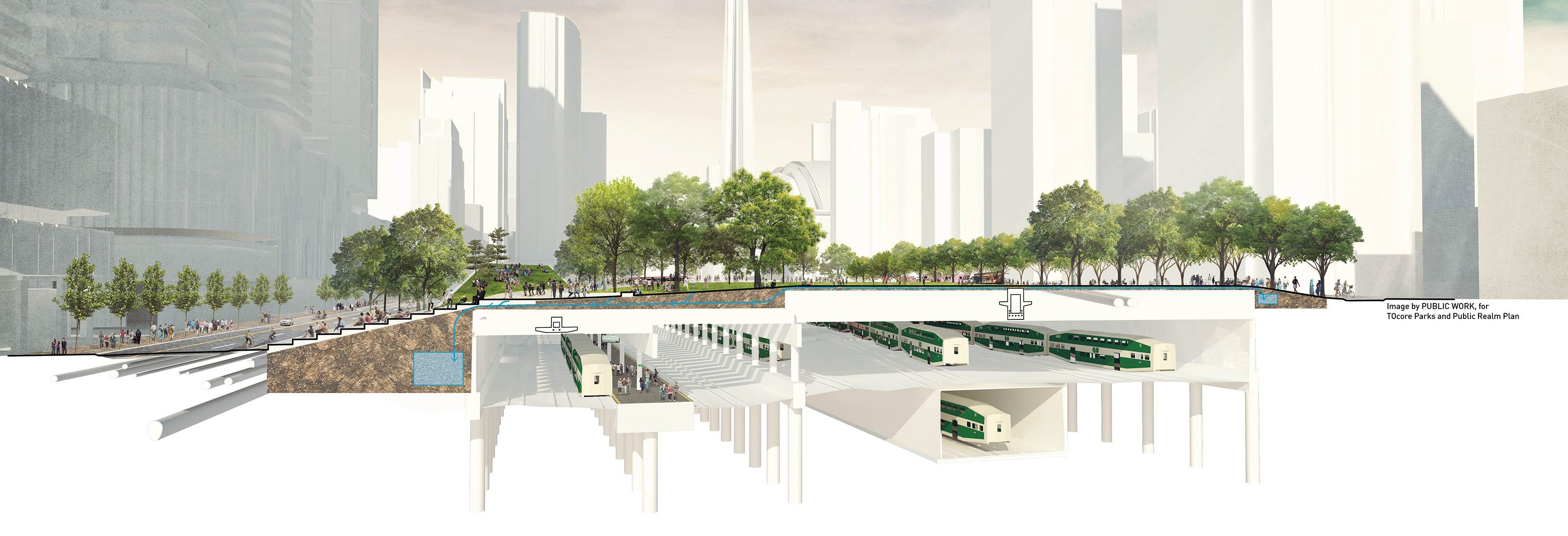
The way I see it:
- Anything in the red bubble is either buildings, or parkettes that are disconnected from the overall parkland
- Anything in the blue bubble is concrete heavy
- What's left over is a disappointment and a huge wasted opportunity
Sad to hear about this decision. Was hoping this could have been Toronto's Millennium Park.
View attachment 319111
The decision made by LPAT was pretty expected (to me at least), as the circumstances have changed a lot from when the idea was floated originally. I was very much on the city's side when the first proposal came out, but as years have passed and housing supply still not being built fast enough, I would rather now see the city negotiate with the developer to get as much community benefit as possible.
A few points to make here to this comment:
1. I don't think large grass patches are necessary like you are saying here. As seen in Cityplace they hold up poorly and turn to dirt quickly... it's not something I'd like to picnic on unless well kept. (not to mention the dog urine.) If the areas you circled in blue can turn out something like Berczy park, I think it'd actually be quite nice.
2. A full Rail Deck Park would have nothing interesting fronting it (Not that all parks have to of course, but wanting something "world class" would require its surroundings to enhance the liveliness of the park, as City place is all townhomes on that side, and Front St has inconsistent retail. This plan allows for cafes and interesting retail to front directly onto the park instead of busy roadways, which I see as a win.
3. I'm not gonna make any friends with this last point, but I strongly dislike people's obsession with Millennium Park in Chicago and the desire to emulate it. Having been there, I found it too big and open, with giant parkway style roads cutting it into a bunch of small uninteresting pieces that are so hard to navigate. It has some well designed sections for sure with lush greenery, and it's size is quite something to behold in a downtown; but it doesn't ever feel like a retreat to greenspace. It feels sterile. This current plan at least tries to bring in some unique ideas to the table, and doesn't waste (too much) of its space.
In no way do the plans here look perfect, I have quite a few issues with what is proposed (like the parking lot elevating the park so much and making it hard to access at certain places) but I do appreciate the creative vision here and can pose as a great addition to the community with the right additions like affordable housing and community benefits.
Now we just hope that this will materialize

Other random thoughts... The cliff idea is quite neat, though I do think it wastes some open space. The current plan seems to have a really good amount of tree coverage, that should make things feel cozy and less urban.
