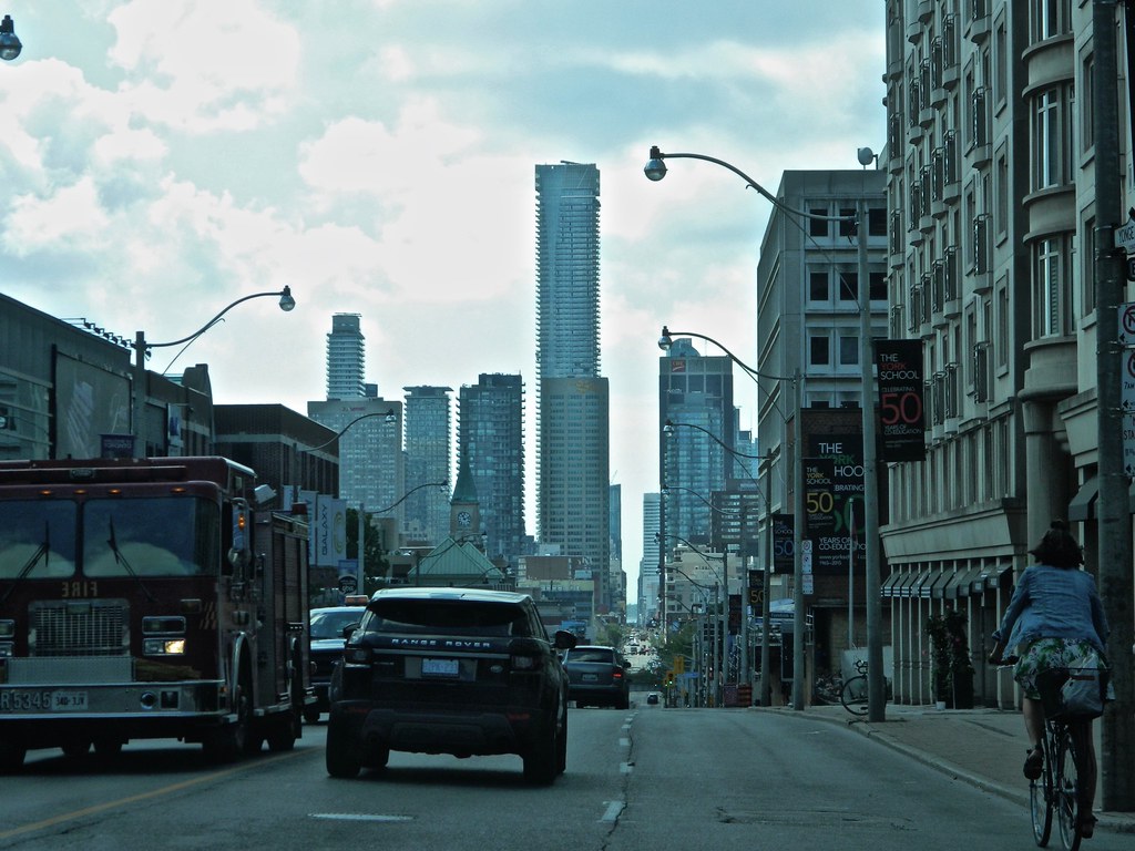
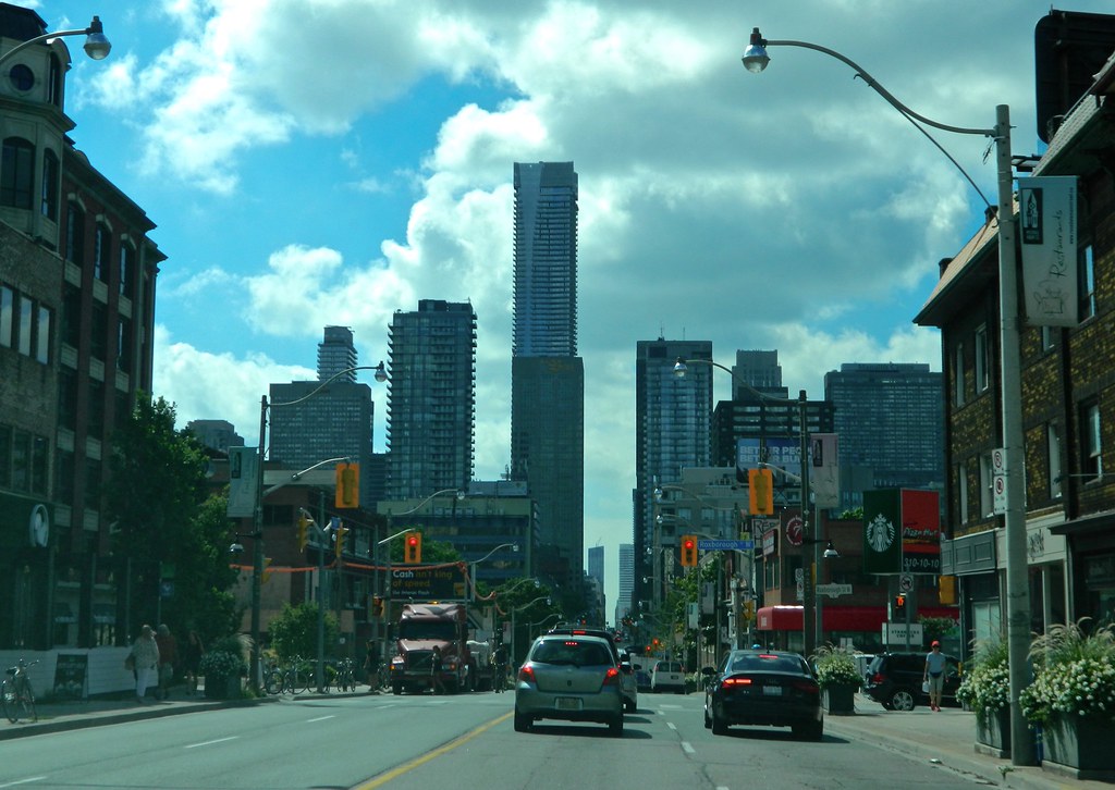
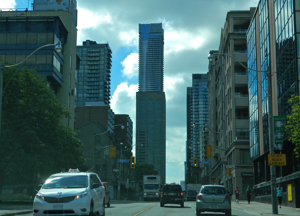
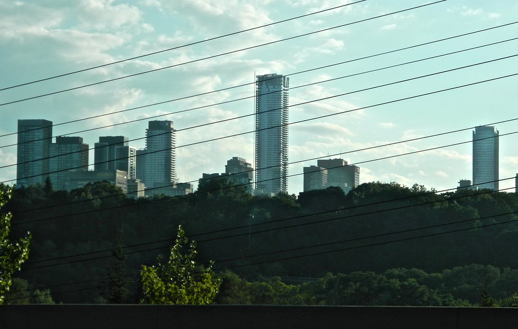
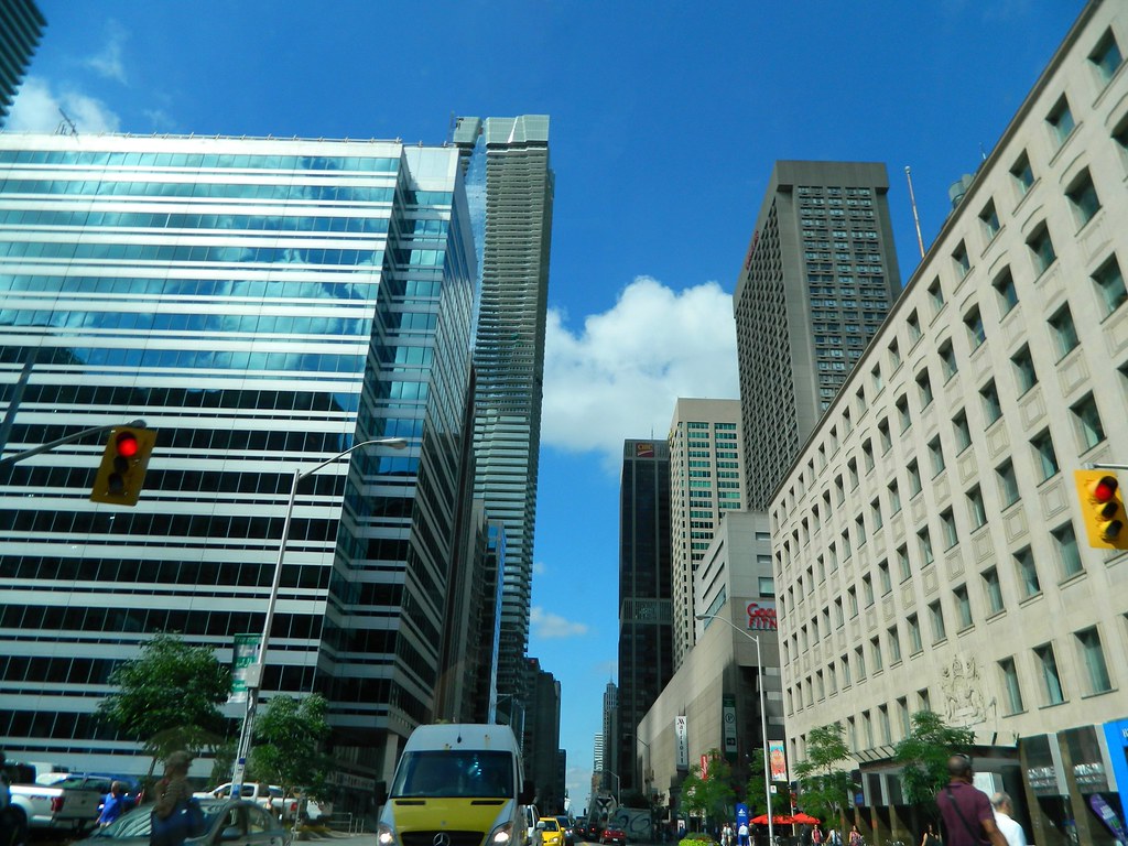
Toronto One Bloor East | 257.24m | 76s | Great Gulf | Hariri Pontarini

They've taken out many of the plantings and replaced them with new plantings. Also surprising is that they are working on the roof of the amoeba today.
IMG_7955.jpg
DSC02315.jpg
DSC02316.jpg
IMG_7968.jpg
DSC02319.jpg
DSC02320.jpg
 

Attachments

  • IMG_7955.jpg
    IMG_7955.jpg
    1.7 MB · Views: 2,005
  • DSC02315.jpg
    DSC02315.jpg
    1.4 MB · Views: 2,016
  • DSC02316.jpg
    DSC02316.jpg
    1.4 MB · Views: 2,016
  • IMG_7968.jpg
    IMG_7968.jpg
    1.7 MB · Views: 2,015
  • DSC02319.jpg
    DSC02319.jpg
    1.6 MB · Views: 2,028
  • DSC02320.jpg
    DSC02320.jpg
    1.1 MB · Views: 2,017
Updates for today.
IMG_8043.jpg
IMG_8044.jpg
IMG_8045.jpg
IMG_8046.jpg
DSC02326.jpg
DSC02327.jpg
DSC02328.jpg
DSC02329.jpg
DSC02330.jpg
 

Attachments

  • IMG_8043.jpg
    IMG_8043.jpg
    1.3 MB · Views: 1,472
  • IMG_8044.jpg
    IMG_8044.jpg
    1.2 MB · Views: 1,304
  • IMG_8045.jpg
    IMG_8045.jpg
    1.4 MB · Views: 1,297
  • IMG_8046.jpg
    IMG_8046.jpg
    1.2 MB · Views: 1,289
  • DSC02326.jpg
    DSC02326.jpg
    988 KB · Views: 1,280
  • DSC02327.jpg
    DSC02327.jpg
    1.3 MB · Views: 1,312
  • DSC02328.jpg
    DSC02328.jpg
    1.3 MB · Views: 1,289
  • DSC02329.jpg
    DSC02329.jpg
    1.4 MB · Views: 1,315
  • DSC02330.jpg
    DSC02330.jpg
    1 MB · Views: 1,294
I find the heavier balcony slab (highest one) under the crown is distracting and jarring from the otherwise sexy and consistent lines on this tower. I'm actually really irked by it because otherwise the building has been such a home run. I really think emphasizing it in the design was a misstep. Hmph.
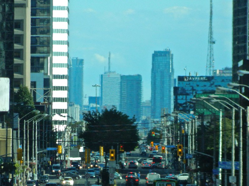
 
This may be the best looking tall building Toronto's gotten in the last 20 years. The parts all come together so well without any awkwardness and the materials seem to be high quality. The mechanical actually fits in. And the smooth form from base to top reminds me of the bank towers, where effort was actually made to achieve quality and make a statement.
 
I find the heavier balcony slab (highest one) under the crown is distracting and jarring from the otherwise sexy and consistent lines on this tower. I'm actually really irked by it because otherwise the building has been such a home run. I really think emphasizing it in the design was a misstep. Hmph.
I know, me too. I keep on noticing it from all around the city when I admire the building. A bit of a bummer, but I'm hoping it'll soften when the balcony glass reaches the top and connects more with the crown.
 
The crown looks obtrusive because there is no balcony glass on the upper floors to blend in with... I think it will look amazing when all the balcony glass is completed...
 

Back
Top