Toronto One Bedford | ?m | 32s | Lanterra | KPMB

That's a little odd, my guess it will be a private garden where residents can commune and sit by the fireplace. What next - a pot of geraniums, a goldfish pond and a cat flap door for the kitty cats...
 
A little park here with fountain and greenery would make for quite a nice little corner. How nice for residents.
 
If KPMB are adopting some sort of architectural politique du pire in order to produce a facadectomy that's so gruesome nobody will ever attempt a facadectomy again ... they've succeeded brilliantly.
 
Thanks Urban Shocker, but pretty sure everyone has already said that a million times in this thread. It's getting really repetitive.
 
Though in this case, given how it was "forced" by the Toronto Preservation Board, it *could* be true...
 
I agree that the attempt to infuse some heritage aspect to this building was terrible.

On another note, does anyone know what they're doing in front of that fireplace? It looks like they're installing a pond or something? I assume this is public space? Maybe Section 37 stuff?
Good one! Fireplace, haha.

Your 'pond' comment got me interested but the only renders of the courtyard I could find was this:

2.jpeg

http://www.theredpin.com/images/precon_amenity/415/watermarked/2.jpeg

Not much more information. They must have changed the plan since. KPMB has very little on this building in their Portfolio and P&S has none... just kind of curious.
I think a victorian style fountain here might actually make the facadism a little more palatable. Kind of in a surreal virtual reality kind of way. Maybe a knee-high hedge maze.
My bigger issue with this project is that the tower is so banal--especially considering it sticks out like a sore thumb from so many places in the city. Like U of T and even down at OCAD. Maybe some future developments near it help make it fit in.
 
Last edited:
We are back at One Bedford, the 32-storey luxury condo project by Lanterra Developments on Bloor Street across from Varsity Stadium. The project is in its final stages with work now being executed on such features as the basins for the courtyard landscaping. We have been wondering about that courtyard for months now, ever since the heritage John Lyle Studio facade was reassembled at the base of the modern tower. Frankly, the facade has looked awkward, out-of-place, and overwhelmed by the sheer size of the project that now surrounds it. Renderings that are brand new to us however, are now leading us to consider if the plan actually will all pull together once the landscaping is in place.

This is what the courtyard and Lyle heritage facade look like now...

OneBedford110319_1.jpg

Craig White

OneBedford110319_2.jpg

Craig White


...and here are the renderings that are now giving us some hope: throw some objects in the mix - trees specifically - whose scale compliments that of the facade, and it doesn't look so forlorn suddenly.

OneBedfordCourtyard.jpg

KPMB Architects

OneBedfordFacade.jpg

KPMB Architects


Of course it may take years for the trees to fill out enough to achieve the effect above, so here's hoping that the condo board will make sure that the courtyard does not suffer from any neglect. Some tender-loving-green-thumbery could save the day here. Below is the landscape plan, looking down on all of rooftops of the site. The ground level area we are considering in these photos is in the middle-left area of the plan below, along Bedford of course.

OneBedfordRooftops.jpg

KPMB Architects/Corban & Goode


Recent work has included the glazing beng applied to the walkway from the sidewalk to the front door. Spaces for gardens - (are there any water features hidden amongst the greenery?) - are now in place. One Bedford's landscape plan is by Bruce Corban of Corban and Goode, who do not have a website.

OneBedford110319_3.jpg

Craig White


There is a fireplace facing the courtyard in the photo above. It's double-sided, facing the lobby as well.

OneBedfordFireplace.jpg

Craig White


To end off, an obligatory look at a rendering, this one watercoloury, of the finished project. One Bedford is designed by KPMB Architects.

OneBedfordWatercolour.jpg

KPMB Architects


42
 
Last edited:
OneBedford110319_1.jpg

Craig White

One detail that was done on this building (you can see it in I42's first picture in the lower right hand side), is that instead of placing metal on the outer corners of the edges of the pillars at ground level, they actually are indented/inverted. I thought this was quite clever to avoid the edges getting bumped, kicked, and crumbly over time.
 
Here's the bit above blown up to illustrate Greenleaf's point a bit more clearly.

OneBedfordIndents.jpg

Craig White
 
One detail that was done on this building (you can see it in I42's first picture in the lower right hand side), is that instead of placing metal on the outer corners of the edges of the pillars at ground level, they actually are indented/inverted. I thought this was quite clever to avoid the edges getting bumped, kicked, and crumbly over time.

... the worst example of street-level "crumbly" in recent memory being the KPMB/Myers entrance to their AGO reno of the early '90s.
 
The "heritage" facade is still ridiculous, all things considered. The new condo itself however, is fine.
 
The additional retail space located on the ground level has attracted several corporations, including Shoppers Drug Mart and Starbucks Canada (Perhaps located behind the heritage facade).
 
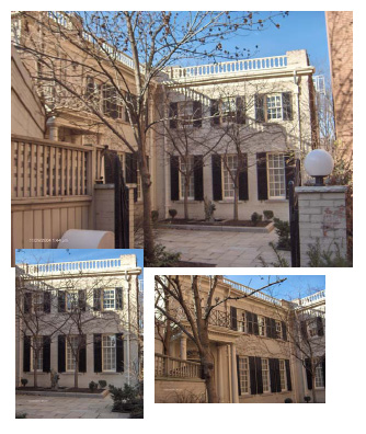
The courtyard is being landscaped.

OneBedfordP1210526.jpg


OneBedfordP1210528.jpg


OneBedfordP1210529.jpg


OneBedfordP1210531.jpg


42
 

Back
Top