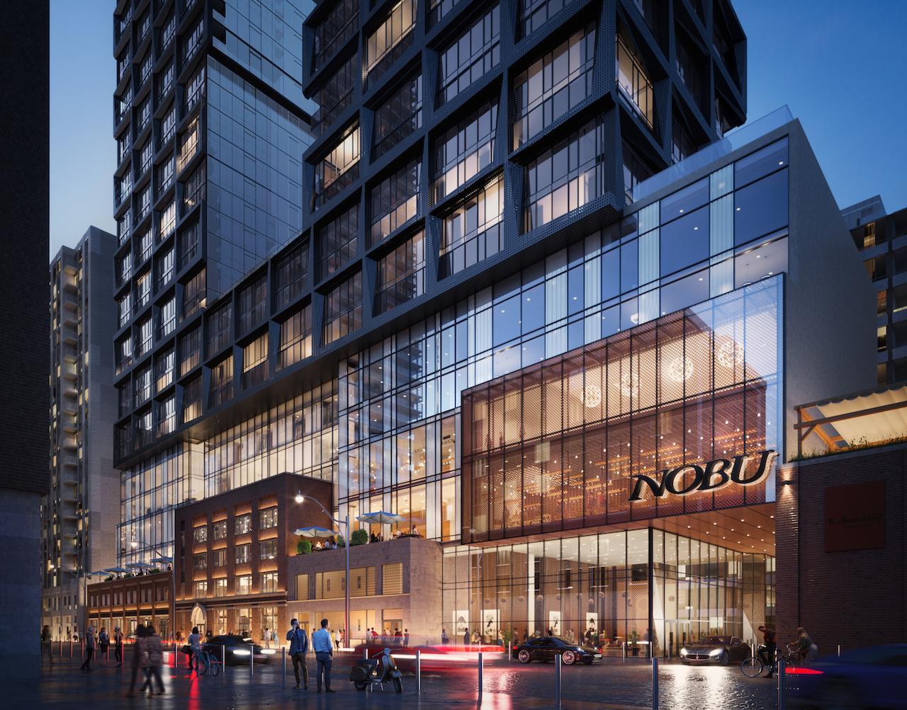
Toronto Nobu Residences Toronto | 156.66m | 45s | Madison Group | Teeple Architects

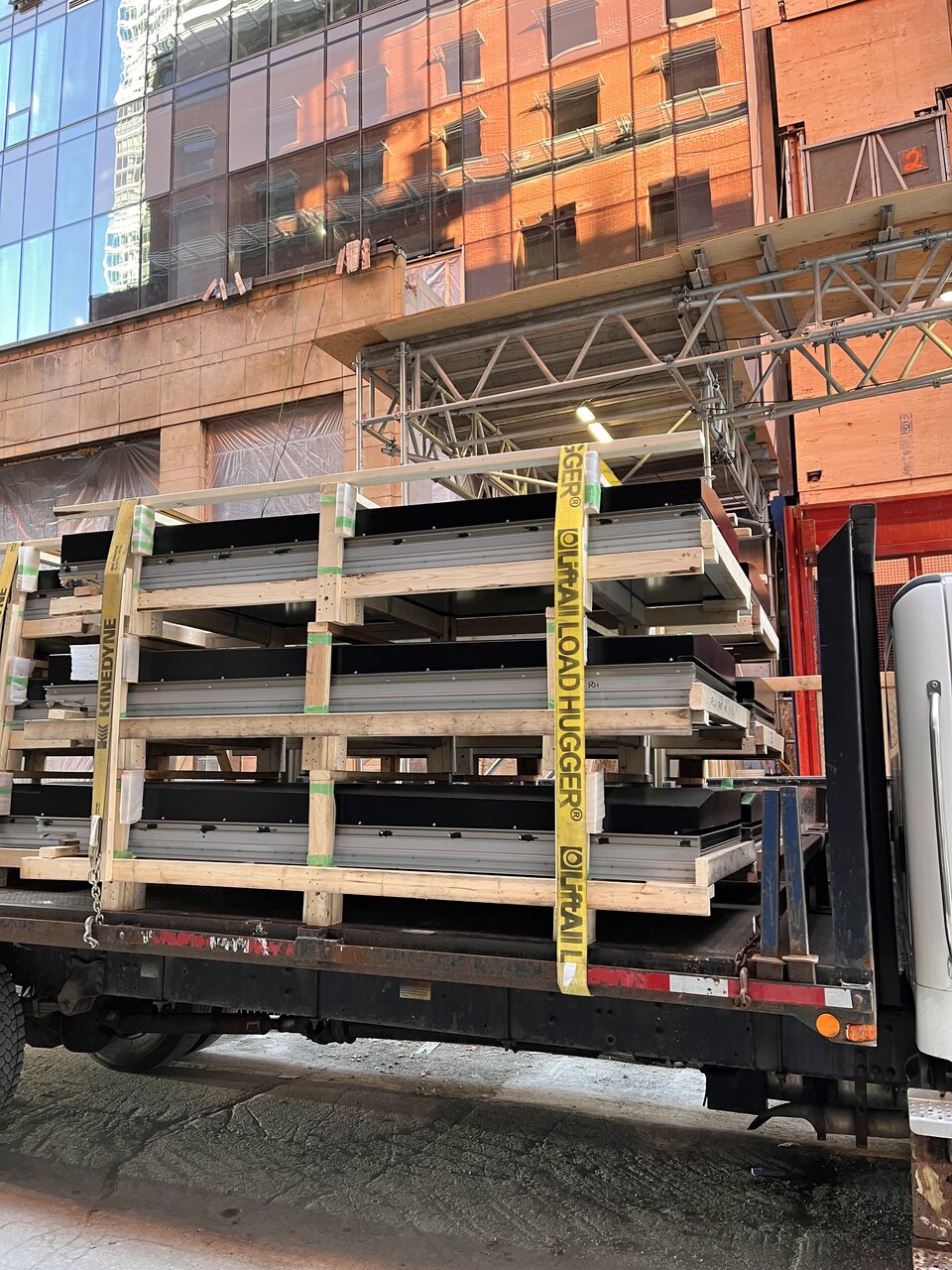
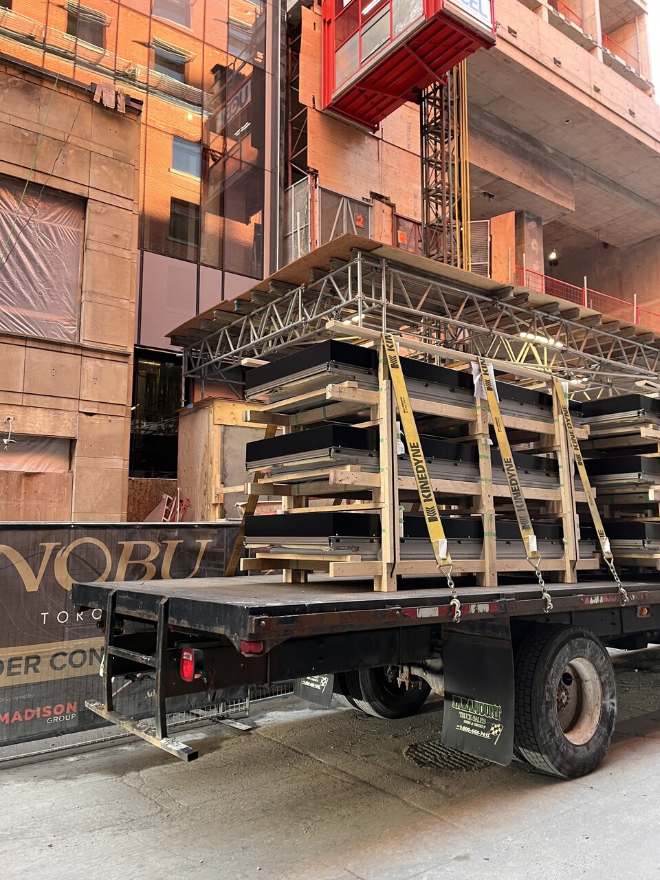
Here are some run and gun shots, looks like the windows with the black metal panels for the main tower have arrived (but I might be mistake).
F6438E46-89AC-4777-96ED-DAF977F81221.jpeg
AC6B09FE-39A8-481F-8290-4263F5ACC295.jpeg
 
Last edited:
That could end up looking pretty striking. The brake on the panels will catch the light in interesting ways, and the heavy verticals will be discernible from far off. It's going to stand out from its neighbours.
The only thing I agree here is it will stand out. As the worst building in the area. What a bait and switch.
 
I shouldn't even be shocked, based on the baiting of the materials on the podium (promised in city documents mind you) but wow this is making me much more frustrated than it should. It's simply upsetting that they would go to their lengths to buy Alpolic panels (expensive) to be thrown in amongst this poorly downgraded mess. No bronze, no channelling, seriously what even is the 'special' part of this development anymore, all of it's been removed. So much for a 'lantern' design, if I were Teeple and Nobu I'd take my name off of this, as there's nothing here that feels like the original vision at all, it's just a soulless version of it. I don't say that lightly.

It's as if Madison Group has zero conscience to honor a design that's been marketed, documented and contracted. Let alone just honoring Teeple's design vision with slight downgrades. I see zero point in any city process if they are able to just switch up the materials that much. I've seen ZERO revisions to what was described in city documents that are public facing, unless grey is somehow bronze and black... 🤨

Only positive thing I can say is the black panels are nice. The one part they spent the dollars on... and ironically the one part I saw early that gave me a lot of false confidence in this developer.

I can only hope the bronze still somehow appears here...

1639771434161.png
 
Last edited:
To get enforcement on SPA, you'd need to have a Buildings department that cares. They don't, and Planning doesn't have the time to take folks to the tribunal over materiality, so this is where we're at.

That's a broadcast to other developers, FYI: they just don't care. Cheap out, completely change materials. Whatever. None of it matters.
 
The glazing doesn't look as deeply recessed as shown on the rendering (or I guess, the black metal panels do not poke out as far).... or is there another layer of perforated black metal to come?
The rendering looks to have perforated metal - marked as "3B - METAL MESH" on the table above.
EDIT - I see attachment points (bolt heads) along the foot high lower mullion. Those are probably to attach the metal mesh.
 
Last edited:
Can we just not see the colour because of the reflectivity? The latest photos from Red Mars have me second guessing. Either way they’re not great, but hopefully there’s at least some warm bronzey tones to the glazing
 

Back
Top