Toronto Maverick | 154.53m | 49s | Empire | Arcadis

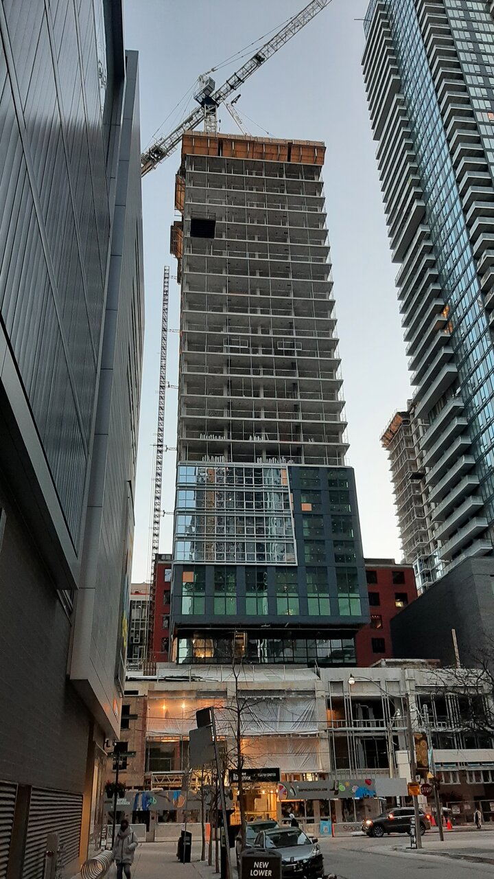
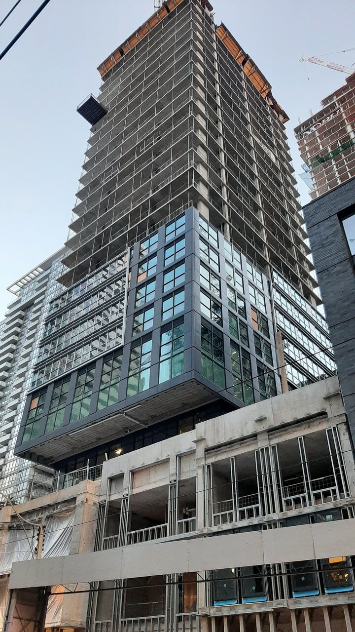
Today:

20221213_163601.jpg
20221213_163701.jpg
 
I'm surprised by these comments, out of all the buildings, I'd say this looks a lot like the renders so far (less the typical non window wall finish, even though renders show otherwise).
 
Looks like the rendering without all the cool lighting and reflections. I never had high hopes for this. The Entertainment District is where good design goes to die.
Agreed, but you can say that for most areas in Toronto. Yonge & Eg, NYCC, Humber Bay Shores ... even Yorkville has plenty of duds.
 
I'm not sure I would consider something passable with two different style/tones of bargain basement grey spandrel though...

Edit: "It looks less bargain basement if you look at it closer...maybe the style of cladding they used is a bit too busy for you, Uta?"

...er, well...I guess so? >.<
 
Last edited:
I think this development is going to look sharp. Mixing its semi dark glazed windows and dark smoked cladding. With the mirrored glazed windows and bright linear trimmed cladding of a tower. On top of the rebuilt historical podium as seen in the photos up above. Should looks sharp in my opinion when finished.
 

Back
Top