Toronto Maple Leaf Square | 185.92m | 54s | Lanterra | KPMB

What exactly does that mean? MLSE spends plenty on both the Leafs and Raptors. The NHL has a hard salary cap and there is a limited amount you can spend. The NBA has a 'softer' cap, and MLSE has said many times they would be willing to spend over it to build a winning team.

Their sports teams may have issues, but money isn't one.
 
Add in some post season play by any of the big four clubs and all will be forgiven, ( well almost all ). When this city is dug up in a couple a thousand years anthropologists might ponder this avenue and conclude this was a culture that worshipped sport. Pretty slick.
 
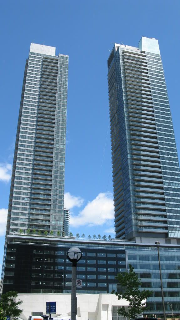
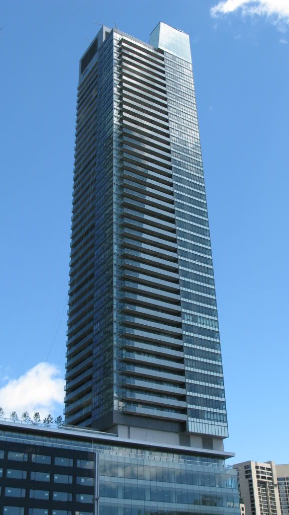
Now that it's pretty much finished, I'm dissapointed by the design of the towers, but I do love the podium and the density it gives to the area. From today:

IMG_1681.jpg


IMG_1682.jpg


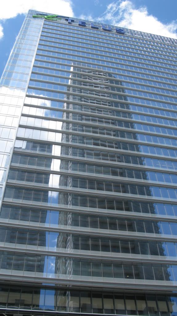
IMG_1688.jpg


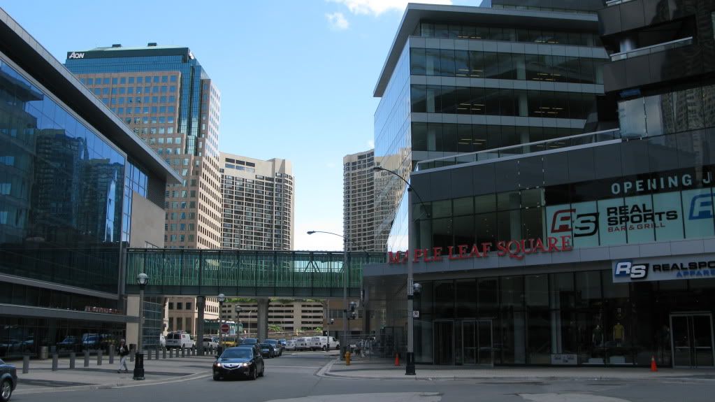
IMG_1692.jpg
 
the only thing impressive about MLS is the scale and massing when driving west on the Gardiner.

This is a vanilla building (as in boring and lacking in character), but a good vanilla building.
 
MLS actually looks decent in your shots Davin... i guess its the lighting or something, but the towers don't look as grey/gloomy as they normally do!.. if MLS looked that great everyday, i'd like it... but in general, these towers don't look that great.. i think it was the cladding/choice of materials that destroyed this building...

the concept was EXCELLENTt though :D (podium, scale, retail, etc...) :D
 
the only thing impressive about MLS is the scale and massing when driving west on the Gardiner.

This is a vanilla building (as in boring and lacking in character), but a good vanilla building.

By comparison (and esp. from a driving-west-on-the-Gardiner standpoint), I'll suppose that Pinnacle and 18 Yonge are "bad vanilla"...
 
I actually quite like the buildings. They're not the best in the city by any means, but they're an awesome addition.
My least favourite part is the office portion. It looks tacked on, and not well integrated. I think maybe because the colour they chose sticks out too much.
I would have liked to see the podium area facing the ACC as large as it was shown in renders. Oh well.
 
MLS actually looks decent in your shots Davin...

I love that last shot....particularly how the pedestrian bridge totally hides the Gardiner......it really looks like there is nothing between the building and the south side of Lakeshore!
 
Mls

But where is the SQUARE itself?
No water features , no skulptures , no threes , no benches , nothing , just asphalt...
 
I agree. Much ado about nothing.

In terms of the " square ", the influx of thousands of sports fans will bring momentary colour to this drab space. If the city ever wins anything, the whole stretch clear to the Rogers thingey will be rockin'. The majority of these prospective celebrants don't give a hoot about the aesthetics. MLSE knows where to put a buck, and where not to . Personally, I'm left with admitting it's better than what was there before, a lot like having running toilets.
 

Back
Top