Toronto Manulife Centre Podium and Streetscape Renewal | 9.75m | 2s | Manulife Real Estate | MdeAS Architects

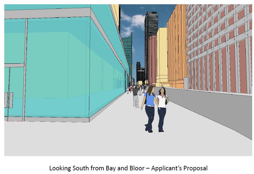
This is the vision for the corner of Bay and Bloor

Hey I'm just wondering if you received more info/where did you get your info from? I've been curious about this project and often check for any signs of construction but have yet to see much.

I just received this. It gives some idea of the lack of inspiration on the part of ManuLife. The city have made a few recommendations, but only in terms of pulling the envelope back in places to widen the sidewalk. We must be able to do better than this!
Applicants vision Bloor and Bay.JPG
 

Attachments

  • Applicants vision Bloor and Bay.JPG
    Applicants vision Bloor and Bay.JPG
    77.5 KB · Views: 2,635
Well it's going to look much better than the basic render above, however it's basically going to look like a complete glass building wrap. This will certainly make the current building "pop" out and connect better with the sidewalk/street.
 
Well it's going to look much better than the basic render above, however it's basically going to look like a complete glass building wrap. This will certainly make the current building "pop" out and connect better with the sidewalk/street.

Obviously its going to look better than the render, but it is still a 2 story, flush glass wrap with (they hope) some interest provided by the retail tenants (sort of like the frontage on 131 Bloor West). As high street frontages go, and compared to what is there now, it is ok. But the problem with Toronto is we always say ok is good enough; and I( am saying in this instance it is NOT good enough!
 
That rendering is so conceptual though that it cannot be understood as anything other than a location for the new envelop. You certainly can't infer proposed finishing details from it.

42
 
Obviously its going to look better than the render, but it is still a 2 story, flush glass wrap with (they hope) some interest provided by the retail tenants (sort of like the frontage on 131 Bloor West). As high street frontages go, and compared to what is there now, it is ok. But the problem with Toronto is we always say ok is good enough; and I( am saying in this instance it is NOT good enough!

I agree, it's not good enough. However, it's a cost-effective way for the LL to enhance the space and at the same time increase the GLA and hopefully attract new tenants into their building. I know, path of least resistance. Let's hope they do a decent job though with the new envelope.
 
I have actually seen the architectural renderings and obviously they are a bit more detailed. But, the principle is the same: two stories of unbroken glass in a straight line running along Bloor Street and down Bay, very much as represented in the conceptual pic I posted. Unfortunately I do not have the actual renderings.
 
I just received this. It gives some idea of the lack of inspiration on the part of ManuLife. The city have made a few recommendations, but only in terms of pulling the envelope back in places to widen the sidewalk. We must be able to do better than this!
View attachment 40686
this image doesn't represent applicant's proposal.
it is simply a misleading information
 
I have actually seen the architectural renderings and obviously they are a bit more detailed. But, the principle is the same: two stories of unbroken glass in a straight line running along Bloor Street and down Bay, very much as represented in the conceptual pic I posted. Unfortunately I do not have the actual renderings.

well sir/madam,
Funny thing, Bloor St.W. in this very section is actually not a straight line, that should be the first hint that your description is far from being precise. Sometimes memory can play a trick on you.
BTW, the image posted above was certainly not produced by the architects.
 
^ Any improvement to the Balmuto side?

Yes - Balmuto is getting the same treatment all the way down to Charles

The less said about that sketchup render the better
 
well sir/madam,
Funny thing, Bloor St.W. in this very section is actually not a straight line, that should be the first hint that your description is far from being precise. Sometimes memory can play a trick on you.
BTW, the image posted above was certainly not produced by the architects.

Thanks for your observation and insight. Clearly I am not an architect, so I will rely on you to tell me exactly what part of Bloor between Balmuto and Bay Street is not a "straight line. It is not apparent to the naked eye, so probably not relevant to my comments. Besides which, even if Bloor St were not a straight line in "this very section," it would not preclude a wall being built, as described above, "in a straight line running along Bloor Street and down Bay". So I am not sure what your point is.

And, yes, you are extremely observant and insightful: the image was not necessarily produced by the architects. It was distributed by the city planning department so it may have been produced by them. Again, in the light of the totality of my comments, I am not sure what your point is.

nothing personal..
1. Bloor St is bent between Bay & Yonge,
2. Property lines with mandatory setbacks are determining potential expansion, simple thing really, bent ROW=usually bent facade
3. The image above is undersigned "Applicant's proposal", which is simply not true
 
Last edited:
the image was not necessarily produced by the architects. It was distributed by the city planning department so it may have been produced by them.

Hey...perhaps it's the work of the great Jennifer Keesmaat herself!!!! Looks about her speed.


Oh...BTW. I have a soft spot for 60's fieldstone bits, and I was wondering if there was any way the planning department could force the architects to incorporate them as some kind of requisite heritage façadism.
 

Back
Top