Toronto Manulife Centre Podium and Streetscape Renewal | 9.75m | 2s | Manulife Real Estate | MdeAS Architects

It's almost if this "renewal" extension was designed to get folks in and about at street level to ignore the original highrise components above it. But when stepping back and looking at the building as a whole, it goes together like oil and vinegar. So thumbs way, way down for this one.

...not to mention, the new glass blocky parts look dull and uninspiring to begin with, IMO.
 
Bay and Balmuto are definitely better. Especially Bay, with the "upstairs/downstairs" being erased on a major street. Bloor is worse than before, but largely due to cheap materials and not playing with the building's distinctive shape. A lost opportunity, likely designed to give Eataly as much floor space as they possibly could muster.
 
Woah, those globe streetlamps look straight out of the 1980s.

Or somewhat 1880s. Have you never noticed them? They're all over the city. In a city awash in minimalist sterility the embellishment they provide is welcomed. I'd prefer fewer competing lamp post designs and would prefer we not lose one of the few things in the public realm that isn't bare bones utilitarian.
 
Last edited:
  • Like
Reactions: xy3
I don't mind the blue-bases of the lights, but the globe-top to me is a bit problematic in that it's a big waster of light energy; sending light up and away, not simply down to the sidewalk area.

Something I wouldn't mind seeing is a fixture more like this; that can be done in a classic Yorkville-Blue.

View attachment 278617
Taken from here: https://www.hapco.com/decorative-poles/

A slightly taller version could front main streets; while more intimate side streets could omit the high-level fixture all together in favour of the shorter design.

Those aren't bad but to be found from one end of North America to the other. I used to be luke warm to Toronto's period lamp posts but have since warmed to them. They're unlike any I've seen in any other city. They give Toronto character and help set the city apart from the rest. It's nice that they actually have a colour. Our streets are grey, beige, and glass. The blue is a great pop of colour in an otherwise drab colour palette..... especially from October to April.
 
Last edited:
It's almost if this "renewal" extension was designed to get folks in and about at street level to ignore the original highrise components above it.

That's very typical... they focus on the pedestrian experience rather than a cohesive scheme.

- Phase 1 of Eaton Centre Sears conversion to Nordstrom left the upper Sears storeys temporarily as-is
- The former Xerox office building at 33 Bloor with the curvey new TTC entrance
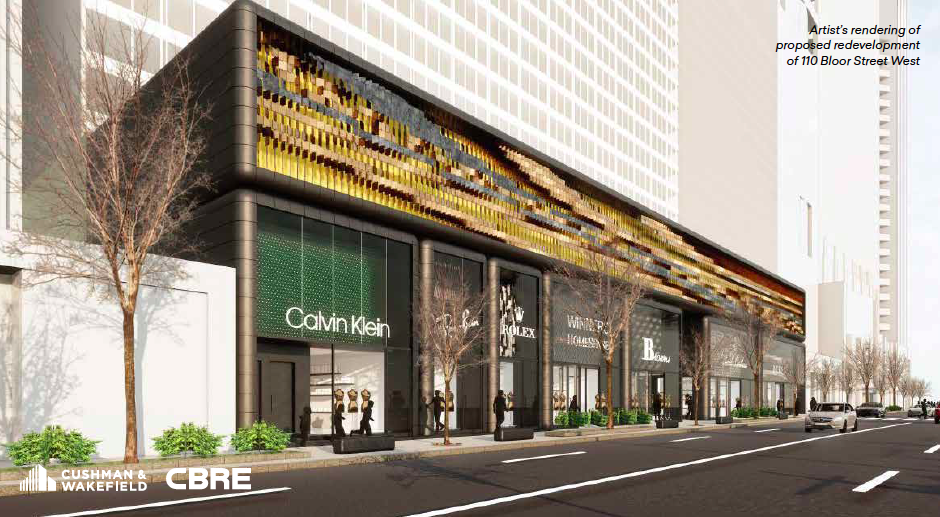
- Proposed renos to110 Bloor with the Winners Homesense.
- Many other individual storefront renos along Bloor St

33 Bloor:

TD Bank Bay & Bloor:

Here's the LV at Renaissence Plaza:
renaissance-plaza-1.jpg


110 Bloor podium overhaul:
110-bloor-street-west-facade.png


Or somewhat 1880s. Have you never noticed them? They're all over the city. In a city awash in minimalist sterility the embellishment they provide is welcomed. I'd prefer fewer competing lamp post designs and would prefer we not lose one of the few things in the public realm that isn't bare bones utilitarian.

I haven't lived in Toronto since university in the early 1990s - and I still recognized those lampposts!
 
Last edited:
Bay and Balmuto are definitely better. Especially Bay, with the "upstairs/downstairs" being erased on a major street. Bloor is worse than before, but largely due to cheap materials and not playing with the building's distinctive shape. A lost opportunity, likely designed to give Eataly as much floor space as they possibly could muster.
Although I find the Eataly space chopped up and difficult to navigate.
 
Those aren't bad but to be found from one end of North America to the other. I used to be luke warm to Toronto's period lamp posts but have since warmed to them. They're unlike any I've seen in any other city. They give Toronto character and help set the city apart from the rest. It's nice that they actually have a colour. Our streets are grey, beige, and glass. The blue is a great pop of colour in an otherwise drab colour palette..... especially from October to April.
I would not get too fond of them as Toronto Hydro Street Lighting (whom the City sold all their streetlights to under David Miller's mayoralty) is trying to standardise all street lights in the city . To concrete poles and probably cobra luminaires. Yes, really!
 

LCBO Secures Highly-Coveted Mink Mile Corner Storefront


The Liquor Control Board of Ontario (LCBO) has leased a more than 10,000-square-foot space on the street level of the Manulife Centre at 55 Bloor Street West in downtown Toronto. The coveted location is at the corner of Bloor Street and Balmuto Street in the renovated podium of the Manulife Centre which cost well over $100 million to renovate and features a 50,000-square-foot Eataly location that opened last year.

The previous tenant in that street level corner space at Manulife Centre was tableware retailer William Ashley, which in the spring of 2018 relocated nearby. In years past, iconic luxury multi-brand retailer Creeds occupied the Bloor-Balmuto corner.


Interesting! I had been told, at one point, that the LCBO wanted the Rexall Drug store space that was next to the existing unit.

Certainly, growing that store has been on the to-do list.

I would imagine a tasting bar might be on their list here (but don't know that); 10,000ft2 is a bit bigger, but I might have expected larger still, compares to 12,000ft2 in Leaside, 30,000ft2 at Summerhill; The new Queen's Quay store will be 25,000ft2.

Spadina/Front is ~14,000ft2 retail but 22,000 all-in.

Edit to add: This unit (new Manulife) was marketed as 14,000ft2. I'm thinking this will be 10,000 selling space, 4,000 in back, but would need to confirm.
 
Last edited:
Interesting! I had been told, at one point, that the LCBO wanted the Rexall Drug store space that was next to the existing unit.

Certainly, growing that store has been on the to-do list.

I would imagine a tasting bar might be on their list here (but don't know that); 10,000ft2 is a bit bigger, but I might have expected larger still, compares to 12,000ft2 in Leaside, 30,000ft2 at Summerhill; The new Queen's Quay store will be 25,000ft2.

Spadina/Front is ~14,000ft2 retail but 22,000 all-in.

Edit to add: This unit (new Manulife) was marketed as 14,000ft2. I'm thinking this will 10,000 selling space, 4,000 in back, but would need to confirm.

William Ashley had a private deliveries and service entrance with direct access from P1 on the exit ramp toward Balmuto street. I wonder if after the renovation, that configuration is still in place, and made it more appealing to the LCBO as to have its own loading/deliveries area.
 

Back
Top