Toronto Lago at the Waterfront | 162.15m | 50s | Mattamy Homes | Graziani + Corazza

The proportions are clumsy, and up-close, the detailing is poor and unsophisticated. It's hard to appreciate form and the greater picture of a design when there is so much capping, flashing, coping, mullions, spandrel panels, and heavy framing of the simplest elements. There is no delicacy, no reveals, no interestingly conceived details to enrich the experience at human scale. This would be acceptable for a strip plaza in Vaughan, but for housing, it's yet another disappointment.
 
Overall I don't mind it, but they really went too conservative with the angling of the balconies. Almost as if they were too afraid to go all the way with it. I don't like it on the ground level. The podium doesn't fit the tower IMO. Looks like 2 different projects.
 
33338326316_6eac8f2faa_h.jpg


33251189581_2f4fa28963_h.jpg
 
Last edited:
Final Closing: May 9 & 11, 2017, so quickly
875267158.jpg


99% done inside

909200223.jpg
980631377.jpg
1087936882.jpg
1528994641.jpg


view from the peninsula
1693389672.jpg


view from the bridge
1900129854.jpg


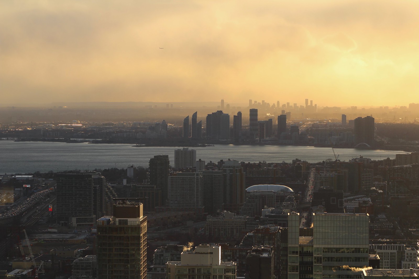
view from Lago
2110327799.jpg
 

Attachments

  • 875267158.jpg
    875267158.jpg
    42.9 KB · Views: 817
  • 909200223.jpg
    909200223.jpg
    61.8 KB · Views: 766
  • 980631377.jpg
    980631377.jpg
    59.5 KB · Views: 756
  • 1087936882.jpg
    1087936882.jpg
    72 KB · Views: 784
  • 1528994641.jpg
    1528994641.jpg
    63.4 KB · Views: 695
  • 1693389672.jpg
    1693389672.jpg
    81.4 KB · Views: 736
  • 1900129854.jpg
    1900129854.jpg
    114.9 KB · Views: 768
  • 2110327799.jpg
    2110327799.jpg
    62.1 KB · Views: 787
Last edited by a moderator:
The alternating black and white pattern is much more noticeable than I would have imagined. Could be influenced by photo editing, but still it looks decent.
 
The amenities look great.

To this day I don't understand how Empire delivered Beyond the Sea with two treadmills and a weight rack. For all three towers!

My condo building (far, far smaller) has 4 ellipticals, 4 treadmills, 4 tandem bikes, a rower for cardio, a full weight room, a yoga/core training area.. Looks like Mattamy gets it.
 
The proportions are clumsy, and up-close, the detailing is poor and unsophisticated. It's hard to appreciate form and the greater picture of a design when there is so much capping, flashing, coping, mullions, spandrel panels, and heavy framing of the simplest elements. There is no delicacy, no reveals, no interestingly conceived details to enrich the experience at human scale. This would be acceptable for a strip plaza in Vaughan, but for housing, it's yet another disappointment.

Okay that book you wrote wasn't necessary. Don't act like an expert architecture connoisseur.
 
Okay that book you wrote wasn't necessary. Don't act like an expert architecture connoisseur.

I think my critique is both necessary and warranted. People are saying "I like it". I am offering a commentary based on the thing that is completely lacking here: detailing.

If you want to pick a fight on a message board, go for it; the mods will put you back in your place soon enough.
 
Okay that book you wrote wasn't necessary. Don't act like an expert architecture connoisseur.

That condescending attitude has no place here. This forum has always had people discussing the fine details of new buildings. You don't need to be a famous critic to have a thoughtful and insightful perspective on whether a building has good architecture or mediocre design. Anyone can discuss these matters, as long as you have an eye for detail. That's part of why people like this forum.
 
I think my critique is both necessary and warranted. People are saying "I like it". I am offering a commentary based on the thing that is completely lacking here: detailing.

If you want to pick a fight on a message board, go for it; the mods will put you back in your place soon enough.

First of all don't threaten me. Thanks. Now if anybody is going to be getting put in place it'll be you.
 
That condescending attitude has no place here. This forum has always had people discussing the fine details of new buildings. You don't need to be a famous critic to have a thoughtful and insightful perspective on whether a building has good architecture or mediocre design. Anyone can discuss these matters, as long as you have an eye for detail. That's part of why people like this forum.

Oh wow. Being attacked on this forum yet again. No surprise there.
 
Alienhenny, if you are not interested in reading criticism of architecture, I really think you are wasting your time at this forum.
 
Sorry, I can't let this go ...

you actually think you were threatened and attacked by those posts?!?
 
Alienhenny, if you are not interested in reading criticism of architecture, I really think you are wasting your time at this forum.

I'm not wasting my time, but the bullying on here needs to stop. I'm taking action and calling the authorities. Prepare to hear from my lawyers. See you in court sweaty
 

Back
Top