Toronto Four Seasons Hotel and Private Residences Toronto | 203.9m | 52s | Lifetime | a—A

More fins on the east side (sorry, eye squinting required, I didn't have my 55-300mm lens in my knapsack!)

Click on the thumbnail to enlarge, then click again on the image for full size.

 
From my cellphone a few moments ago.

photo-126.jpg
 
The Four Seasons at night, from Yonge & Wellesley. I thought it looked kinda' cool all lit up like that.

Click on the thumbnail to enlarge, then click again on the image for full size.

 
The Four Seasons at night, from Yonge & Wellesley. I thought it looked kinda' cool all lit up like that. ...

Interesting to note that for some reason the Four Seasons and the construction team building it are not concerned with Airplane safety. There are no red beacon lights on the top of the crane and as the tallest thing in the vicinity, it seems like a giant hazard to me. Even the just completed Uptown has aircraft warning beacons (though strangely not at its highest points???)

I thought all cranes had to, by law, have warning beacons.
 
I don't know, requiring lights on the tops of cranes reeks of conspiracy to me. It just seems like another example of the "well-choreographed and calculated machinations by [Menkes] to get what they really want."
 
That includes ground level above sea-level, which happens to be about ~117 meters at Bay and Yorkville, according to Google Earth... So that makes it 200 meters... But I believe the Penthouse is listed as Floor 55 (Which is not the same as the actual level counts, when you take out floors like 13 and so on.) The mechanical may be extra height not listed.

does google earth exist still cause i dont know of anyone whos able to use it today! nore download from anywhere. just curios!
 
Lately I have noticed while walking on Avenue Road that this building is somewhat lopsided when viewed from the west or east. The top setback is higher on one side than the other. Perhaps it will look better once the curtain wall and fins are complete - but right now I think that it ruins the modern, clean lines. Symmetrical setbacks would have looked better.
 
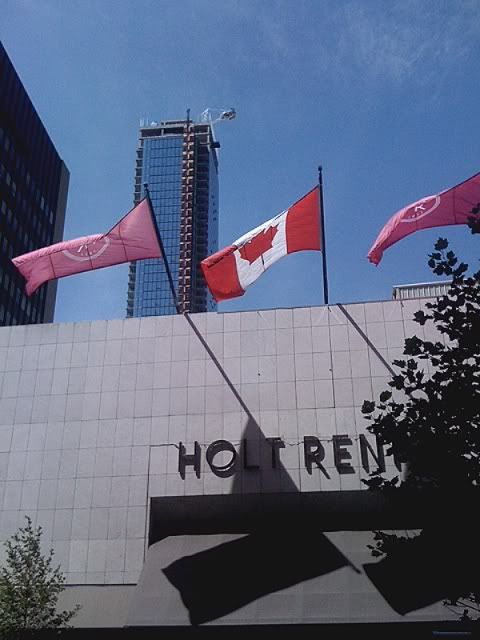
Some pics by me from yesterday.
 

Attachments

  • base.jpg
    base.jpg
    98.6 KB · Views: 163
  • top.jpg
    top.jpg
    94.6 KB · Views: 148
  • 4S.jpg
    4S.jpg
    97.1 KB · Views: 159
  • 4s2.jpg
    4s2.jpg
    95.3 KB · Views: 167

Back
Top