Toronto Four Seasons Hotel and Private Residences Toronto | 203.9m | 52s | Lifetime | a—A

That's a complex render from that angle and I had already considered it. First I'll have to see if I can do some colour correction and sharpening. The hardest part will be faking the top half of the picture above the frame... A couple of the buildings, like Four seasons and One Bloor would be above the frame, so I'd have to fake a whole lot of Rosedale and Yorkville to fit them in.

Let me think about it.

:cool:
 
Burano's gonna be a cool tower, Traynor , you the best, dont worry bout adding whats not there (rosedale), just clad what you can see of FS, and 1Bloor,(if you want to do it) ..... the angle is a little tougher no question.
Its just crazy that any town would need so many renderings from so many different vantage points....It seems like Murno Burano rocp, Lumiere, will all fill in nicely leading up to Aura,now a few projects to infill south towards CBD..... Will RCMI, fill in that gap a little???
 
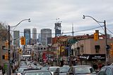
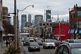
Today, from Yonge Street south of St. Clair. Four Seasons is making one hell of a dramatic impression on the downtown skyline.

Click on the thumbnail to enlarge, then click again on the image for full size.

 
Four seasons also looks freakishly tall from mount pleasant south of st.clair ^^^ and when you're coming down from the hill, four seasons just looks massive (like a supertall) and it's smack in the middle of your view! check it out :D!

So sweet how FS will go taller than the CN tower in Dt's pics.
there will be unbalance in this view though when FS is topped off (that is until 1 bloor is built). four seasons is making everything else look small.
 
from today
20110212059.jpg

Its bizarre to me, how a building like CIBC can be so dated, and for lack of a better word ugly. Then a few more players come on the stage and suddenly its an interesting, old growth tower, thrust into the background,.... the way its kinda just looming in the background, versus being front and center, it looks like filler I guess, and is better at that role, for sure.
 
Whats the name of the staggered building in front of FS???? I can't remember as I dint follow the lesser projects the same. Now I';m sure I'll get ripped for this but, IMO, thats the UGLIEST thing Ive ever seen built, I'm sure the quality is great etc..... but its frickin the beast man, only artsy people, who try to hard to be critics , can love this slapped together mish mash, for all you middle density, lovers of European arch. Here is your cake, now eat it.
Uptown has context, ROCP, has context, this is horrendous garbage, it's like loving modern art, your trying to hard to be different and "hip".
You can love the wailing of Ornette Coleman, you can love the lines of Picasso, but whens the last time you put on free jazz, or hung an ink blot?
To each his own, but anyone who prefers this over the Uptown, should move into a M.C. Escher painting:rolleyes:
 
it's 155 cumberland ^^^
to me it's not bad, though the sides are very plain (but it's unavoidable since it's what supports the structure)

going back to Jasonzed's CN tower pic, U condos will block out a fair chunk outa this view. enjoy it while you can!
 
Isn't 155 cumberland to be demolished in the not too distant future? I agree, it's like a concrete, windowed, half complete pyramid from the 70's. Get the hell outta here. It's 2k11 baby!
 
Isn't 155 cumberland to be demolished in the not too distant future? I agree, it's like a concrete, windowed, half complete pyramid from the 70's. Get the hell outta here. It's 2k11 baby!

Huh? It was practically completed in 2k10. (Though interesting point in its coming off retro-Brutalist in that picture.)

And remember that its form is in part a creative piggyback gesture atop the "Philip Johnson" Torno penthouse...
 

Back
Top