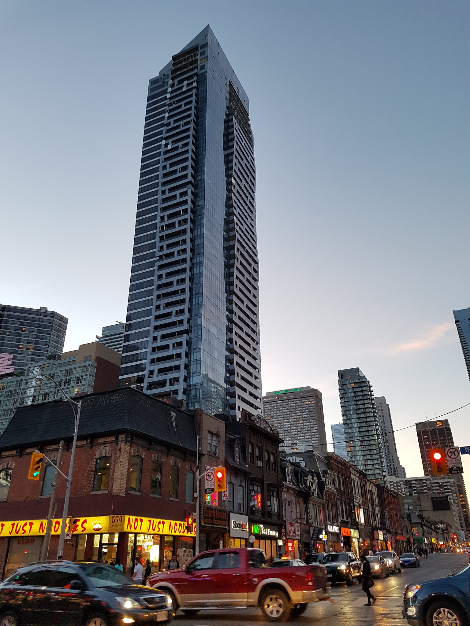
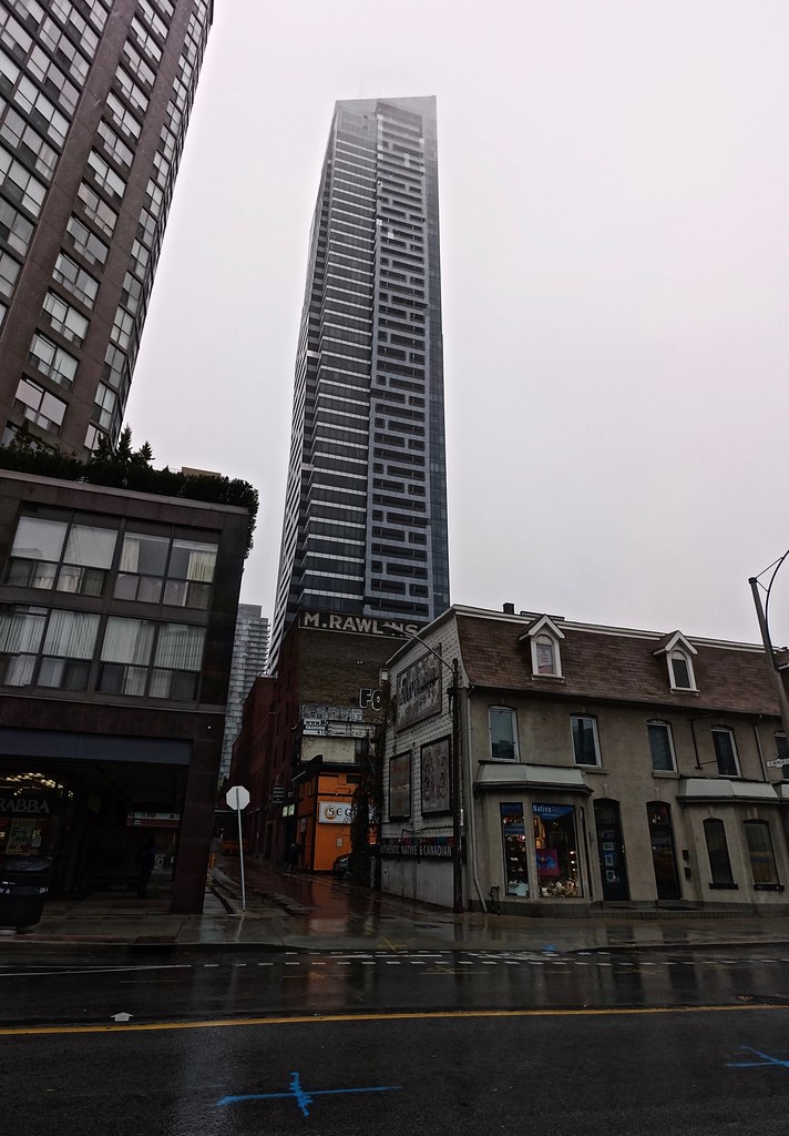
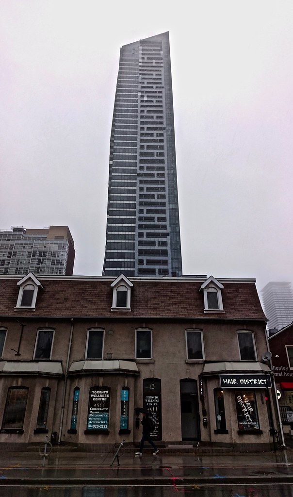
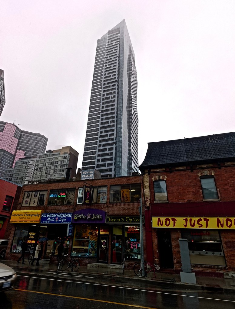
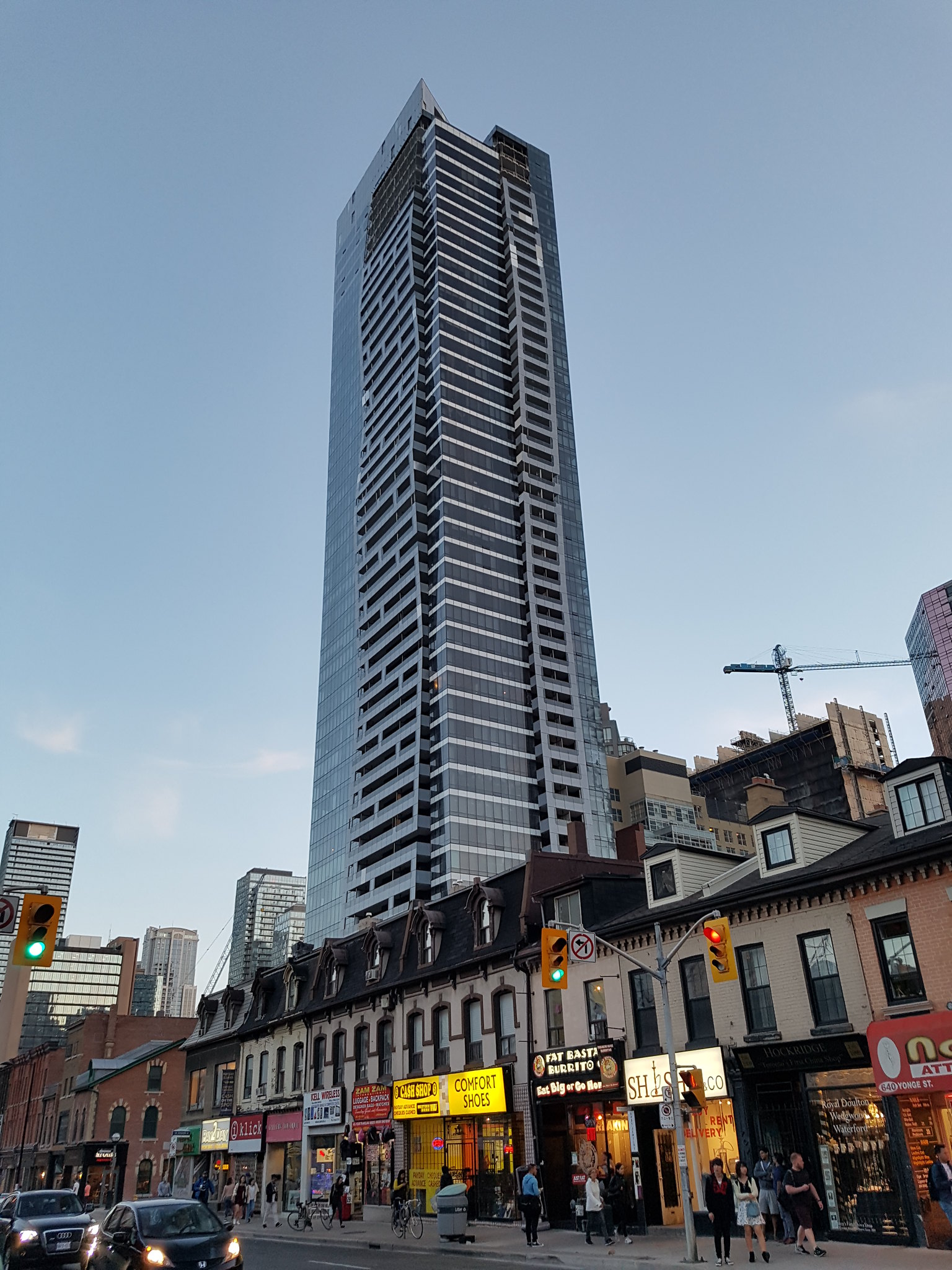
Toronto Five St Joseph | 160.93m | 48s | Five St. Joseph | Hariri Pontarini

From a week ago.

29747165912_ea059d5638_k.jpg


29234327573_dc1b9f9db0_k.jpg
 
In twenty years I suspect this'll look dated...

We all know that styles change and new generations will look back at their parents' and grandparents' "look" as dated. Notwithstanding the quality of Georgian buildings of the 1840's and 1850's, by the high Victorian era of the 1880's and 1890's they were replaced (i.e. the 1845 Bank of British North America by John Howard at Yonge & Wellington gets replaced in 1875 by the current version by Henry Langley). Likewise, Romanesque-Revival later replaced by Art Deco, which in turn gets replaced by International Style Modernism (First Canadian Place). Sic transit gloria!
 
I wish this city had been less efficient at actually replacing some of those buildings, the diversity of styles through the ages makes for a more richly textured and interesting cityscape.

I tend to use the word 'dated' for new architecture that resembles a style from a previous, but also fairly recent, building period- the 80's or 90's for eg. It is disparaging in that it implies a lack of forward thinking or imagination I suppose. I really like the undulating balconies on this building- adds some visual interest to what would otherwise be a run-of-mill glass panel point tower.
 
Why does nearly every Toronto development use that same style of door and handle? They're ugly. At least the doors here are darker than the usual gray.
 
I wish more of one laneways could be lined with shops like this instead of being dark and dingy.
 

Back
Top