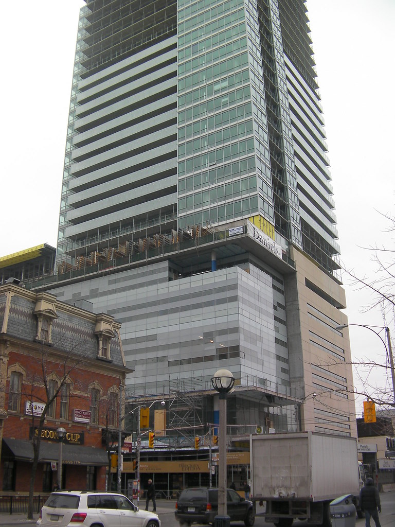
Toronto Festival Tower and tiff Lightbox | 156.96m | 42s | Daniels | KPMB

It's my understanding that Michael Snow was commissioned to complete an artistic light based installation as a component of the 'box' shaped feature at the pinnacle of the tower.

OH DEAR GAWD! I was making a funny!

Caltrane74 is and has been a forumer who has expressed his love of this building over and over. He has taken a billion pictures of this project and posted them each step of the way. He has stated uncatagorically, that he likes the way it looks, the way it meets the street and so on. By saying he designed or ownsTIFF, I was giving him a friendly jab for liking it so much.

Please don't take everything I post at face value. I am just one guy with a silly sense of humour.
 
Take those same "bland" shots against the backdrop of a beautiful, sunny July day and the opposite would be said of them.

That's not to speak of the reflecting sun off of these buildings during sunsets and sunrises. Is that enough colour for you overly-depressed types?

PS:It sounds like it's February in here or something.

But to rely on something as ephemeral as ambient lighting conditions to give your city colour is a cop out and not good design.
 
Take those same "bland" shots against the backdrop of a beautiful, sunny July day and the opposite would be said of them.

That's not to speak of the reflecting sun off of these buildings during sunsets and sunrises. Is that enough colour for you overly-depressed types?

PS:It sounds like it's February in here or something.

The diffused light created by continuous cloud cover brings out the architectural details of buildings, and subtlety - caltrane74's recent photographs of the Lightbox podium take advantage of those conditions. Cloudless blue skies with bright sunlight make it less easy to apprehend surface details, washing them out and creating pools of shadow where detail also disappears. Not just in photographs, but when you're walking about town and looking.
 
Here's caltrane74's image of Lighbox on a classic happy-happy-blue-sky day, with deep shadows and washed out surface details:

sany1604.jpg


... and here's his image of the building in supposedly inferior overcast lighting, where subtle details can be enjoyed:

4343596433_9293048413_b.jpg
 
I agree. Views (shots) such as this make the city very unappealing. Are the words bland and banal too harsh?

I think we're in danger of getting the same sort of bland monotony we got from the concrete monoliths of the 60s and 70s with this current overdose of glassy monoliths.
 
True insofar as details go, but I was just trying to cheer up some of these glum folk. They seemed to be worried about colour. Light brings colour. Well, rather, colour is light, which is where I got my sunny day idea from.
Though, admittedly, I'm a bit of a sun-whore.

PS:Winter's almost over.....oh, and yes, Northern Magus, I agree about the balconies. I quite like them as well.
 
Considering Toronto only gets about 3 days of sunshine a year it's probably not a good idea to rely on it for any aesthetic contribution. Leave this for San Diego or somewhere like that.

... Come to think of it wouldn't one typically find a more vibrant palette of colour used in the design/architecture of northern places, where there is less natural light? I'm thinking of the bright more saturated colours used in Scandinavia, Northern Europe/Holland etc, and of the traditional architecture along the east coast of Canada, St. John's and Lunenburg etc and up to Quebec (the exposed stone there actually being more about contemporary tastes than any actual traditional aesthetc)... all of this vs the ochres, white washes and neutrals of the bright southwest for example?

Toronto can be a pretty bleak place in the winter with leafless trees and grey skies, especially when there is no snow around. The overuse of grey tones and cold glass does seem a little cruel.
 
Last edited:
I think we're in danger of getting the same sort of bland monotony we got from the concrete monoliths of the 60s and 70s with this current overdose of glassy monoliths.

I've thought so too in the past, but I think the glass towers look a bit more sophisticated than the very repetitive brick clad (not concrete) towers that are nearly inescapable in suburban Toronto. There's a bit more variation and often some decent public art contributions.

What I strongly dislike is the monolithic glass tower aesthetic with a big mechanical box on top with generic cladding. The eye is automatically draw to the generic structure.
 
Considering Toronto only gets about 3 days of sunshine a year it's probably not a good idea to rely on it for any aesthetic contribution. Leave this for San Diego or somewhere like that.

Toronto can be a pretty bleak place in the winter with leafless trees and grey skies, especially when there is no snow around. The overuse of grey tones and cold glass does seem a little cruel.

uhh... what? This isn't Vancouver or London. Toronto is generally quite sunny - even in the winter time. In fact I'm looking out my window today and all I see are blue skies and sunshine.

So either today is one of those incredibly rare days, or you just don't know what you're talking about..
 
Yes, I find today to be quite rare honestly, but I'll take some of your happy pills please.
 
^And I'll take some of what you're having. Oh to be delusional for a day! Or how long does that which you ingest last?

3 days of sun? Tofino gets more sun than that.

I wouldn't love Toronto as much as I do if it was that dreary here, that's for sure.
 
[video=youtube;YiUPAJisaNU]http://www.youtube.com/watch?v=YiUPAJisaNU[/video]

Here is a little video of me strolling around the Entertainment District.
I made it more for people not to familiar with Toronto.
But still you get a good look at TIFF from street level as well as Shangri La and Rtiz.
 

Back
Top