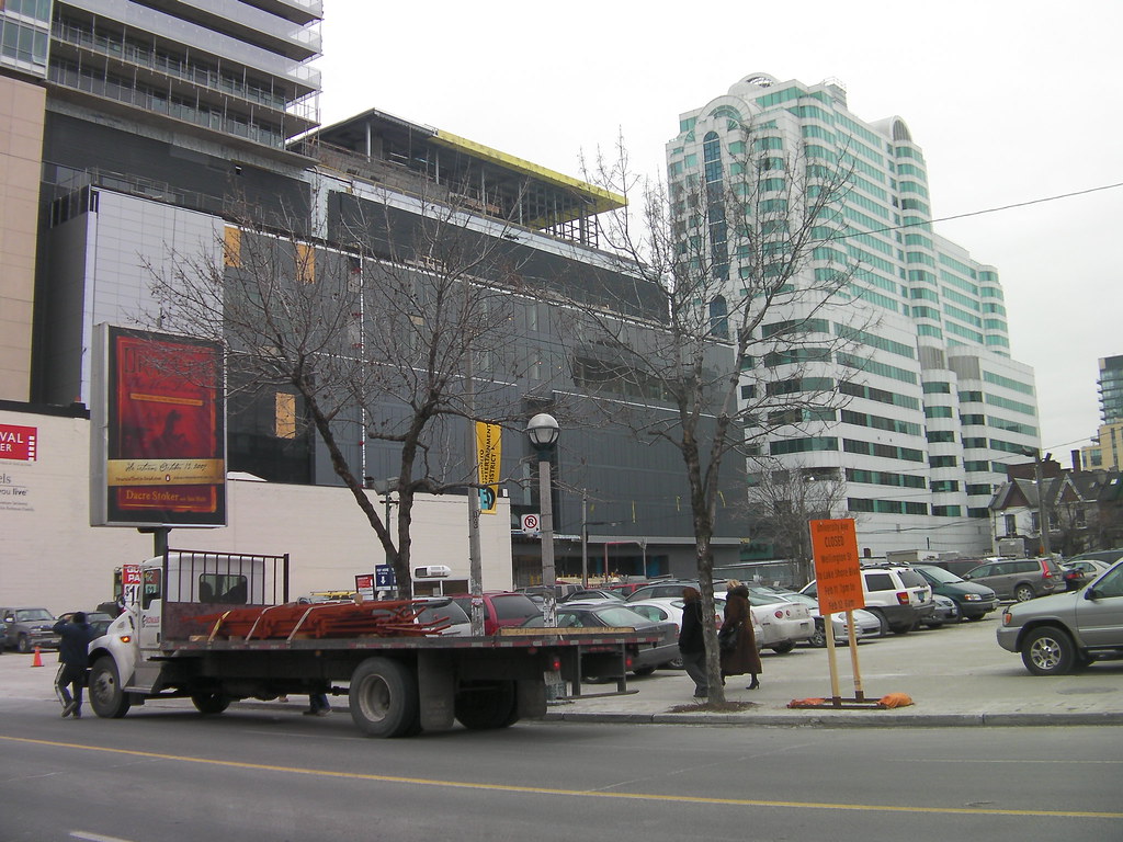
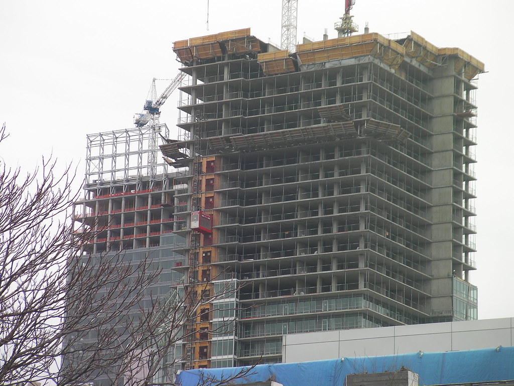
Toronto Festival Tower and tiff Lightbox | 156.96m | 42s | Daniels | KPMB

I agree. Views (shots) such as this make the city very unappealing. Are the words bland and banal too harsh?
 
this is by me

4343591061_26e6d940a8_b.jpg


4343596433_9293048413_b.jpg


4344350838_7413f452b7_b.jpg


4344359640_4997d28aea_b.jpg
 
I agree. Views (shots) such as this make the city very unappealing. Are the words bland and banal too harsh?

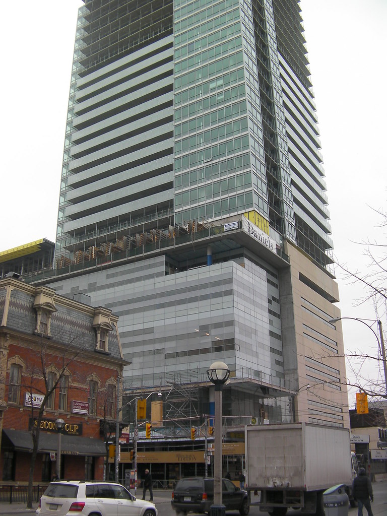
Bland would be appropriate when looking collectively at the a lot of the new buildings, perhaps 'Januaryish', if that makes any sense. Individually, a lot look great, such as Festival Tower, Telus, Ritz, but together it's a giant melting pot. CityPlace is a great example of individual vs. collective.

The Lightbox is looking great and I can't wait to see it finished with a summer sun reflecting off the glass.
 
ok from that angle it looks alot better. Nice pics cal, the second picture really shows how much better the balcony glass is making this buuilding....
 
Nice Job. But, Yikes that mechanical box on top of Festival Tower makes it look awful.

Why can't they just build a fake roof over top of these hideous things? X is completely ruined in my opinion.
 
Nice Job. But, Yikes that mechanical box on top of Festival Tower makes it look awful.

Why can't they just build a fake roof over top of these hideous things? X is completely ruined in my opinion.

I think in this case the "mechanical box" is considered the "roof element". This is, after all, KPMB we're talking about.
 
I'm not a expert on TIFF (For that I think we should consult Caltrane74, I think he designed it or owns it) but I think the roof element will be an LED or light feature of some kind. Another expression of the "Light-box" theme.
 
Mechanical boxes are simply a part of architecture. It would be false and far too classical/formalist to always have to hide it away.

On the other hand, in many cases they can seem inappropriate. I think what they did at 18 Yorkville was an excellent treatment of it, and the "roof feature" is my favourite of any new neo-modernist project in this city.
 
we've all seen the renders a million times. the mechanical box proper seems to be covered in glass and will likely be lit up at night. there is also another glass-clad "box" on the roof that will be an extension of glass column that does not have balconies.
 
Last edited:
I'm not a expert on TIFF (For that I think we should consult Caltrane74, I think he designed it or owns it) but I think the roof element will be an LED or light feature of some kind. Another expression of the "Light-box" theme.

It's my understanding that Michael Snow was commissioned to complete an artistic light based installation as a component of the 'box' shaped feature at the pinnacle of the tower.
 
Take those same "bland" shots against the backdrop of a beautiful, sunny July day and the opposite would be said of them.

That's not to speak of the reflecting sun off of these buildings during sunsets and sunrises. Is that enough colour for you overly-depressed types?

PS:It sounds like it's February in here or something.
 
I think many people were skeptical about the lightbox's association with the tower above. While the tower was being built it appeared at first to be somewhat ordinary and similar to many recent towers around the city, but with the balcony glass, we can see the real connection that will be forming between the podium and tower, the theme being continued quite nicely imo upwards. Now the top is the most interesting part to me with the Michael Snow piece, because it will really make or break the connection between the podium and the tower. The middle of a tower doesn't often attract the eye, at least not mine if it is consistant and uniform all the way up; rather its the base and pinnacle for me that either completes the tower well or detracts from it...at least for me.
 

Back
Top