You are using an out of date browser. It may not display this or other websites correctly.
You should upgrade or use an alternative browser.
You should upgrade or use an alternative browser.
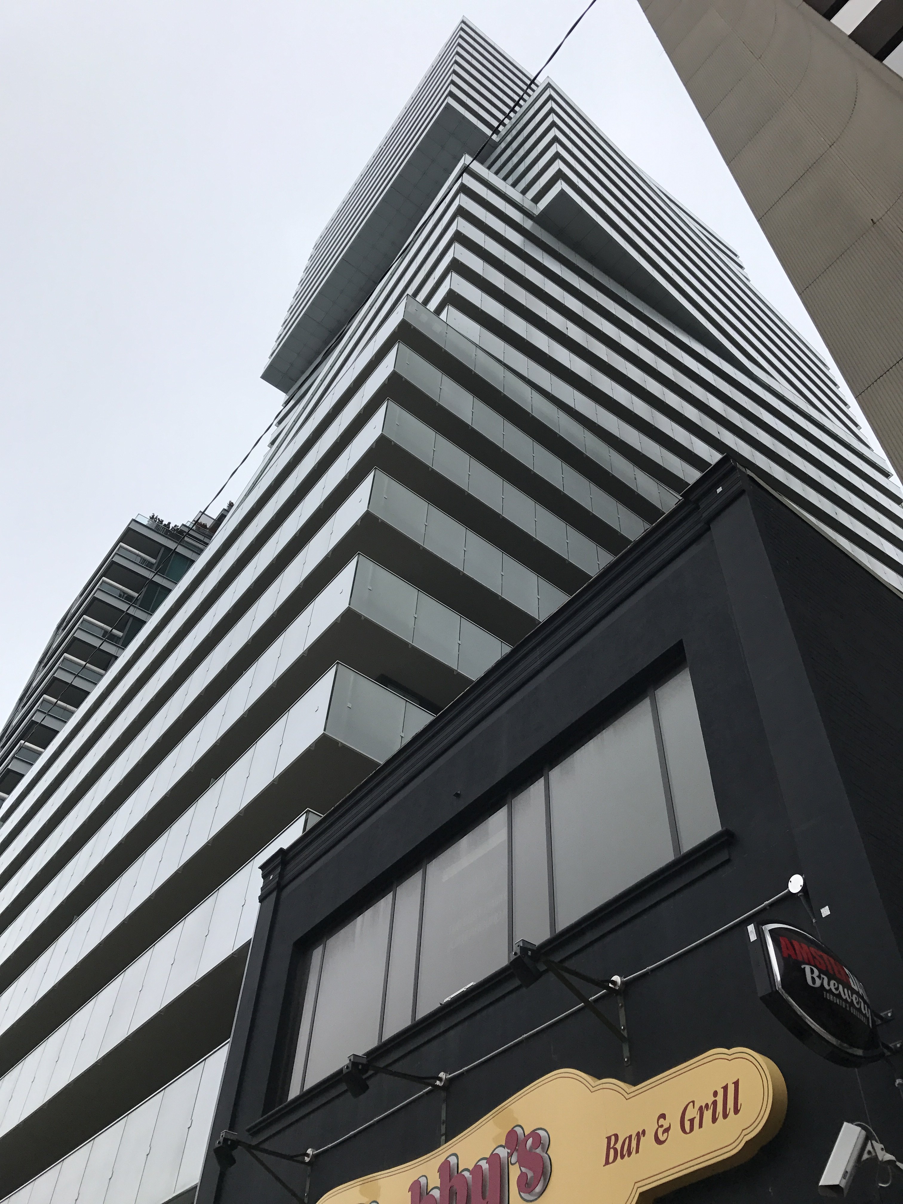
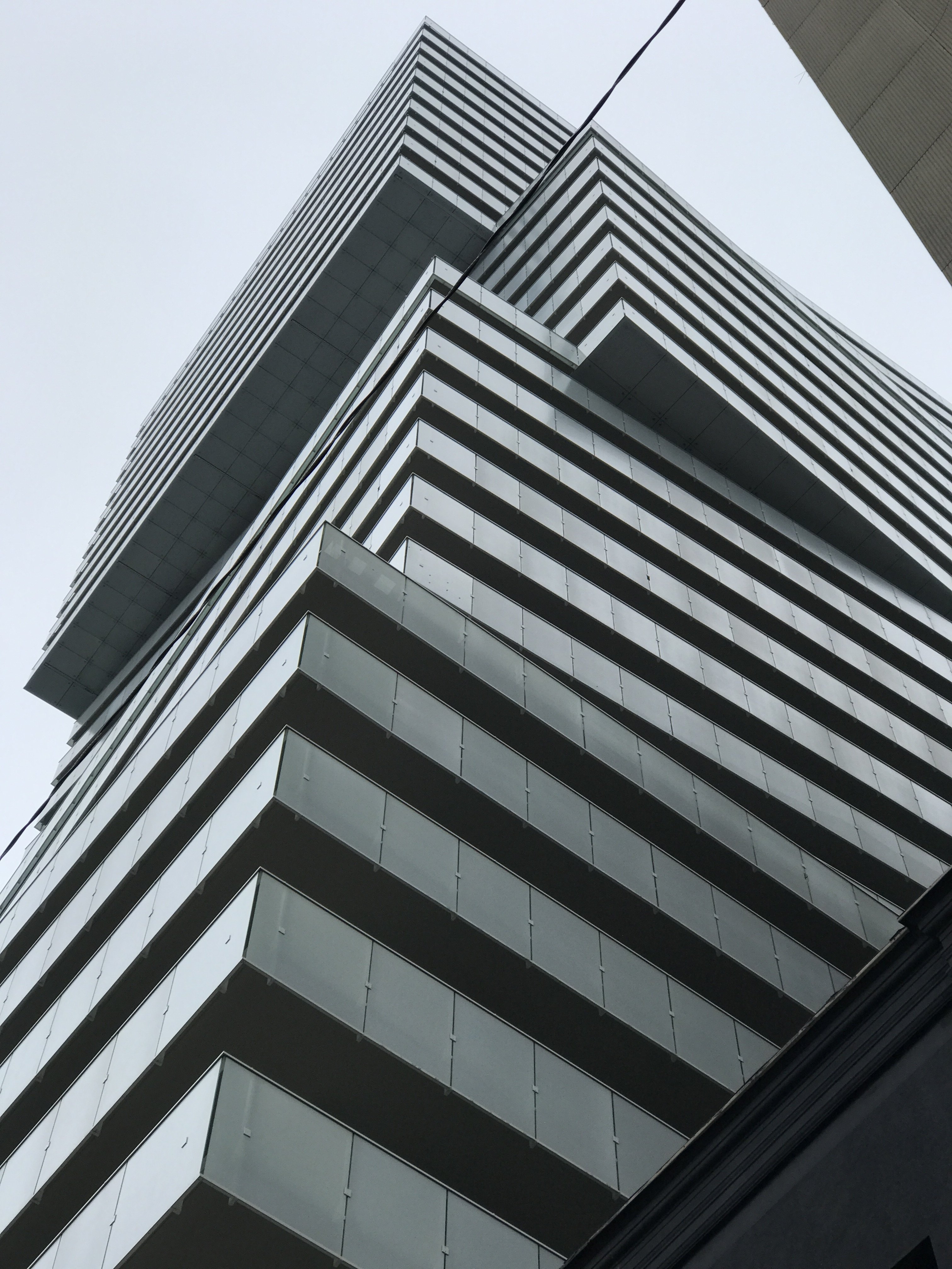
Toronto Exhibit Residences | 99.97m | 32s | Bazis | Rosario Varacalli
- Thread starter AlvinofDiaspar
- Start date
Midtown Urbanist
Superstar
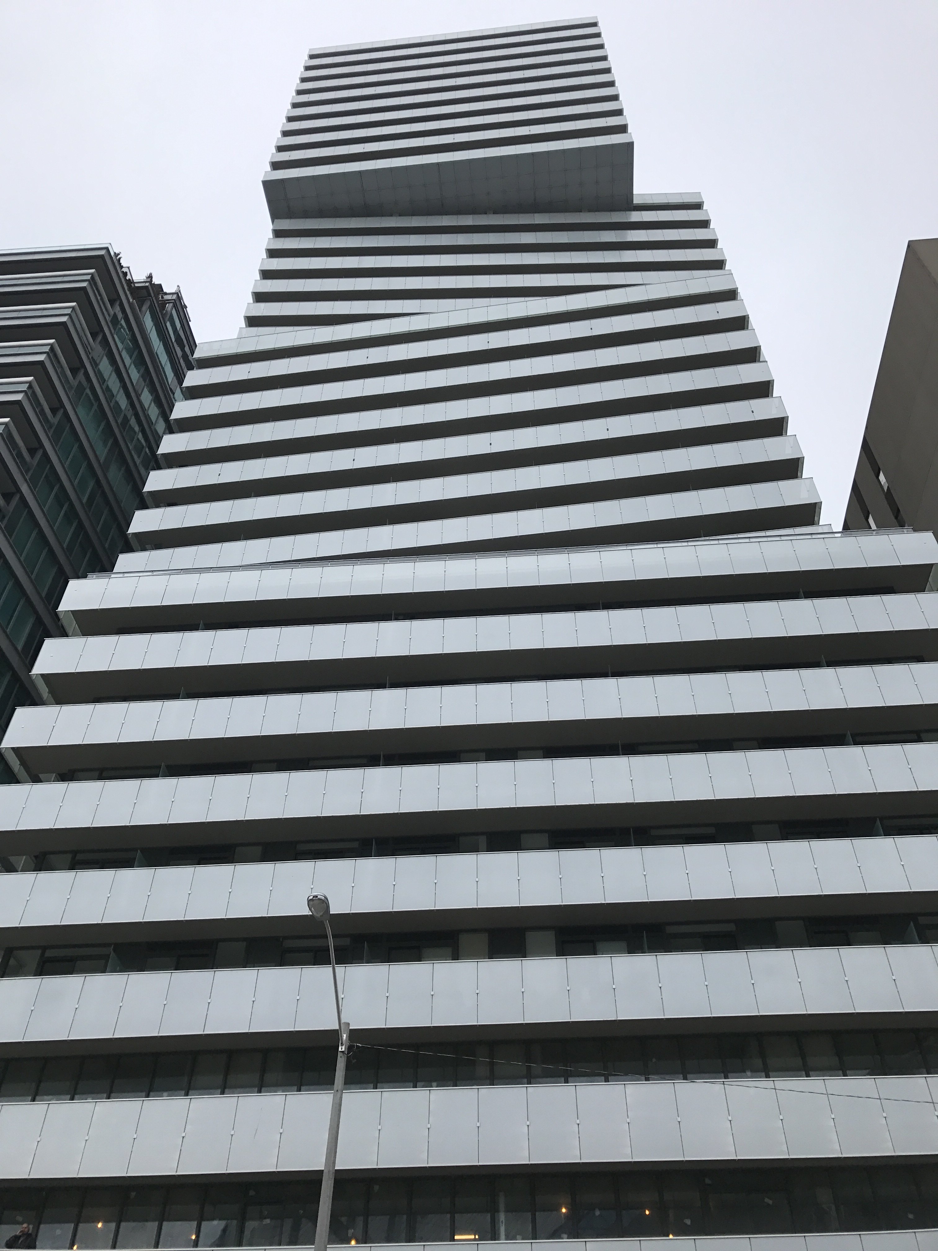
This project is pleasing to the eye. I believe the design will stand the test of time.
Also, I have never seen Casa Loma from that kind of angle before, pretty neat.
Also, I have never seen Casa Loma from that kind of angle before, pretty neat.
Benito
Senior Member
ADRM
Senior Member
Benito
Senior Member
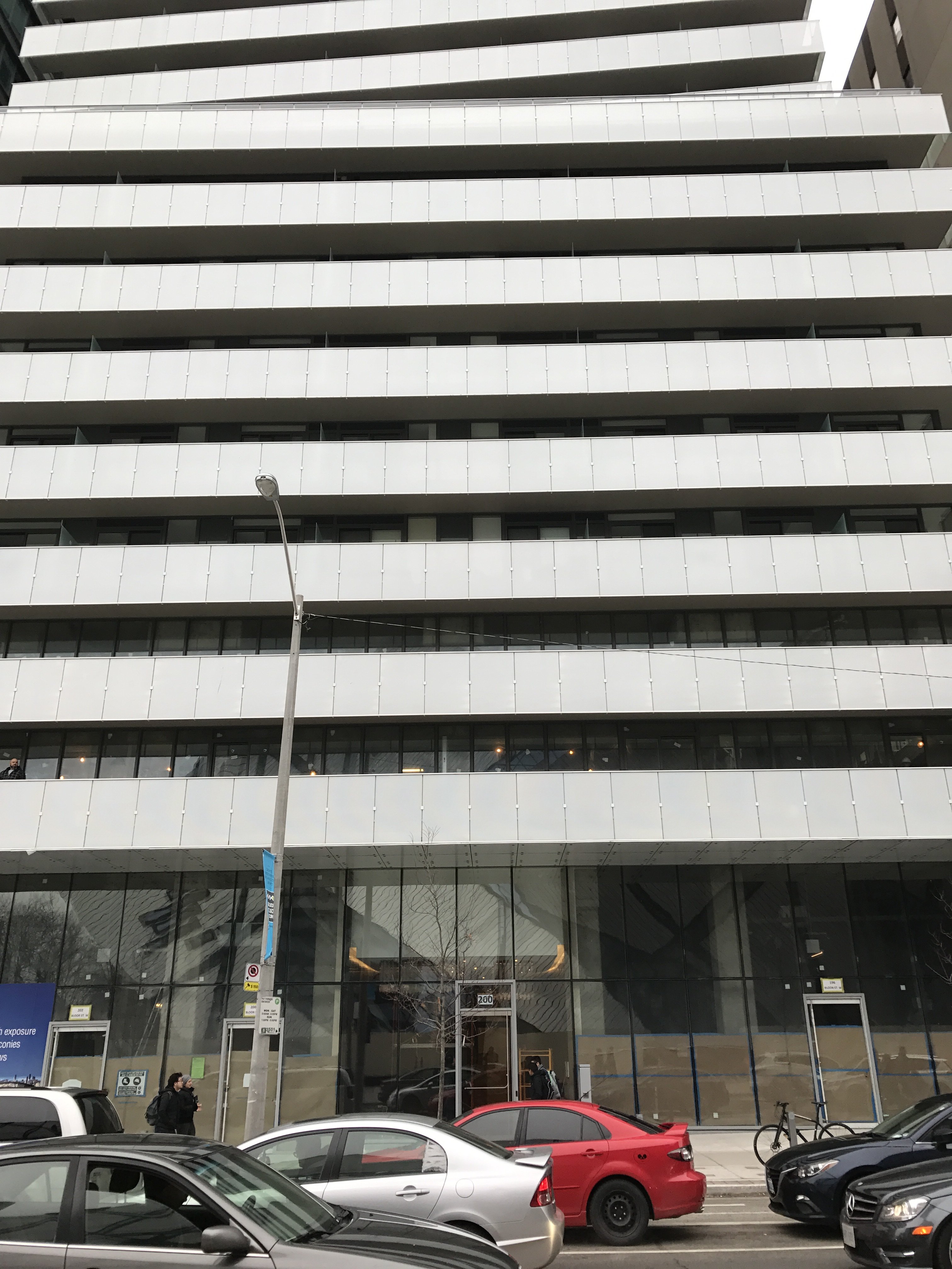
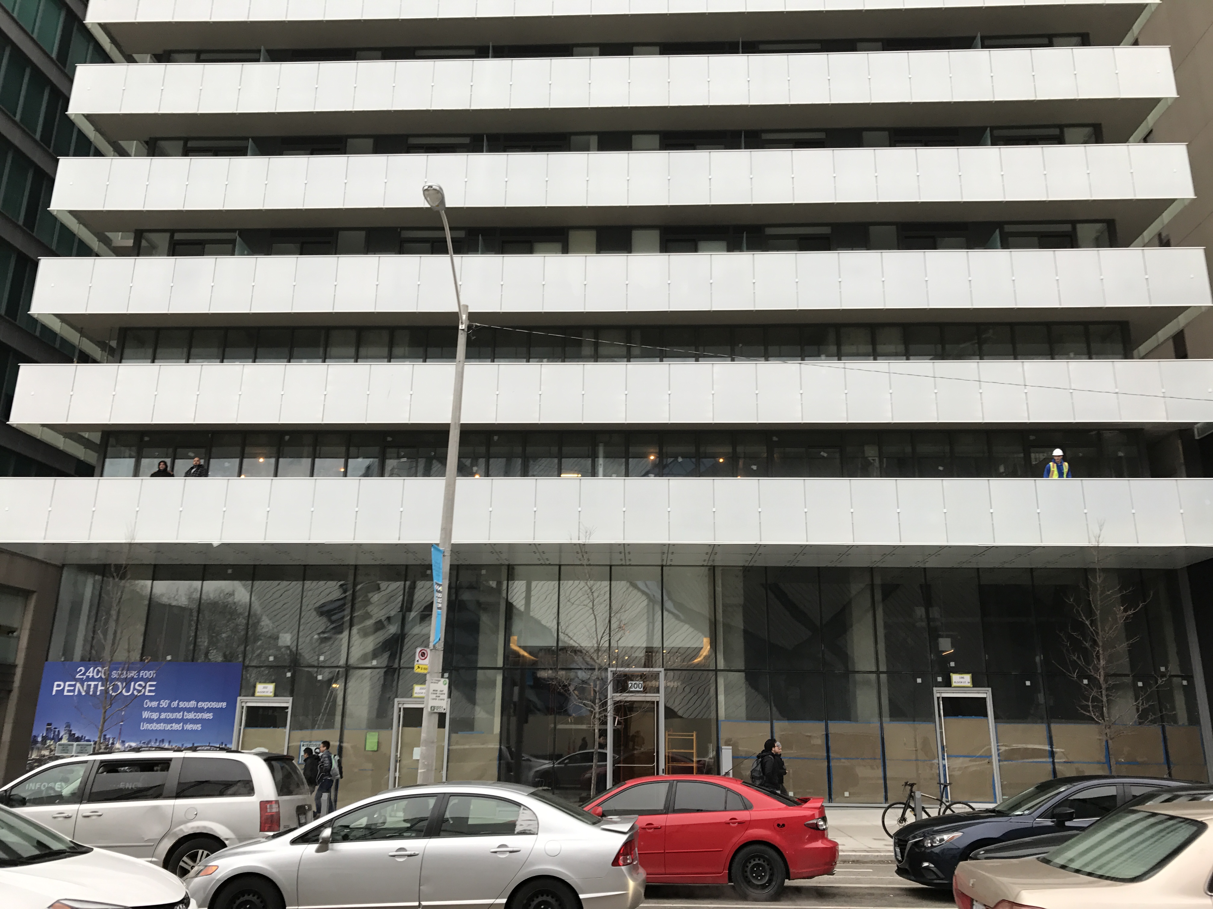
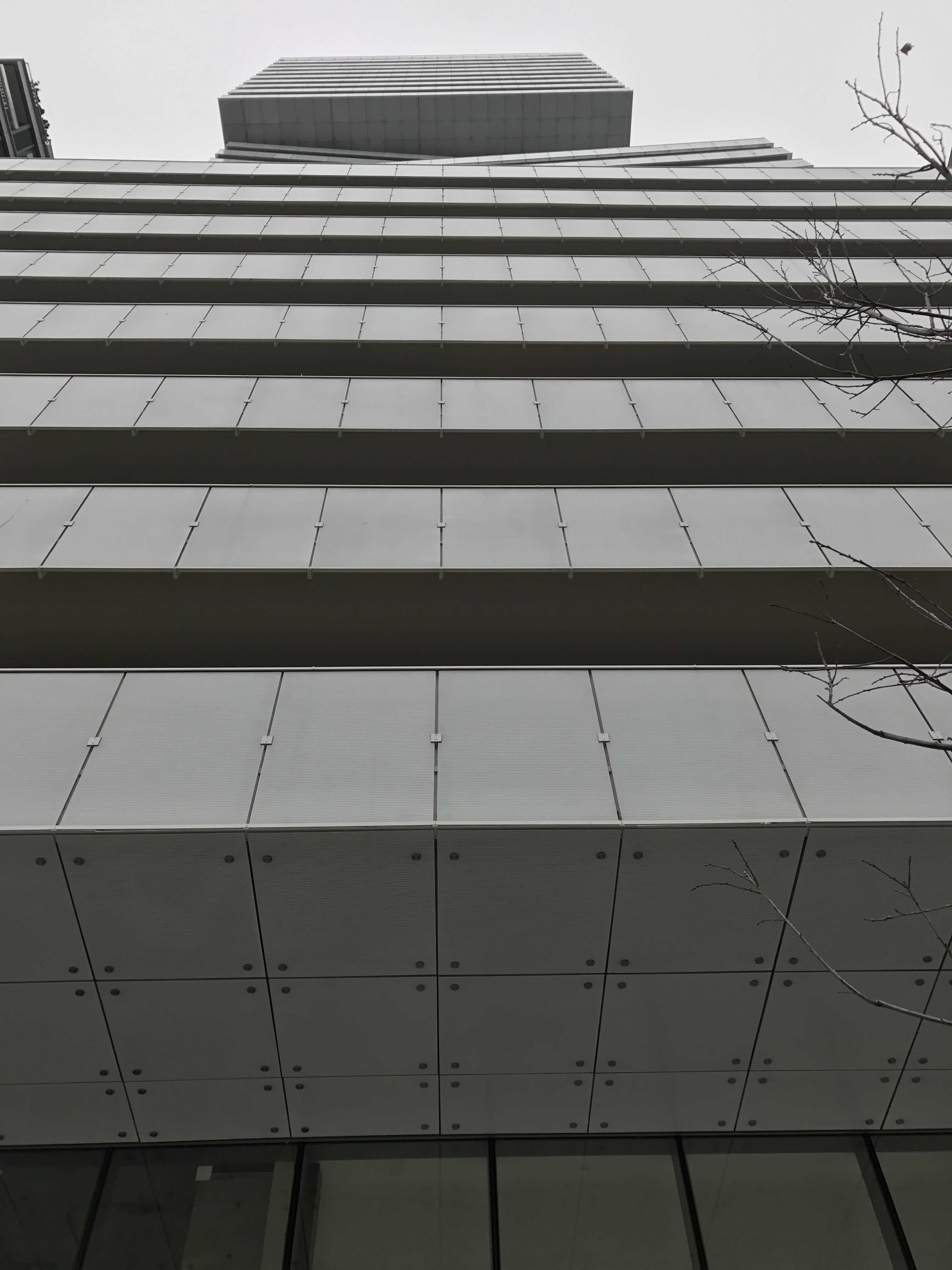
Today.
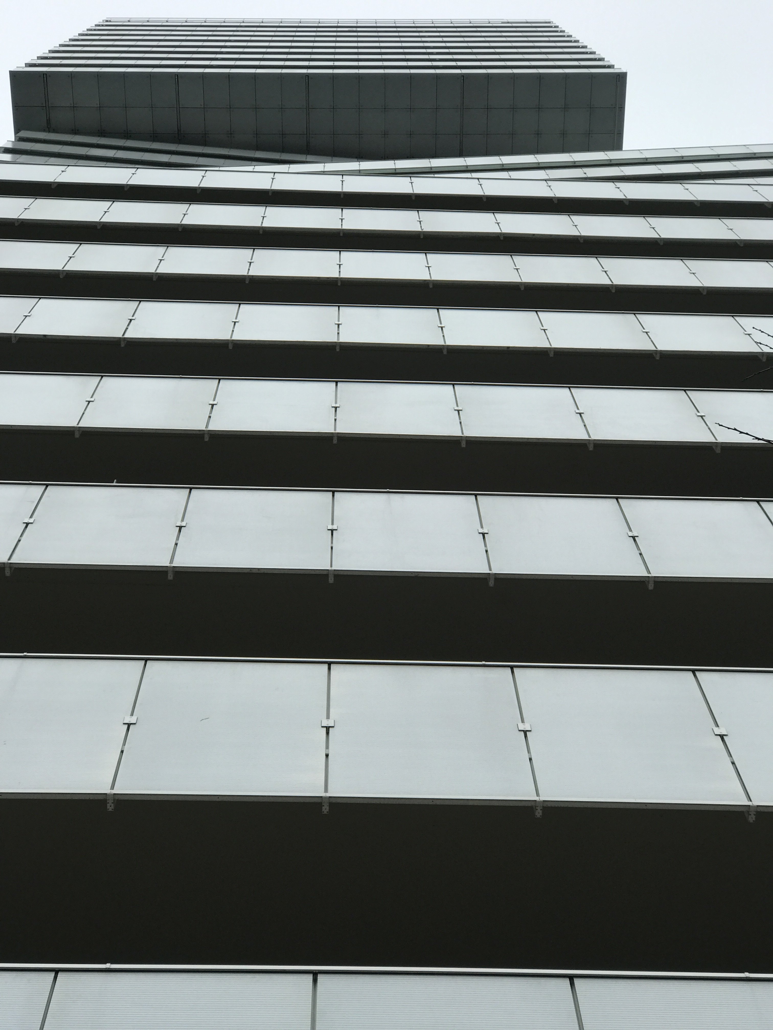
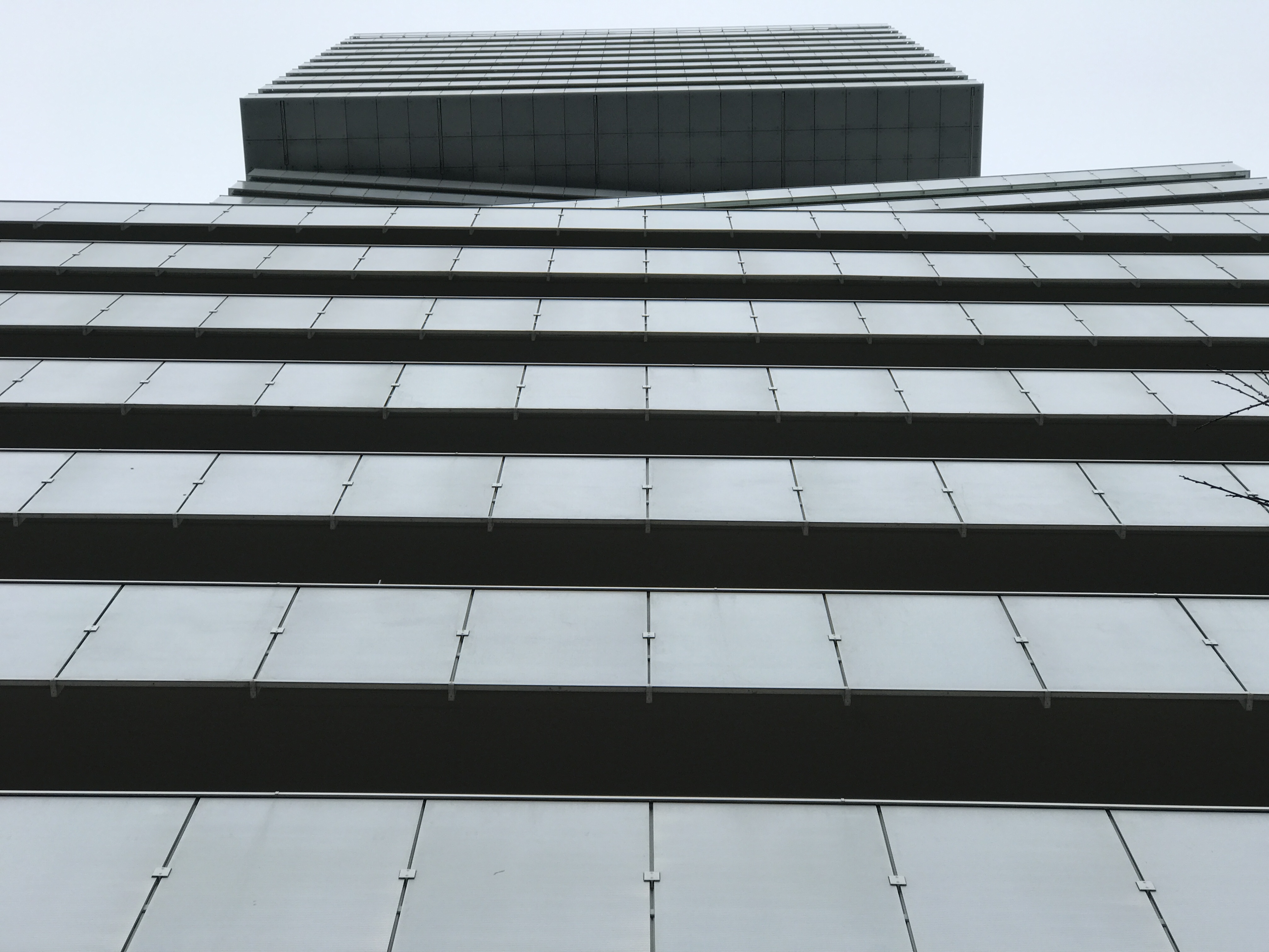
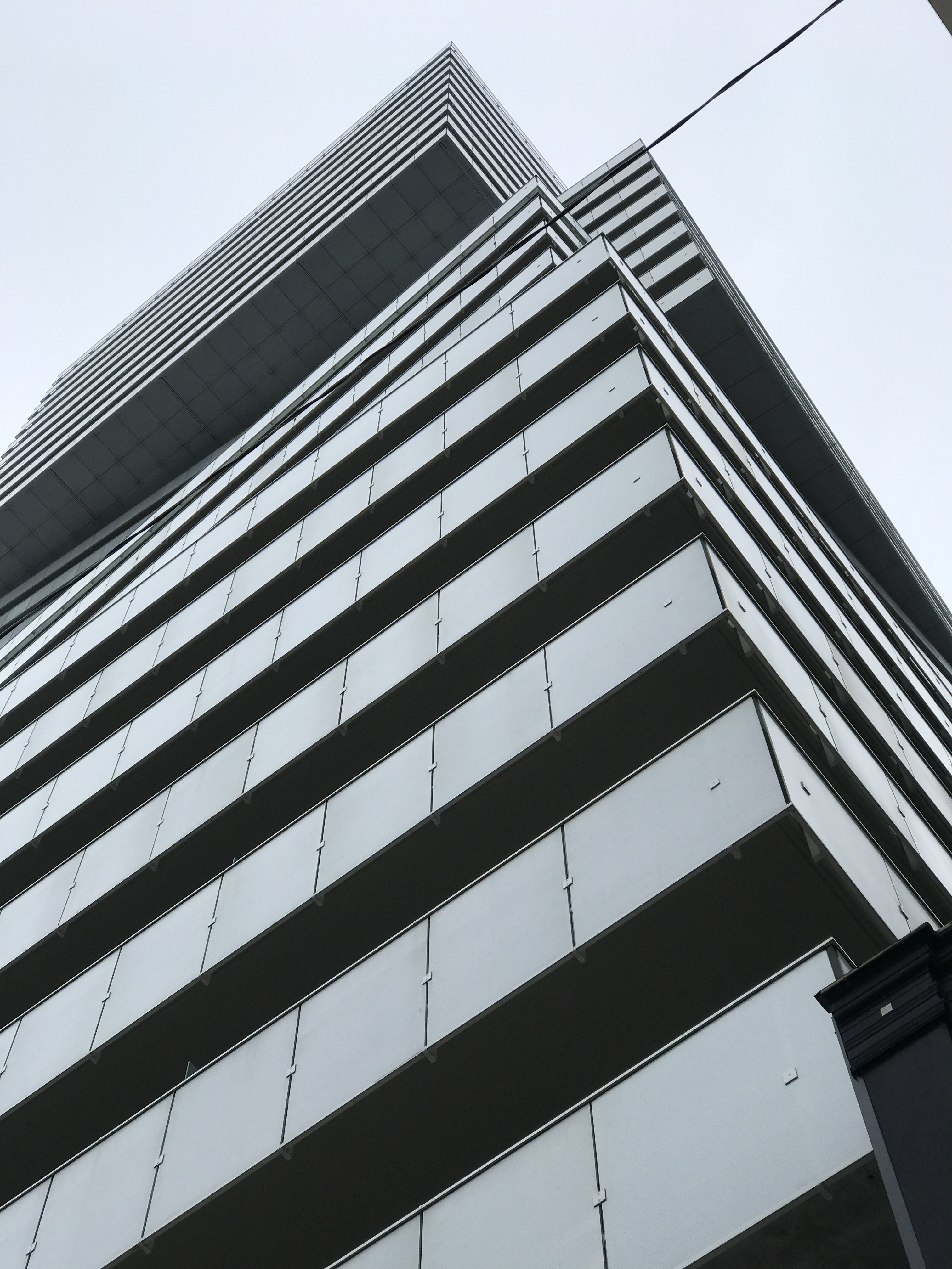
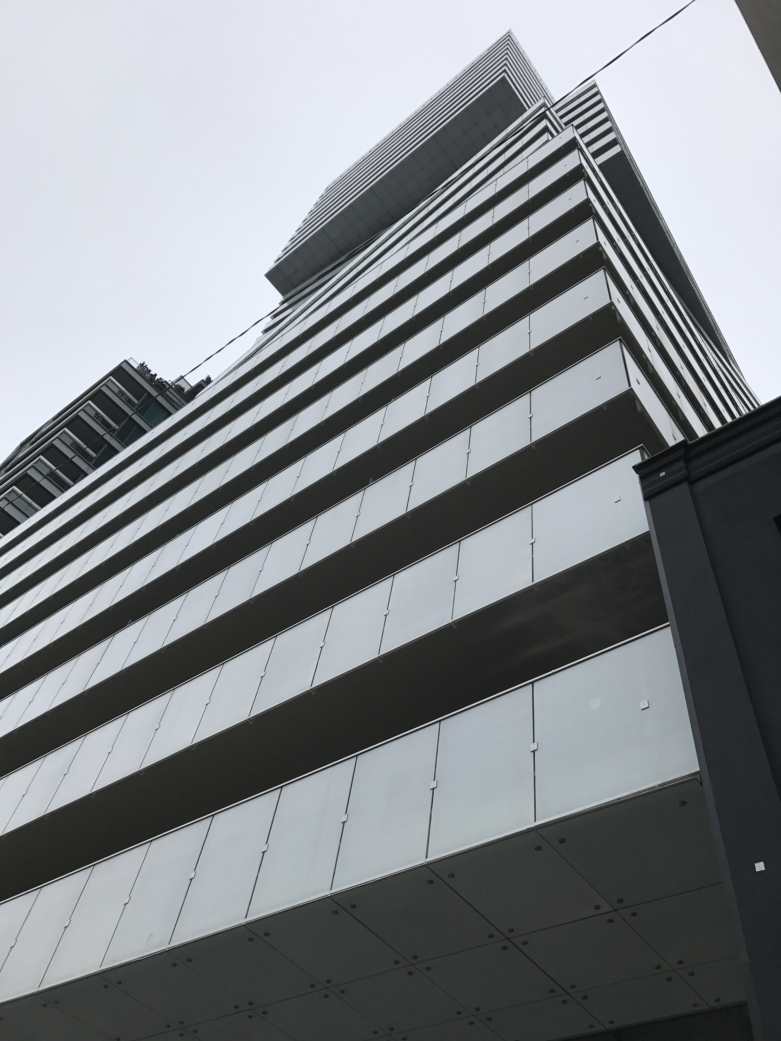
Attachments
-
 IMG_0575.JPG1.3 MB · Views: 458
 -
 IMG_0576.JPG1.4 MB · Views: 499
 -
 IMG_0577.JPG1.8 MB · Views: 450
 -
 IMG_0578.JPG1.2 MB · Views: 522
 -
 IMG_0579.JPG1.3 MB · Views: 452
 -
 IMG_0580.JPG1.6 MB · Views: 525
 -
 IMG_0581.JPG1.5 MB · Views: 436
 -
 IMG_0582.JPG1.4 MB · Views: 473
 -
 IMG_0583.JPG1.6 MB · Views: 444
 -
 IMG_0584.JPG1.5 MB · Views: 484
People moving in yet?
Benito
Senior Member
I would say yes Edward, there were people in the lobby so I would assume there have been move ins already.
NBGtect
Active Member
ADRM
Senior Member
Dr. Snoot
Active Member
This is a very well done building. My only wish is that they'd done anything but clad this in a flat grey colour. Imagine if there were even slight variations for the boxes that protrude or recede to emphasize the shifts. Even darker greys and lighter greys would have been better.


