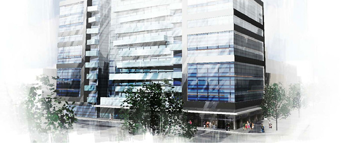
Toronto Dragon Condos | 37.49m | 10s | Ideal Developments | IBI Group

Love the red accents. It would look amazing without all that spandrel.

Also, I'm pretty sure that those two render people are right in the middle of traffic.
 
Beautiful, looks like a Chinese screen. Two new projects on the west side of Spadina and a number of conversions on the east side and it looks like the part of Chinatown on Spadina between Dundas and Queen is slowly disappearing. Another 10 years it could be totally gone.
 
It looks fine form the 2nd floor up. I like the C shape of the building.

However, that ground floor looks like it will deaden the street. It looks like one massive lobby. I thought new planning guidelines required two story ground levels now? There is an opportunity to shift a bit of the retail down the street towards Alexandra Park too, and this development could mimic the large windows facing onto Williston like Gold Stone Noodle does on the southside. Williston will meet up with the new Grange Court street once Alex Park begins its revitalization, so there will be foot, bike and auto traffic along here.
 
Application: Building Additions/Alterations Status: Not Started

Location: 270 SPADINA AVE
TORONTO ON M5T 2E5

Ward 20: Trinity-Spadina

Application#: 12 226849 BLD 00 BA Accepted Date: Aug 9, 2012

Project: Multiple Use/Non Residential Interior Alterations

Description: Interior alterations to 2nd floor commercial space to convert to condo sales centre.
 
Beautiful, looks like a Chinese screen. Two new projects on the west side of Spadina and a number of conversions on the east side and it looks like the part of Chinatown on Spadina between Dundas and Queen is slowly disappearing. Another 10 years it could be totally gone.

I thought Spadina between Dundas and College is real chinatown?
It is nice to see the part south of Dundas experience some dramatic transformation.
 
dragons11.jpg
 
This project has been quietly marketed a year ago by agents up in Richmond Hill and Markham. They were using Metaform's initial renderings at the time which looked absolutely dreadful.
The building as you see it now is designed by Young & Wright/IBI Group, which is a huge improvement but still is lacking substance (floorplans are on the condo website).

I don't see the appeal of living next to the Dragon Centre on an extremely busy and rather dirty intersection.

This will probably end up being a rental building will all of the investors buying into it. Most of the units are under 600 sq.ft. and all units come with a "limited edition" bicycle with a bicycle storage spot and free condo maintenance for a year.
 
When I saw this I was hoping that this meant the end of the Dragon Centre... the place is a nightmare... disgustingly dirty. But alas...

I agree I don't see the appeal of living in this area, specifically this location.
 

Back
Top