Toronto CrystalBlu Condos | ?m | 36s | Bazis | Burka

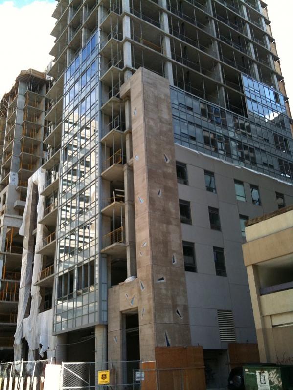
Well, at least on clear, sunny days, the blue sky reflects really well. Hava look at these....much prettier than on grey, dull days. I think it's still too early to tell, but I have a feeling once the windows are installed on higher, sunlit floors, the building will look better.
photo-6.jpg


photo-7.jpg


photo-8.jpg
 

Attachments

  • photo-6.jpg
    photo-6.jpg
    77.4 KB · Views: 280
  • photo-7.jpg
    photo-7.jpg
    64.7 KB · Views: 280
  • photo-8.jpg
    photo-8.jpg
    85.2 KB · Views: 286
Last edited:
But why do they have to be so blatantly misleading? I could see something like this happening once in a while, a change of plans but this happens with almost every condo. Is it too much to ask for a bit of honesty. It's pretty sad when you have to assume that everything you hear is just lies. Why can't a damned developer build what was promised?

We are just getting so over loaded with grey buildings and it's depressing. I need some colour. In 30 years people will look back and ask why Toronto was so obsessed with the colour grey. (what the hell were they thinking? Winter is grey enough!)

I agree. This isn't a game console, flat panel TV or furniture purchase, it's a home - probably the biggest investment the average person/couple will make in their lives. It's shameful that so many developers release models, renderings and misleading printed language which, even though released early in the development and design stage could surely be more accurate.

Back when I was in the market in the 90's & early 2000's the models and renderings turned out to be pretty much dead on - Opera Place Phase 1, The Alexus & Radio City. I still have the original sales materials to prove it. Even the lobby renderings were accurate right down to the art which would eventually hang in the lobby.
 
Last edited:
Sky blue? Are they joking? Look at the sky when it is clear. Now look at the cladding on CB. Are they anything alike? With renderings you can imagine the artist will go for a bit of colour saturation, but the way they worded that copy is blatantly false.
 
I agree. This isn't a game console, flat panel TV or furniture purchase, it's a home - probably the biggest investment the average person/couple will make in their lives. It's shameful that so many developers release models, renderings and misleading printed language which, even though released early in the development and design stage could surely be more accurate.

Back when I was in the market in the 90's & early 2000's the models and renderings turned out to be pretty much dead on - Opera Place Phase 1, The Alexus & Radio City. I still have the original sales materials to prove it. Even the lobby renderings were accurate right down to the art which would eventually hang in the lobby.


After seeing a significant number of model suites, I realized that alot of them fibbed with the dimensions actually used vs. the ones on the floorplan.

They conveniently add on 6 inches or so, which makes a significant difference in these small units.
 
Oct. 13th Update

Blu from above

Click on the thumbnail to enlarge, then click again on the image for full size.

 
amazing density shot there! look out Manhattan, here comes Toronto!

well.... no where near NY or Chicago so far... We don't have many street canyons lined with skyscrapers row by row.... We have alot of really bad street walls such as Yonge Street near gerard, etc.. but MAYBE one day we'll get there (but by then the other cities would have advanced further of course :( )

IMO-
 
but MAYBE one day we'll get there (but by then the other cities would have advanced further of course :( )

I'm not sure that Chicago will be able to keep pace with Toronto since they have a declining population but who knows? Maybe something will change there to make it start going up again.

but back to the topic at hand.. this building.. in photos the windows dont seem to look as bad as I expected. I will have to go look in person to see what I think though since pictures sometimes look better or worse than being there to see.
 
Oct. 15th

Blu from the Yonge & Bloor area and from Yonge Street south of Wellesley

Click on the thumbnail to enlarge, then click again on the image for full size.

 
I think the glass looks much better in person.... higher quality looking.

It depends on whether it's a sunny day or an overcast day like today. Also, as the precast is added to Uptown the blue in Blu becomes more apparent with the contrast in materials side by side.
 
I was going to say the same thing. I walked by it today for the first time in a few weeks and really noticed the blue when the building was in my field of vision at the same time as Uptown. I think the effect will become even more apparent as both towers fill in. They may have been wise to go with a really subtle blue like that, because if it were more prominent it would actually look garish beside Uptown.
 
Yes...

Walking by the tower during the day the glass looks very glossy and seems vibrant despite the colour being grey.
 

Back
Top