I have been always been critical of Metrolinx’s wayfinding approach. That said, at some point:
- You kill the entire idea
- OR, you fully commit to it and roll it out over the region and all transit services
As conceived, the Kill option is the correct one. I would legislate the bill to be split 10% to Phil Verster, 20% to the Mx Board, and 70% to the consultants who proposed the idea. The gov't will pick up the balance, replacing every single pillar with standard TTC signage.
***
I note your like of the pillars; I have no problem w/them in principle, the problem I have w/them, if you look at them, is that the icons/logos/detailed info on them is so small as to be unreadable/recognizable at any distance.
The pillars are really designed to be seen at a distance, but in that context, you want a logo that is universal, easy to understand, and one you can clearly identify a block away. The TTC's existing subway signage better serves this purpose, and could simply get a height lift if desired.
Once you're at the station, you might benefit from more detailed information (Line numbers, station name, area map, retail services inside), but none of that fits sensibly onto a pillar/pylon and would be better displayed in another form.
***
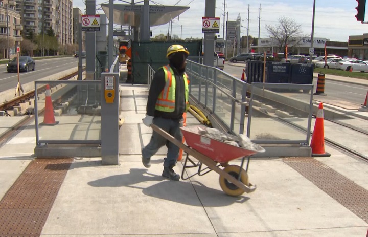
Line 5 has the added complication of the large surface sections and the underground; and importantly, the surface sections in the east end which will get minimal, if any transit priority. I'm not a champion of underground everywhere, but aside from mismatching the enormous density now proposed at the Golden Mile; the inconsistency in line format means the east end really is not rapid transit, merely intermediate capacity transit; and I would argue the two distinct sections of line really ought not to be identified in the same fashion in that context. Line 2 is both surface and underground, but it is always grade-separated (no traffic lights/intersections shared with auto traffic). So many bad decisions here.


