News   Jul 12, 2024
 1.3K     0 
News   Jul 12, 2024
 1K     1 
News   Jul 12, 2024
 383     0 

Toronto Crosstown LRT | ?m | ?s | Metrolinx | Arcadis

I never claimed that the CTA issued the map. Which agency made it isn't the point; the point is it's an official map and that Toronto has no rapid transit map that actually shows all the rapid transit in Toronto.
So you’re saying the Province/Metrolinx should create an official rapid transit map for Toronto?
 
I hope you don't mind me asking, but are you Chinese? (I was born in Hong Kong) Because that voice...

I hear a bunch of asian people working at tim hortons from time to time with this kind of voice. Its like a Chinese castrato or something. I've always been very curious about it, because they sound genetically like they have very low levels of testosterone. I've always wondered if there is some kind of genetic variation in their genes.
 
I hear a bunch of asian people working at tim hortons from time to time with this kind of voice. Its like a Chinese castrato or something. I've always been very curious about it, because they sound genetically like they have very low levels of testosterone. I've always wondered if there is some kind of genetic variation in their genes.

I asked because I probably sound like that (well, not exactly, but...). My sister says it's strange how I still speak with a Chinese accent, despite the fact that I came here when I was five and have basically no Chinese friends (although I speak Cantonese at home).
 
No excuse. The TTC and GO are both big parts of Toronto's transit system, and GO will only become more important as RER gets built out. It makes no sense for the TTC to continue to pretend that they don't exist. Not even the Pearson Express is on the subway map and it's practically an express metro through the west end. People riding rapid transit shouldn't have to worry about which agency owns which lines.
The TTC doesn't show Go transit on the subway maps on the trains because they want to keep it simple for people to be able to understand, the same reason why they don't list all of the coating bus numbers either. If they did have all that it would be hard to read and very busy with extra lines and numbers. The new posters they put up in the trains with the streetcar routes are similar to the ones they put above the doors of the new ones that show how the streetcar network connects to the subway network.

In any case, you've just identified a big part of the problem with transit in Toronto. GO and the TTC should be a single entity, or at least under the same umbrella. The current structure just doesn't work.

Go isn't a big factor inside of the city of Toronto as mainly the only lines that see major use are the lakeshore and UPX. The Lakeshore line only runs trains about every 30 minutes or so and you have to time being at the station when the train will arive. As opposed to the subway that runs way more frequently anywhere between 6 and 2 minutes between trains plus all buses and streetcars feed into the subway network and not the go network.
 
So TTC riders are less capable than other cities?

There's a general movement toward very simple linear moving maps on LCD and they typically show much less information than the TTC currently has in their over-the-door maps.

Yes, a more detailed version might be tucked away on a wall but those are pretty damn hard to read when most riders are using the system (rush). Cities are increasingly forwarding you to their website for additional information and route planning.
 
Last edited:
You shouldn't have to go to a website to find a map that tells you at a glance where you need to go. Even more so, you shouldn't have to find multiple maps on multiple websites from multiple agencies and then try to piece your trip together. Trip planners are a great tool, but the official rapid transit map is still the primary way that people navigate rapid transit systems.

It's unrealistic that a city the size of Toronto should be able to fit its entire rapid transit system in a map over the door. That's old fashioned thinking and something that most cities don't do. Instead they put them on the walls of the train, in stations, printed on paper, or on phone apps.

The TTC doesn't show Go transit on the subway maps on the trains because they want to keep it simple for people to be able to understand, the same reason why they don't list all of the coating bus numbers either. If they did have all that it would be hard to read and very busy with extra lines and numbers. The new posters they put up in the trains with the streetcar routes are similar to the ones they put above the doors of the new ones that show how the streetcar network connects to the subway network.
The people of Montreal, Chicago, Boston, and Philadelphia all use maps that show the regional lines. Even the New York subway map shows them. I'm sure the good people of Toronto will be able to figure it out.

Go isn't a big factor inside of the city of Toronto as mainly the only lines that see major use are the lakeshore and UPX. The Lakeshore line only runs trains about every 30 minutes or so and you have to time being at the station when the train will arive. As opposed to the subway that runs way more frequently anywhere between 6 and 2 minutes between trains plus all buses and streetcars feed into the subway network and not the go network.
This is becoming less true with every passing year. UPX and Lakeshore both run every ~15 minutes and multiple other lines will follow, with frequencies rivalling the subway where lines converge. Fares will be integrated in some form. GO is going to continue becoming more relevant to the city of Toronto in the future, and will probably be almost as relevant as the subway itself. Definitely more so than the streetcar network.

Besides, it's not like you couldn't make the same argument for the regional systems in the other cities I just mentioned, but they all put them on their maps anyway. Because real transit doesn't operate in silos.
 
I hear a bunch of asian people working at tim hortons from time to time with this kind of voice. Its like a Chinese castrato or something. I've always been very curious about it, because they sound genetically like they have very low levels of testosterone. I've always wondered if there is some kind of genetic variation in their genes.
Are you for real? Maybe you should also start a thread comparing skull measurements between races.
 
It's unrealistic that a city the size of Toronto should be able to fit its entire rapid transit system in a map over the door. That's old fashioned thinking and something that most cities don't do. Instead they put them on the walls of the train, in stations, printed on paper, or on phone apps.
This is becoming less true with every passing year. UPX and Lakeshore both run every ~15 minutes and multiple other lines will follow, with frequencies rivalling the subway where lines converge. Fares will be integrated in some form. GO is going to continue becoming more relevant to the city of Toronto in the future, and will probably be almost as relevant as the subway itself. Definitely more so than the streetcar network.

Besides, it's not like you couldn't make the same argument for the regional systems in the other cities I just mentioned, but they all put them on their maps anyway. Because real transit doesn't operate in silos.
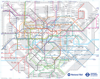
In fact, some cities like London UK, with massive intricate systems, publish both discrete and complete maps. I was just studying one last night and thought to download it for this discussion:

You can find on this page the map of London suburban train, the map of London overground, the map of London DLR, the map of London Crossrail, the map of the South West Trains, the map of the First Capital Connect, the map of the Southern Railway, the map of the C2C, the map of the First Great Western, the map of the Chiltern Railways, the map of the Abellio Greater Anglia, the map of the Southeastern Railway and the map of the Heathrow Connect. These 12 urban, suburban and communter train networks are a transit system serving the city of London (United Kingdom) with the tube, the tram, the bus, the nigth bus or the river bus. These 12 commuter train networks have 52 lines and 1,325 stations forming a rail network of 2,671 miles (4,300 km).

London Rail Map
178187


Map of London train, urban, commuter & suburban railway network
London rail map
PrintDownload PDF


The London urban, suburban and communter trains network is gathering several train networks.

Its network includes the following 12 networks:

• London Overground
• Docklands Light Railway (DLR)
• Crossrail
• South West Trains
• First Capital Connect
• Southern Railway
• C2C
• First Great Western
• Chiltern Railways
• Abellio Greater Anglia
• Southeastern Railway
• Heathrow Connect
https://londonmap360.com/london-train-map

If London can do it with a system approx ten times the size of Toronto's, then why can't Toronto? Eh?
 
In fact, some cities like London UK, with massive intricate systems, publish both discrete and complete maps. I was just studying one last night and thought to download it for this discussion:


https://londonmap360.com/london-train-map

If London can do it with a system approx ten times the size of Toronto's, then why can't Toronto? Eh?

It would actually be quite useful if there was one map for GO and TTC.
 

Back
Top