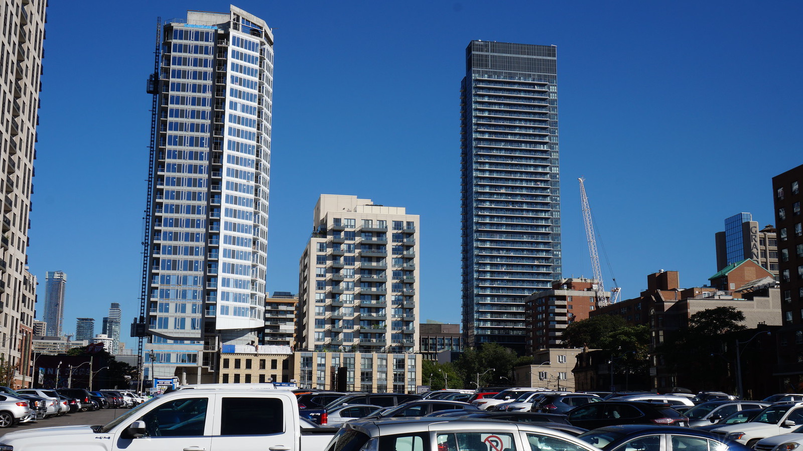
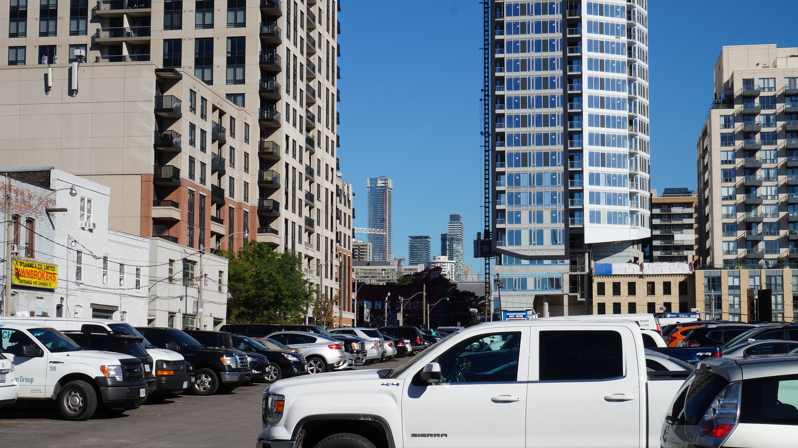
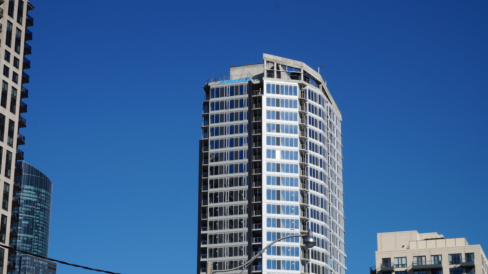
Toronto Core Condos | 84.12m | 24s | CentreCourt | P + S / IBI

The idea of two different volumes (dark and light) wrapping around a core could have been really interesting and more successful with punched-out windows; something with exterior fenestration like 60 Richmond E. Unfortunately, we got a ton of window wall and spandrel once again.

There are projects where extensive curtainwall glazing (or in reality, window wall) really fits the parti/central concept of the design. But there are times when the building begs for something different, and I think this is one of those cases.
 
Yeah, it's not great. There's no doubt. But have you guys had a chance to see it in person? I think that the attempt at a more unique design forgives it a bit, as it does pop out and catch your eye, and at least creates a moment of visual interest.
 
I walk by it regularly.
Sadly I do not think it's better in person. Maybe it will turn around I just hate that warm grey spandrel. Combined with cool grey spandrel. Like why not black and white?

The angular form does work in its favour and I appreciate that.
 
I like it perhaps because it is quite different from pretty much everything we are getting these days.

IMG_1826.JPG
 

Attachments

  • IMG_1826.JPG
    IMG_1826.JPG
    298.9 KB · Views: 2,021
November 16:

IMG_8627.jpg
IMG_8636.jpg
IMG_8637.jpg
IMG_8640.jpg
IMG_8645.jpg
 

Attachments

  • IMG_8627.jpg
    IMG_8627.jpg
    650.2 KB · Views: 710
  • IMG_8636.jpg
    IMG_8636.jpg
    665.1 KB · Views: 722
  • IMG_8637.jpg
    IMG_8637.jpg
    439.9 KB · Views: 670
  • IMG_8640.jpg
    IMG_8640.jpg
    653.6 KB · Views: 706
  • IMG_8645.jpg
    IMG_8645.jpg
    727.3 KB · Views: 707

Back
Top