Toronto Cinema Tower | 142.64m | 43s | Daniels | Kirkor Architects

This looks a bit tacky to me...
DSCN2324_zpsa810144c.jpg

DSCN2325_zps507fc484.jpg

DSCN2326_zps945b9c6f.jpg

Yikes! That entrance is beyond tacky!!!
The colours and execution is inexcusable and would definitely be a deal breaker for me if I was looking at a place here. It reminds me of a cheap theme park set -- for some reason I was thinking Rainforest Café. The two downspouts are literally parts you would find at a Home Depot for a DIY home project shows that either the architect is a complete idiot or the developer didn't want to spend any more money to accommodate this crude art work. The entrance doors to the lobby look very pedestrian and lacks any sense of arrival -- I have seen fire exits much more attractive and special than this.

I hope this artwork is reversible, I'm sure some condo board in the future will want to strip this monstrosity and have something that is more tasteful, sophisticated and less to maintain.
 
Toronto's public art mandate falls so short of what it could be. This is an example of things gone particularly wrong.
 
The least successful examples are ones like these which are integrated with the actual building.

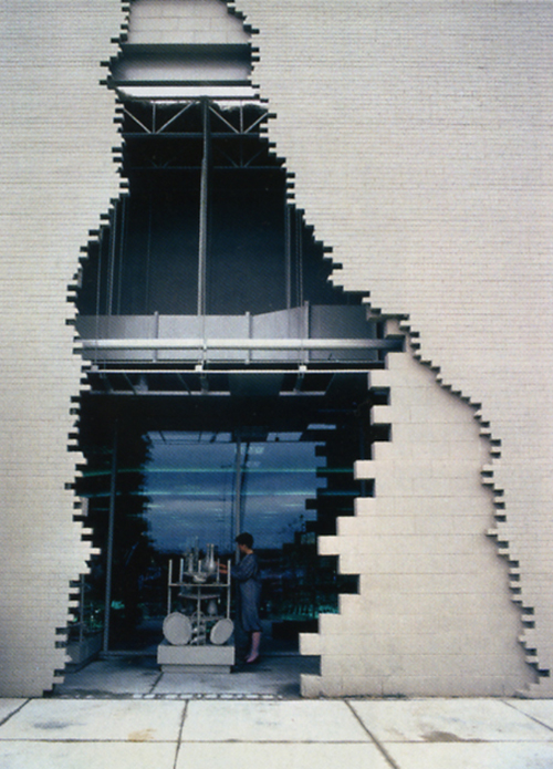
I think the most brilliant art turned architecture (or vice versa) would be by James Wines of SITE Architecture for his façade designs of Best Department stores in the 70's:
a5b8dd4072f12df79a3c18c600c2e6eb.jpg

73b03d112501b774a3d8bc093f7eea68.jpg

3359694303_0123dc9082_o.jpg


By the way, what are those three odd red boxes on the pavement?
 
How does a mistake like this entrance happen? Horrible. First the tacky base and now this. On the bright side it's great for season pass holders at Wonderland.
 

Back
Top