Toronto Cinema Tower | 142.64m | 43s | Daniels | Kirkor Architects

looking good .... its funny the rendering 'strategically' left out the TIFF tower to the south (which would totally block its south view)
 
The base is okay, but I would have prefered the original shape of the tower on top of this revised podium.

Should Daniels wait until the markets picks up and go with the original ??
That would probably mean sitting on a site that they paid top dollar for.

As far as Kirkor, they seem to be improving some of their stuff - not all of it.
It's strange that it's either complete dross or verging on acceptable.
Different clients or different designers ?
 
I think it has to do with both, and the marketers as well. The clients - Daniels in this case - build both modern and postmodern, depending on what the marketers tell them will sell in any particular area. The architects are then told "we need crap" or "we need cool", and up pops crap or cool plans. Just how cool or just how crap is not only dependent on how talented the architects are, but also how daring the developers are to realize those plans, and how prepared the marketers are to push something avant garde.

While the exterior design is only part of the reason why potential purchasers to decide to buy or not, in the end it is up to them whether or not those designs fly, as determined by the number of sales.

42
 
Here is the real question then.

As we've seen with other developments, not only in high-rise residential design, but other projects types.

Is what we see the original architects versions, or the stripped down end-result of the games between politics and developers. Somewhere along the line you have to assume that the architect must have wanted to do more with the design of the project, or is that being too hopeful of some firms in the GTA. The architect at the end of the day must realize that what has been built will reflect on them for a longer period of time than the whimsy of cost cutting or design decisions by the developer.

At this time, with the downtown an Architect might just be willing to give in too easily to feed their firm through this period.
 
I'm sure G+C would tell you that the Corinthian columns holding up their latest projects are 'functional.'

Realistically, there is no 'rule.' Sometimes good projects get dumbed down, other times the design was just bad from the start.
 
My guess in regards to this particular project, and it could be totally, completely, and utterly wrong, is that the first design was what the architects put together after Daniels said something like "we'd love something supacool down here" (I've met Daniels VP Niall Haggart and I think he'd say 'supacool'"), but then after initial presentations, they set a marketing team upon it, and those guys told them to pull back, we're coming into more conservative times because of the tanking economy, do something less daring, and therefore less expensive.

That's my take.

42
 
"Supercool"
Never met him, but I am begining to get the picture.
Bet, the developer/marketing guys pulled the plug.

shame because between the two designs, it looked like something
fairly impressive was coming along.
 
I think in most downturns or slow periods, the quality of the projects drops like a rock. Most of the projects of the mid to late nineties were either cheaper looking or smaller scale which makes sense.
 
From Adam Vaughan's Ward 20 March 2009 newsletter

21 Widmer St

(image available in PDF version of newsletter)

Daniels Corp. presented updated plans for the proposal at 21 Widmer Street at Councillor Vaughan's King-Spadina Development meeting January 20. The updated plans include a 44-storey, 445 unit building (38 storeys + 6 storey podium).

Numerous changes have been made to the design of the project since the preliminary report was filed in March 2008, in part based on feedback from a charrette that was held on this block, which also contains the TIFF Bell Lightbox (which is under construction) and a proposal by Pinnacle International.

A block plan was developed as a result of the charrette, which recommended greater special separation of the towers in each of the proposals, developing the laneways between projects as pedestrian-friendly spaces, creating mid-block pedestrian connectivity, and connected service areas for the parking, loading and garbage of the buildings.The point tower has been redesigned to be concave on the north façade, with notches in the design on the north-west corner. This replaces the former proposal where the entire tower had a concave shape. The podium will follow the same height as the podium of the TIFF building to the south, and will have articulated masonry panels similar to the renovated Royal Conservatory of Music on Bloor Street to fit with the warehouse character of the area. There will be a glass façade on the ground-level Artscape performance space to allow visibility into the building, similar to the National Ballet School on Jarvis Street.

As part of the community benefits that would be provided as part of this proposal, Artscape will have 6000 square feet of performance space. They are also aiming for 10 per cent to be 3-bedroom units, which would be 44-45 units. They would also like to provide affordable home ownership options via Habitat for Humanity.

Questions were raised about whether the Corned Beef House at the north-west corner of the site could be included in the proposal in the future. Councillor Vaughan indicated that several parties have tried to contact the property owner about the possibility of purchasing the property, but she was not willing to do so. Councillor Vaughan said that he has requested Daniels to design the building with knockout panels so that a hard park could be created at that corner if this property became available in the future.
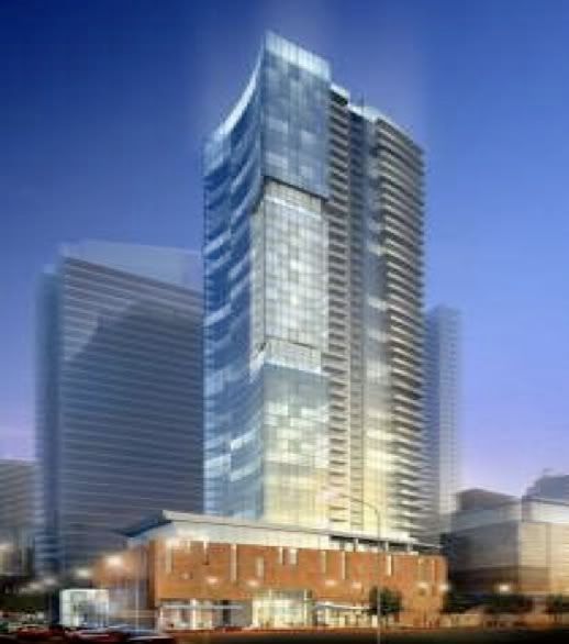
21Widmer.jpg
 
Last edited:
Wow, could they have made the HP building in the background (which is actually quite slender) any fatter? It looks atrocious there!
 
I wasn't a fan of the first design and assumed it's crazy floorplate wouldn't last but, this, is crap; 40 storey glandular crap.
 

Back
Top