skycandy
Senior Member
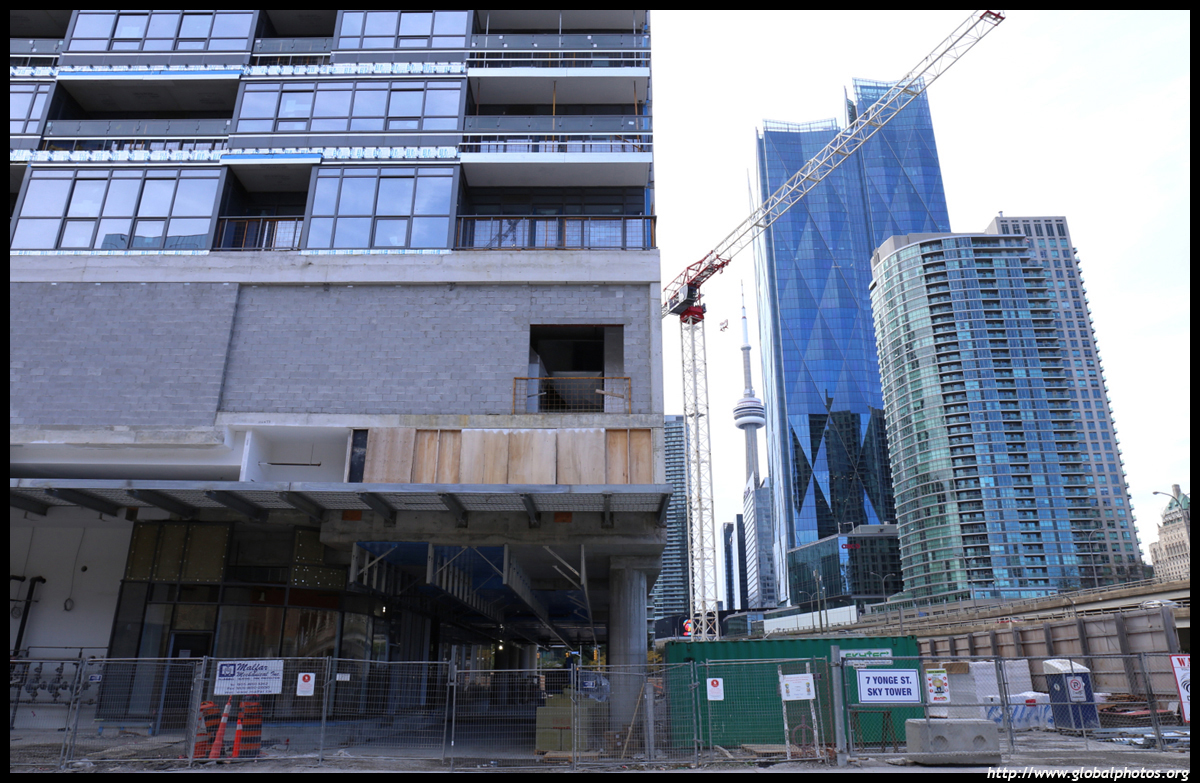
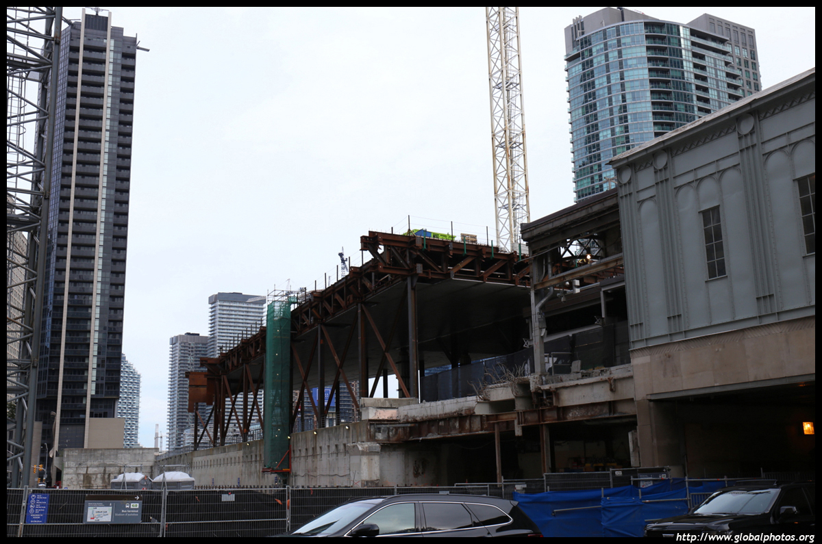
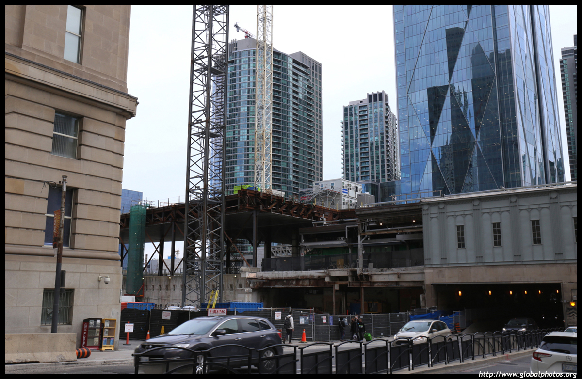
Interior work with this hoarding...
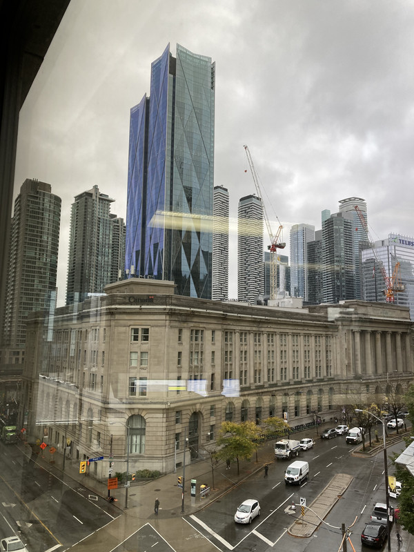
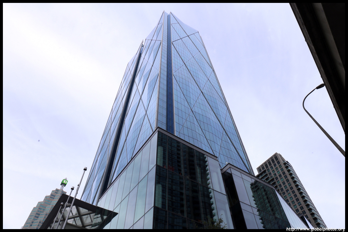
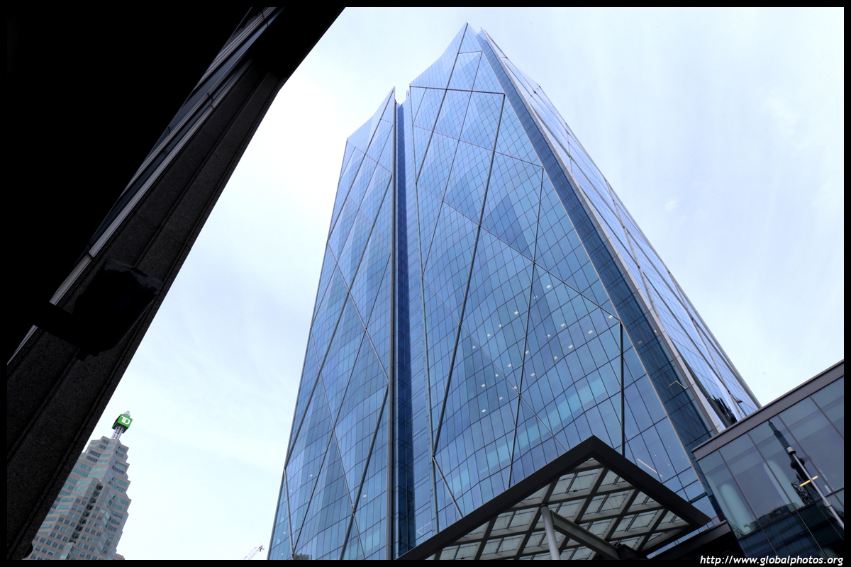
One last view from 33 Yonge before I head off to California - looking forward to following the progress on here

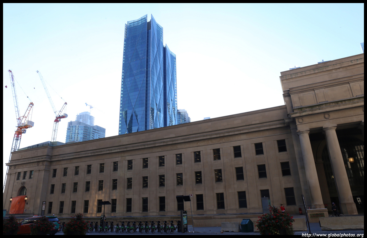
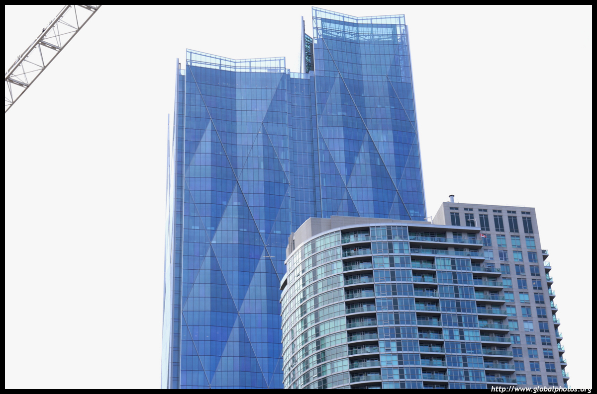
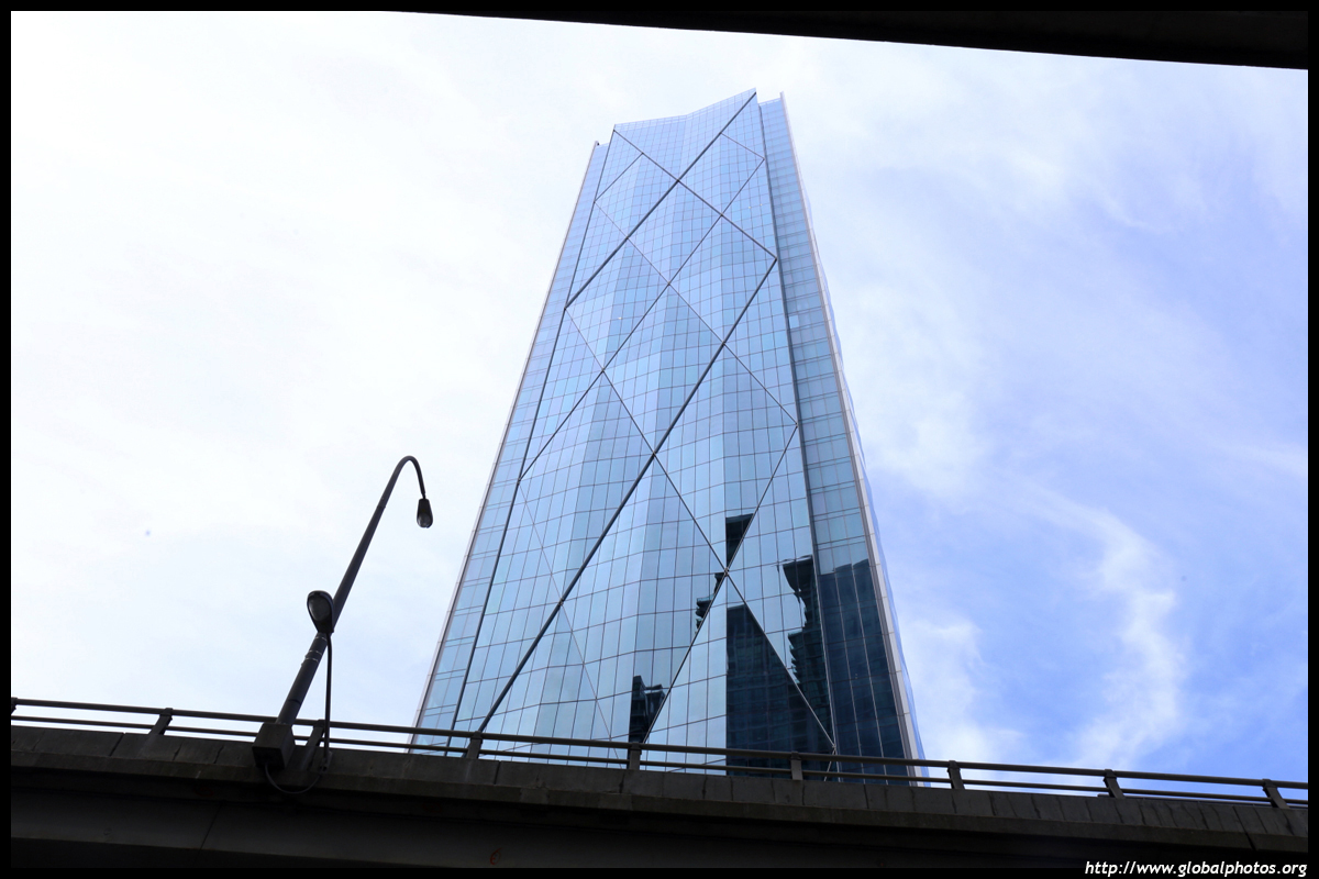
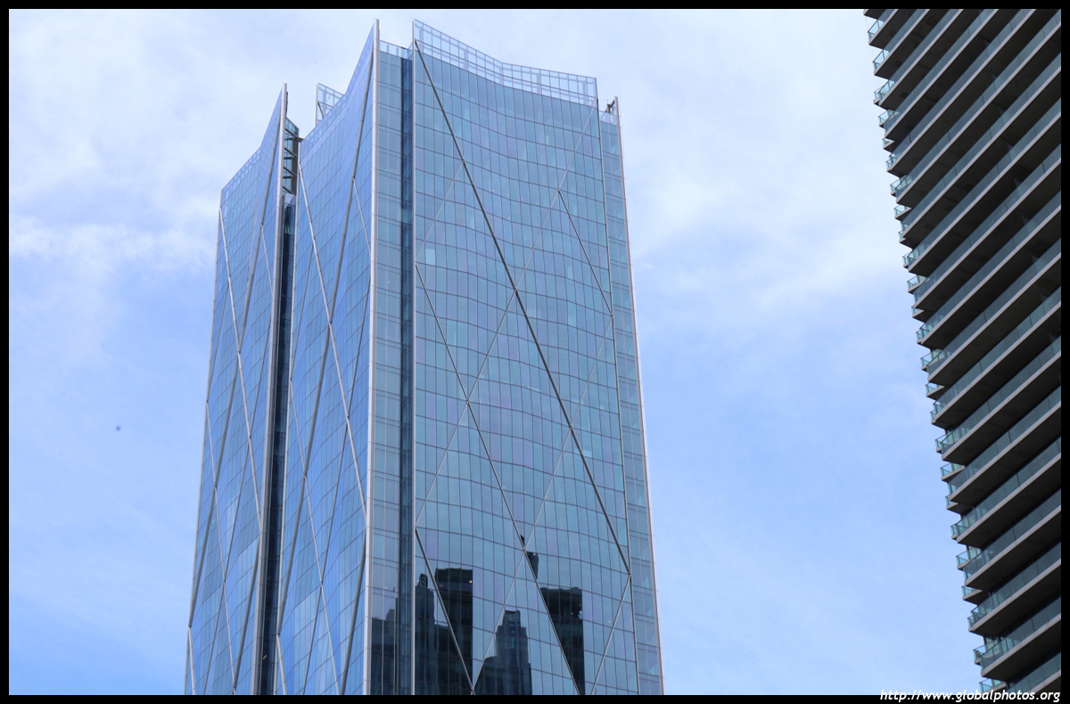
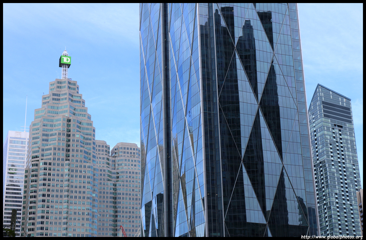
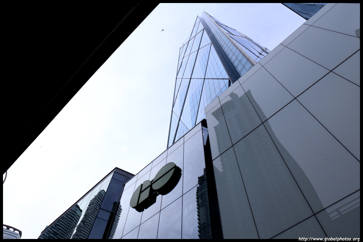
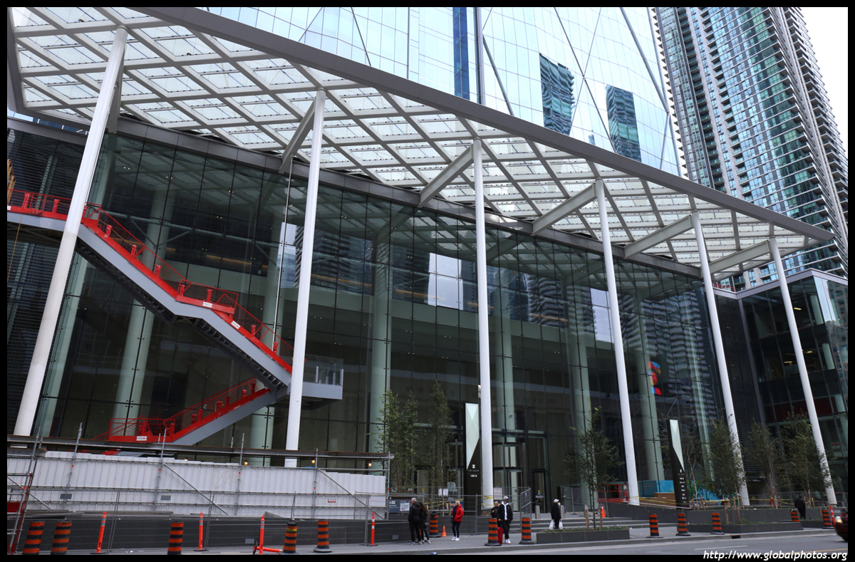
Cropped and out of context, this photo looks like they have sealed off the area as they have unearthed some kind of ancient alien obelisk artifact.Photos taken October 27th, 2021:
Cropped and out of context, this photo looks like they have sealed off the area as they have unearthed some kind of ancient alien obelisk artifact.
View attachment 358769
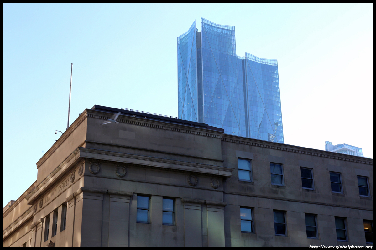




Is it that new logo they have? I think it's so uncreative and lacking in any obvious association with the bank.Couldn’t snap a picture but CIBC logo up above the banking centre (beside the go bus terminal). It’s on the roof and not really legible from road level, not sure if temporary or it’s permanent for the Gardiner commuters
Yup, this one. Not really relevant for this thread but I think it’s not a great logo because it can’t exist without the text. Maybe that will change with time but it’s too generic of a shape and I don’t think most people associate diamond with CIBC. Feels like they just hired the Commerzbank designer and made it red. Also happen to both have the word “commerce” in their name.Is it that new logo they have? I think it's so uncreative and lacking in any obvious association with the bank.

Yup, this one. Not really relevant for this thread but I think it’s not a great logo because it can’t exist without the text. Maybe that will change with time but it’s too generic of a shape and I don’t think most people associate diamond with CIBC. Feels like they just hired the Commerzbank designer and made it red. Also happen to both have the word “commerce” in their name.
View attachment 359377