Toronto Cherry House at Canary Landing | 50.32m | 13s | Dream | COBE Architects

I like the materials and the building design, but I still don't love the courtyard.

It strikes me as a fantastic amenity for building residents, but I have doubts it will be used by the public. Maybe I'm wrong. At the least, I'm glad to see a very substantial increase in its size and the width of the entryways, which will make it feel more inviting.
Yet, it's very common in Europe and we love it there. Not every development needs to have a public park.
 
One of the reasons I'm really happy that Cobe is doing a bunch of work in the city is to see how/if they're able to drag Toronto developers along (and work with local suppliers) to spring for good material detailing, which is a hallmark of many of their projects in Denmark. As the post above illustrates, they've envisioned a pretty robust diversity of finishes for the tower and podium components, and from the landscape plans, I love the lighting they've spec'd (I imagine there was coordination between Cobe and Public Work on the latter).

In particular, I'm liking the hanging feature (ELT-03), which they envision being strung overhead across both entryways to the courtyard -- this is a great way to signify the entrances and to encourage pedestrians to circulate through the courtyard, it's a welcome bit of whimsy in a city that's sorely lacking for it, and is also a really nice nod to Copenhagen, where strung lights that are somewhat similar to the one they've spec'd are a well-known hallmark of the city's urban design (they're strung across many downtown roadways).

View attachment 245129

View attachment 245130View attachment 245131

I love catenary lighting. So uncommon here but you're right, it really does add a sense of whimsy.
 
Part of the success of the St Lawrence Neighbourhood is the mid-block connections for pedestrians.
This courtyard, while nice for residents, will have a limited effect on the movement of people as it hits a wall when it comes to the new E-W street. I feel this is a missed opportunity for neighbourhood improvement. If only somehow there could be a continuous southern pedestrian thoroughfare to Mill Street.
 
Last edited:
Part of the success of the St Lawrence Neighbourhood is the mid-block connections for pedestrians.
The courtyard, while nice for residents, will have a limited effect on the movement of people as it hits a wall when it comes to the new E-W street. I feel this is a missed opportunity for neighbourhood improvement.

1595545859498.png

(From presentation; Dream)

Not much they can do about that given that the south wall is a a pre-existing building (there is a laneway to the side in any case that would enable N-S circulation - see above).

AoD
 
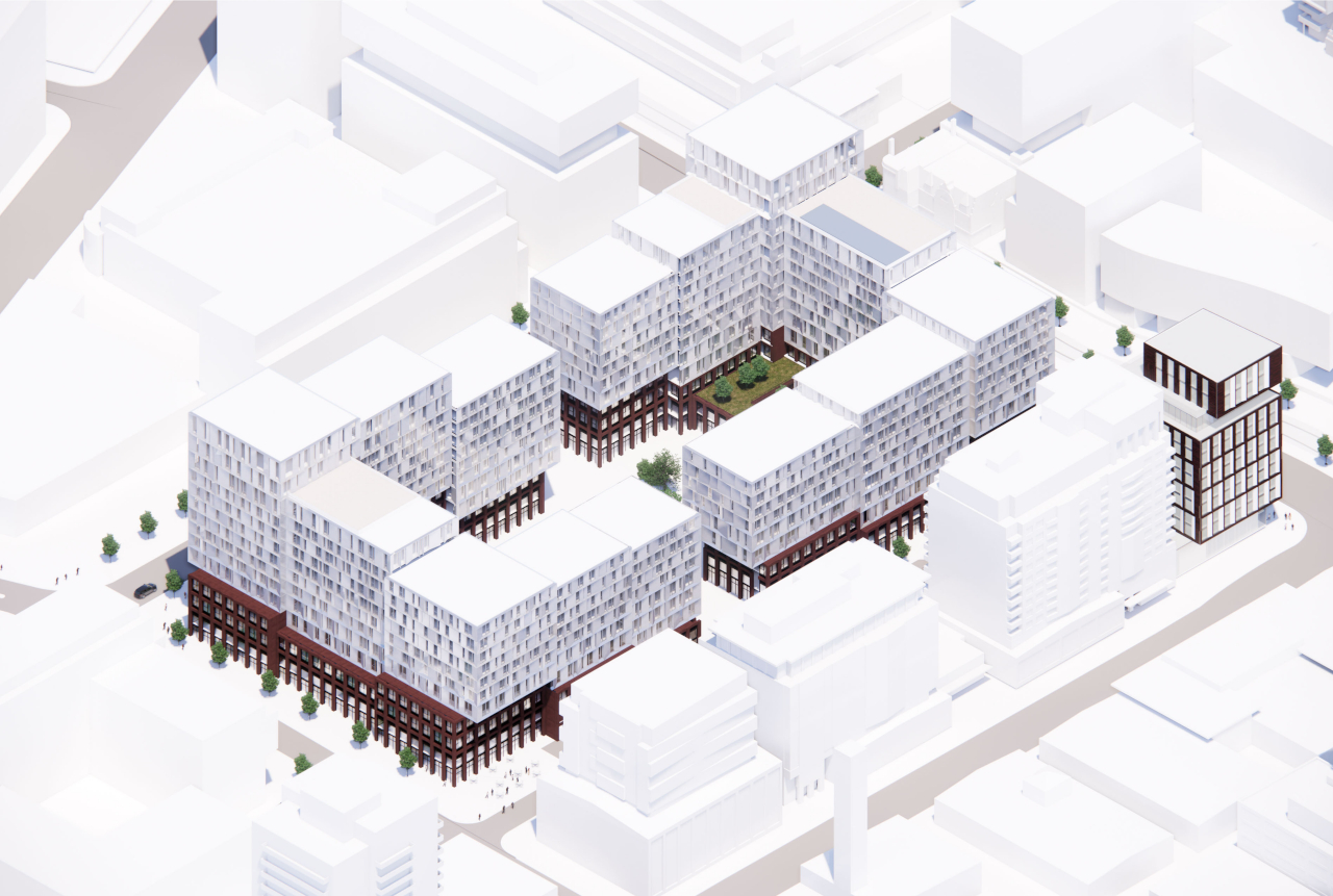
I haven't had this much fun going through DRP docs in quite some time; this is really quite the package, and is definitely worth delving into. Two overwhelming thoughts: one, there is an incredible amount of detail provided here crossing a number of different focus areas (I especially like the extent of detail provided with respect to both cladding/materiality and some of the axonometrics); and two, there really are some grand elements proposed here.

Screen Shot 2020-07-24 at 11.33.32 AM.png
Screen Shot 2020-07-24 at 11.30.37 AM.png
Screen Shot 2020-07-24 at 11.29.15 AM.png
Screen Shot 2020-07-24 at 11.28.04 AM.png
Screen Shot 2020-07-24 at 11.24.30 AM.png
Screen Shot 2020-07-24 at 11.24.04 AM.png
Screen Shot 2020-07-24 at 11.23.55 AM.png
Screen Shot 2020-07-24 at 11.23.19 AM.png
 

Attachments

  • Screen Shot 2020-07-24 at 11.29.44 AM.png
    Screen Shot 2020-07-24 at 11.29.44 AM.png
    779.7 KB · Views: 387
  • Screen Shot 2020-07-24 at 11.27.22 AM.png
    Screen Shot 2020-07-24 at 11.27.22 AM.png
    1.1 MB · Views: 389
  • Screen Shot 2020-07-24 at 11.26.57 AM.png
    Screen Shot 2020-07-24 at 11.26.57 AM.png
    832.5 KB · Views: 372
  • Screen Shot 2020-07-24 at 11.26.08 AM.png
    Screen Shot 2020-07-24 at 11.26.08 AM.png
    890 KB · Views: 373
  • Screen Shot 2020-07-24 at 11.25.39 AM.png
    Screen Shot 2020-07-24 at 11.25.39 AM.png
    1.1 MB · Views: 401
  • Screen Shot 2020-07-24 at 11.22.48 AM.png
    Screen Shot 2020-07-24 at 11.22.48 AM.png
    959.8 KB · Views: 371
  • Screen Shot 2020-07-24 at 11.22.11 AM.png
    Screen Shot 2020-07-24 at 11.22.11 AM.png
    1,013 KB · Views: 376
I haven't had this much fun going through DRP docs in quite some time; this is really quite the package, and is definitely worth delving into. Two overwhelming thoughts: one, there is an incredible amount of detail provided here crossing a number of different focus areas (I especially like the extent of detail provided with respect to both cladding/materiality and some of the axonometrics); and two, there really are some grand elements proposed here.

View attachment 259257View attachment 259258View attachment 259260View attachment 259261View attachment 259266View attachment 259267View attachment 259268View attachment 259269

Screen Shot 2020-07-24 at 11.20.49 AM.png
Screen Shot 2020-07-24 at 11.20.39 AM.png
Screen Shot 2020-07-24 at 11.20.03 AM.png
Screen Shot 2020-07-24 at 11.19.45 AM.png
Screen Shot 2020-07-24 at 11.19.13 AM.png
Screen Shot 2020-07-24 at 11.18.16 AM.png
 

Back
Top