bengaijin
Active Member
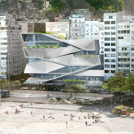
Not to be grouchy, but I actually think this design is pretty lame. It's a particularly monotonous rendition of a design move that was very popular a decade ago - the continuous folded plane that goes from floor to wall to floor again. I think that the individual elevations have almost no character - just plain, horizontal striations of frosted balcony glass (I'm assuming that's what the slightly translucent white material is supposed to be).
Here are some way cooler takes on the same spatial idea:


Here are some way cooler takes on the same spatial idea:


