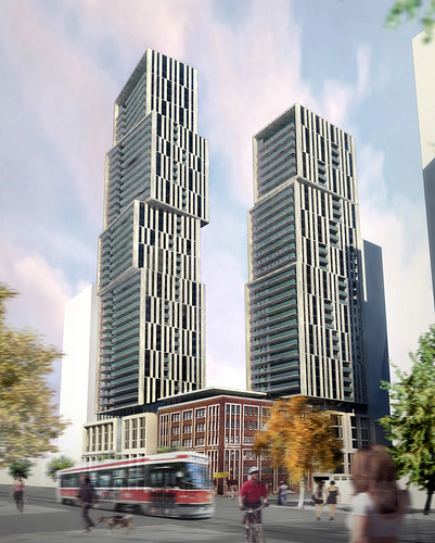
Toronto Casa II Condos | 184.09m | 56s | Cresford | a—A

Don't forget 355 King West / 119 Blue Jays Way:
3277495750_b6930439d7.jpg
 
Thanks UD ... aA does it again ... copy & paste of its own design (Exhibit), how original is that ~

Just to clarify, aA did not design Exhibit (Varacelli did); aA designed Pier 27. I agree though, cmd/ctrl-c, cmd/ctrl-v for this project. I don't like how this specific design feature is repeated again, however I think this is a good location for it as it's a slight spin on Casa (pun intended) across the street with the wraparound balconies.
 
... and also similar to CASA, sat on top of a sexy, but completely lifeless box of a podium that will do nothing to animate the street.
 
Surfing around just came across a real aA stunner of a rendering or two, with a Charles St tag....hmm....looks cool even if it's not the design...;)

screenshot taken from http://www.ghkint.com/GHKCanada/Projects/Planning/LandDevelopmentApprovals.aspx

charlesstreetarchitects.jpg


Building to the left in rendering has similar massing to Cresford's neighbouring BSN project....and to the right, the post office building. But does it add up to 64s?

Very Exhibit Residences, albeit in a 100% sexier fashion.:D


The Charles Street tag has been removed, or was not included in the information at this site.

Monkey Business forsure!
 
^ No, different render. However I understand your mix-up. I never went to Architectural school and I am not a fellow in a architecture fraternity, but I gather from the lack of variation in new designs we see, that every year there are two or three approved styles that are the trend and all the architects in the world are given the samples and they are only allowed to make minor changes in the theme. It is the only explanation of why EVERYTHING LOOKS EXACTLY ALIKE these days.
 
^these days?

Think post-modernism, international style, modernism, art-deco, richardsonian-romanesque, deconstructivist, brutalism, art nouveau, beaux-arts, tudor, gothic, renaissance, etc etc etc. Notice that most buildings from that era look exactly alike?

This is how architecture and design in general usually works. its nothing new that hundreds of buildings from an era look very very similar. Is that a bad thing? It creates a very interesting layered effect on cities; i think its beautiful. You can tell when a city was booming and when it wasn't just by the buildings you see. Toronto has a plethora of modernism and PoMo buildings as well as a good collection from the late 1800s/early 1900s because thats when Toronto was booming. And now a boatload of (neo-modern?) buildings from today. This is how architecture has always and probably will always work, so dont be surprised.
 
I think it's long past due to declare that aA is simply out of ideas. Four years ago I was pleased whenever it was announced that aA was designing a new proposal; now I cringe.
 
Of course all architects are victims of their time... I didn't mean overall architectural design styles like Art Deco, International Moderism, Romanesque, Neo-Gothic and so on, but the particular kitsch tricks within each style that gets overused. The staggered box is being done to death. I like Neo-Moderism, yet when you see one specific motif that exemplifies the design and then is used again and again, it turns it into hackneyed kitsch.
 
I don't think we'd ever get sick of boxy buildings, or the Toronto 2-sided box roof feature, or these stacked boxes if they were executed differently each time, instead of the same balconies, the same fritted glass, the same glass colours, same massing... etc. etc. etc.

Wallman has been proving to us lately that they can create fresh examples that use these common themes. ie.) The Yorkville Residences are a very fresh take on the Toronto-style roof element and colours.
 
Don't forget that Lago pile that everyone seems to like.

It appears that everyone wants to add a 'canted-box' model to their oeuvre, and is that such a problem? I think not, so long as everyone only does one...
 

Back
Top