Toronto Casa | 147.52m | 46s | Cresford | a—A

Terrific lobby photographs casaguy, it's beautiful. Is it a lighting effect or do a couple of the wood panels toward the left seem water damaged?
 
The colour balance between the pale wood panels and the elevated blue room is effective. Nothing screams, and the slightly warm blue is muted and subtle. And with such an extensively glazed lobby - the residents get their very own City Room - the minimal pot and spot lighting makes sense. I suppose it makes sense for the whole tower, really - all that natural light, especially in the short winter days, will help keep the hydro bills down.
 
...to offset the hot and sticky summer days when A/C will be running at full tilt to battle the sun, as with almost every glass condo in the city.
 
The mullions take away a lot from the lobby for me. Sigh. Nice inside though, and better at night.
 
Well I use the term loosely, but it often refers to those metal caps that run along the gaps where windows meet up... in a sense, window frames, if you will.
 
Last edited:
I just see a whole lot of lines at different distances that don't line up, and messy reflections of everything outside. I guess my expectations were too high-- I was expecting a City Room (referring to Four Seasons Centre) perhaps ;)
 
Well, I think it's their version of the City Room. Or maybe their version of an auto showroom - I could see a car set up there in the blue room. Or their version of the Galleria Italia - sculptures in the blue room, maybe. Whatever it is, it has antecedents in the glazed lobbies of numerous Modernist apartment buildings around town, dating back to the '50s.
 
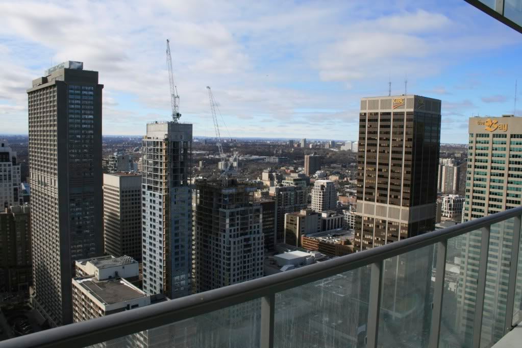
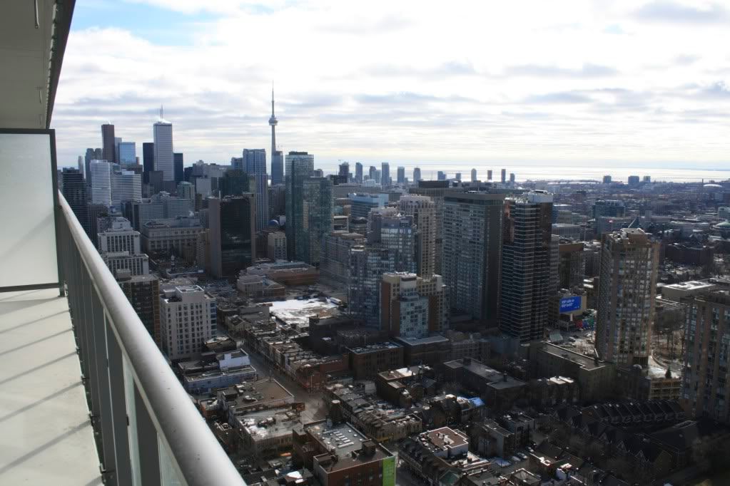
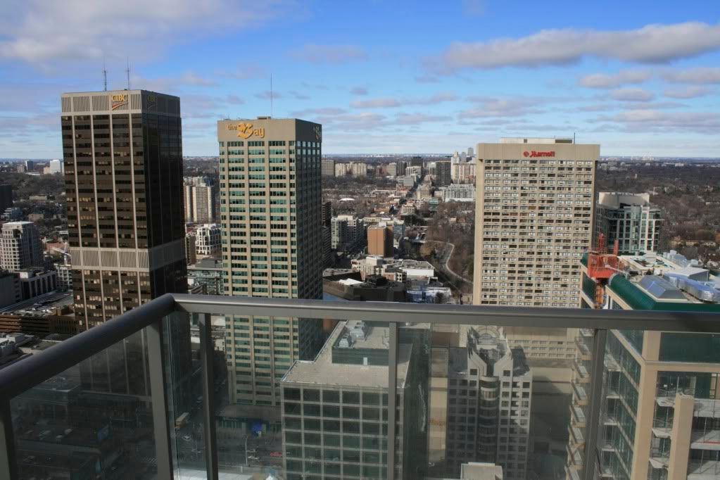
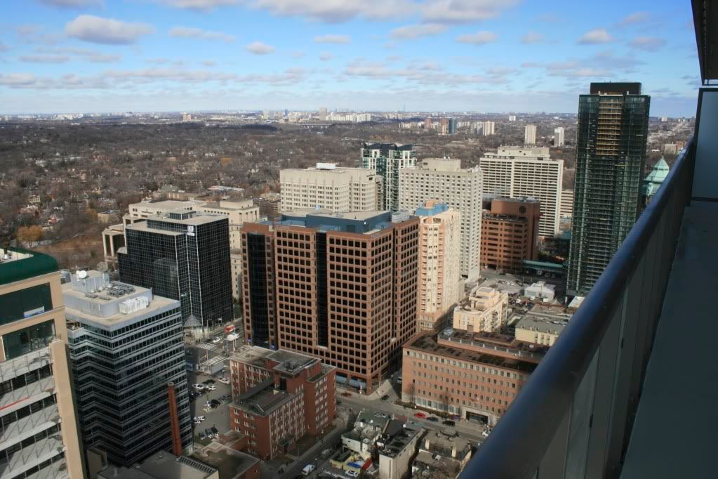
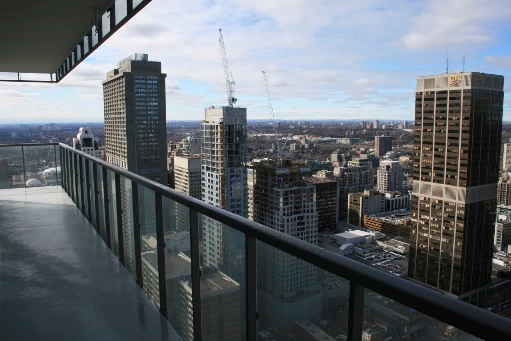
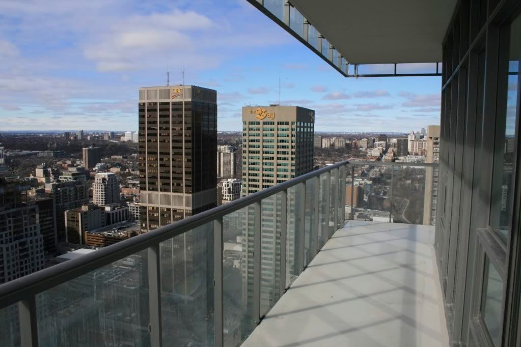
Some views from the upper floors of Casa. Will do some better quality shots soon.

IMG_5389.jpg


IMG_5390.jpg


IMG_5393.jpg


IMG_5395.jpg


IMG_5396.jpg


IMG_5397.jpg
 

Back
Top