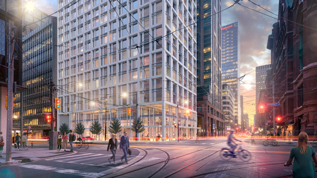
Toronto Cambridge Suites Redevelopment | 230.85m | 71s | Centennial Hotels Limited | WZMH


One thing that “leapt out” about this site, says MacLean, was a series of staircases that go down through the building that have fewer and less sizeable walls than typically found. By removing the stairs, they’ll be able to push new structure down and through the existing structure to provide support. As well, there are no structural walls between the hotel suites, which provides the perfect opportunity to reconfigure them.

The new design will take up the existing building core and increase the width of the core walls, with columns added at each corner.

“It has stepping walls and a stone base and we had to get the base squared up,” says Abelman.

The taller building will need more elevators, so the elevator core will be enlarged and will be upgraded so it handles the additional load to better withstand earthquakes.

The new columns at each corner will provide support for a big table top or transfer slab on top of the existing building.

“It will allow us to build a grid to plunk the new construction on top. It works well for the building team as a platform for logistics and to structurally to construct what’s above,” says MacLean.

A two-storey frame with mechanical floors and amenity space will be created on top of the existing building along with 48 residential floors. A huge steel frame will be built inside the existing building, the old green glass façade removed and a new façade will be installed with bird-friendly glass.

A new residential lobby with access from Victoria Street is proposed, connecting to a driveway shared by the adjacent GWL office building. The redevelopment will follow the Toronto Green Building standard and the new façade will create higher thermal resistance and prevent heat loss.

The new floors will add to the city skyline character with tall, vertical aluminum columns and spandrel glass panels hiding the mechanical aspects from view while creating a distinctive tower top. The floor plate of the development is only 540 metres, so it lends itself to a tall, slender tower.

The lowest transitional floors in the new tower and its west side will be recessed to sculpt the tower and balconies will be added. There will be approximately 41 square metres of green roof and 571 underground bicycle parking spaces and a bicycle parking elevator in the underground garage.

The old hotel at the base of the tower will be transformed to condo or rental units, says Vihant.

Ceilings in the old building are eight-feet tall, thus no longer desirable as hotel rooms. As they were designed as suites that are larger than typical hotel rooms, with separate living, dining and sleeping areas, they are well suited for residential use.

New retail will be added.
 
The podium itself on the redesign looks like a complete write-off and doesnt even attempt to match the aesthetic of it's immediate neighbor which is unfortunate. The tower itself looks pretty promising based off the renderings we can see right now.

Nevertheless, i've never been a big fan of the current building and it's green facade.
My family and I have been staying at this hotel since the late 90’s and what it lacks in terms of trendiness and chicness is its very great setting, huge suites and good comfort. Considering it’s over 30 years old it’s held up well overall. So many of the new towers in downtown all look so similar so I’m kind of fond of the 90’z green glass and overly larger red signage at top. It’s not cool at all but it is still distinctive.
 
My family and I have been staying at this hotel since the late 90’s and what it lacks in terms of trendiness and chicness is its very great setting, huge suites and good comfort. Considering it’s over 30 years old it’s held up well overall. So many of the new towers in downtown all look so similar so I’m kind of fond of the 90’z green glass and overly larger red signage at top. It’s not cool at all but it is still distinctive.
Would be nice if they keep the old podium granite facade look without the roof to expand the tower above it lol. Much richer looking!
 
My family and I have been staying at this hotel since the late 90’s and what it lacks in terms of trendiness and chicness is its very great setting, huge suites and good comfort. Considering it’s over 30 years old it’s held up well overall. So many of the new towers in downtown all look so similar so I’m kind of fond of the 90’z green glass and overly larger red signage at top. It’s not cool at all but it is still distinctive.

I had a lot of clients over the years that picked the Cambridge Suites over the other four and five star hotels, because of the room size. The Cambridge Suites felt more like a condo than a generic shaped hotel room.

I will be sad to see this unique property go.
 
Development notice posted at the site. Yesterday:

PXL_20230402_180657975.jpg


PXL_20230402_180710325.jpg


PXL_20230402_180735304.jpg
 
Ok, I think we've got most/all of the renders for this, so I'm going to focus elsewhere.

First, I found this interesting in the Arch. Plans:

1680539152635.png

1680539177007.png

Site Plan:

1680539258230.png


Uhhh........... I have news............ LOL This is part of something much bigger than we thought: (this billed in the planning report as a 'block context plan' which is only a hypothetical proposal of what might be
built, but I don't recall seeing one use the term 'phases' before in respect of a plan for properties not under the control of the same owner.


1680539395348.png


On to the Planning Rationale Report:

1680540016443.png

1680540051434.png

1680540084244.png

1680540173775.png

1680540201481.png

1680540220722.png


1680540256526.png
 
Last edited:

Back
Top