You are using an out of date browser. It may not display this or other websites correctly.
You should upgrade or use an alternative browser.
You should upgrade or use an alternative browser.
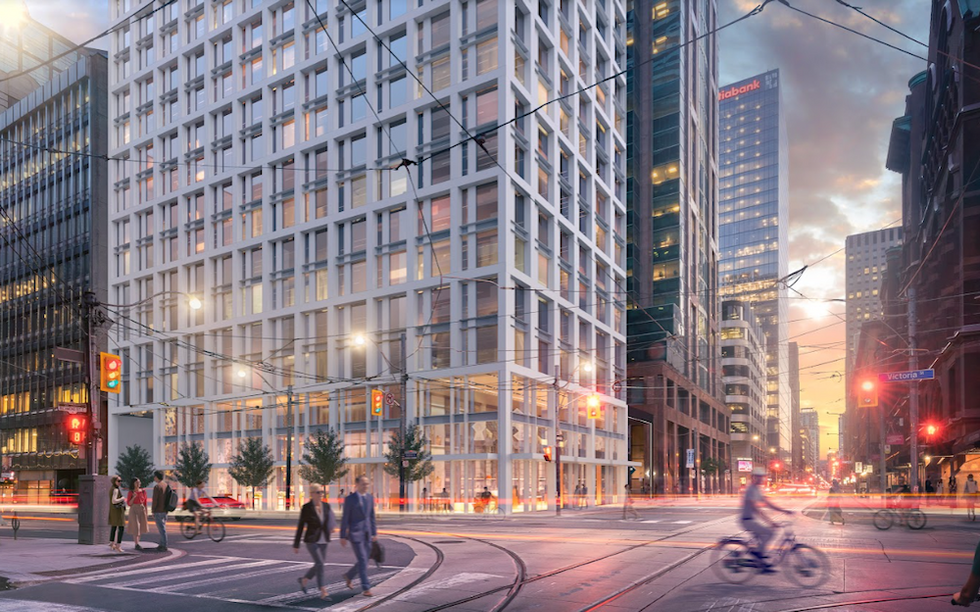
Toronto Cambridge Suites Redevelopment | 230.85m | 71s | Centennial Hotels Limited | WZMH
- Thread starter steveve
- Start date
afransen
Senior Member
Maybe once GO Expansion or OL gets completed, more mid-range hotels can spring up along those lines in the burbs. Land downtown costs what it costs.Sad to see yet another hotel bite the dust. Where do they expect tourists to stay? Not everyone can afford to stay at a 500 dollar a night four or five star hotel. Toronto must be one of the biggest cities in the world with the least hotel rooms.
I know people who visit Toronto stay out by the airport due to the lack of mid level priced hotels downtown.
officedweller
Senior Member
Timeless = generic.What a yawn fest. They should at least match the reddish-brown stone of the west tower, which in turn complements the Confederation Life Bldg across the street. I know PoMo is generally derided but at least it has a little character with the colour and pointed roof. Toronto never really got any extravagant PoMo skyscrapers during the style's heyday, I'd actually love it if they created 71 storey modern interpretation. Perhaps it's time for some Po-Neo-Mo (post-neo-modernism) lol
I thought the same about matching the office tower next door, then I realized that it will also be redeveloped in time.
gabe
Senior Member
Maybe once GO Expansion or OL gets completed, more mid-range hotels can spring up along those lines in the burbs. Land downtown costs what it costs.
Land is expensive in every big city downtown, so what NYC and Chicago did is built two hotels in one building. New York City has The Courtyard Hotel and Residence Inn, sharing a 67 story building near central park. And Chicago has the Hampton Inn and Homewood Suites in one building. NYC also has supper skinny infill buildings that are mid level hotels, like Four Points, Hilton Garden Inn, Holiday Inn, Hampton Inn.etc. NYC has seen a huge hotel boom over the past 10 years that added thousands of three star hotel rooms. They now have hotels for all price levels. Tourists don't have to stay in the suburbs to save money these days, they can stay right in middle of Manhattan. Toronto has enough infill space to do the same.
JasonParis
Moderator
It's interesting how a 50+ storey extension to an existing building is now just par for the course in T.O.
Last edited:
AlvinofDiaspar
Moderator
It's interesting how a 50+ storey extension to an existing building is now just par for the course in T.O.
I am not aware of any city anywhere around the world doing these types of additions at the scale that we do it. As to this project - ho hum replacing a ho hum; would have preferred to see an entirely new build, but it isn't awful at least.
AoD
3Dementia
Senior Member
Sorry AoD but I think @Amare hacked your post... where's the moderators when you need them. Oh wait..I am not aware of any city anywhere around the world doing these types of additions at the scale that we do it. As to this project - ho hum replacing a ho hum; would have preferred to see an entirely new build, but it isn't FILTH at least.
AoD
Amare
Senior Member
@3Dementia the hacking was all on you here, mods discipline him I did no wrong!Sorry AoD but I think @Amare hacked your post... where's the moderators when you need them. Oh wait..
UtakataNoAnnex
Senior Member
When the PoMo gets PoPoMo'd... 
FormerTorontonianBackInTO
New Member
I like the density but the new building is typical Toronto, designed by another Toronto architectural firm that's colorblind and seems to hate pedestrians. The existing building is original, has color, and some nice stone at the ground realm that actually adds to the city (I pass by this building all the time), while the new building is a going to provide the city with another sterile colorless tower with a soulless ground realm - again, typical Toronto. If they were going to build on top of the existing building I'd prefer it if they stuck with the same/similar Post Modern look and simply moved that existing roof to the new higher peak height. WZMH is quickly becoming my most hated architectural firm in this city, I say that because it's one thing to build sterile architecture to replace parking lots, but WZMH has become the go-to for destroying original/unique office towers in this city (76 Adelaide W, 522 University Ave, 401 Bay St, etc) with these soulless buildings.Source: https://storeys.com/new-redevelopment-fresh-green-life-cambridge-suites/
New Redevelopment to Breathe Fresh, Green Life into The Cambridge Suites
Since 1989, the Cambridge Suites Hotel has been a fixture of Toronto’s Financial District. Located at the corner of Richmond and Victoria Streets, it has been known as a long term stay destination for travelling executives, easily spotted for its striking — if dated — postmodern green glass facade.
Now, a new adaptive reuse development, spearheaded by WZMH Architects, will transform the 21-storey hotel into a 71-storey residential mixed-use building with a sleek pencil tower — including 50 additional storeys — all designed with the latest sustainable green building features.
An OPA and ZBA submitted to the city proposes 560 condo units for a total of 40,557 sq. m of residential space, along with 126 sq. m of retail space at grade. The new portion, which will include two mechanical levels in addition to 48 residential storeys, would sit atop a 23-storey podium and take the form of a narrow spire, encompassing 540 sq. m rather than the traditional 750. This is in order to reduce shadowing on nearby Moss Park and Nathan Phillips Square, located at the southeast and northwest of the site.
Among the green enhancements will be a thermal facade to replace the current glass, to better prevent heat loss. The old electrical and mechanical equipment is to be entirely modernized, while the mechanical penthouse is to be incorporated into the building’s body design, to preserve the area’s skyline character.
A green roof will be among the 41 sq. m of outdoor amenity space, while all glass elements above the mid level will be bird-friendly vision to prevent avian collisions. The site heavily promotes the pedestrian attributes of the surrounding area — which is within walking distance of six TTC stops — with a total of 571 bicycle parking spaces, along with a bike parking elevator to be accessed from Victoria Street. The building will also connect directly to the PATH via one of its three basement levels.
While no longer functioning as a hotel, the redevelopment will actually return the building to its original use as a condominium, says WZMH Principal Len Abelman. The architecture firm, which was behind the Cambridge’s original design, were invited back by the owners for its overhaul, with the intention of taking its period-typical 90s aesthetic and turning it into something timeless.
“Very often, we are invited back, many years later, to renovate these existing buildings that a previous generation of architects had designed,” Abelman tells STOREYS. “The original building is really a postmodern style which, back in the 90s, was the style of architecture being used, which is this blend of different historical references. The pitched roof, and the stepping of the facade, and the sloped base — it’s all drawing from different times in history.”
WZMH approached the project with the intention of simplifying its many architectural attributes, while retaining as much of the existing building as possible. Their plan strips off the facades and pitched roof, right down to the base concrete, before adding new columns and structure. Working closely with a structural engineer, they beefed up the core of the building in order to provide a strong base for the 50 additional storeys — no small feat.
One of the main reasons the building is being transitioned to residential, says Abelman, are its original eight-ft ceilings, which would put it at a disadvantage compared to newly-built hotel, which have higher ceiling clearances. Another unique attribute of the site is its taller-than-usual podium element, which was typical of 90s-era buildings.
“If you look at more classical buildings, that podium element was always taller, and what we try to do by keeping the original height of the building and expressing the base separately from the piece above, we’re trying to relate it to the existing streetscape on Richmond,” he says. “That really helped informed the aesthetic of how we proportioned it.”
“Overall, it’s an attempt to create something timeless and to blend it into the fabric of the city.”


3Dementia
Senior Member
^ have to agree after reading your (dirty) laundry list/recap of WZMH's recent blunders.
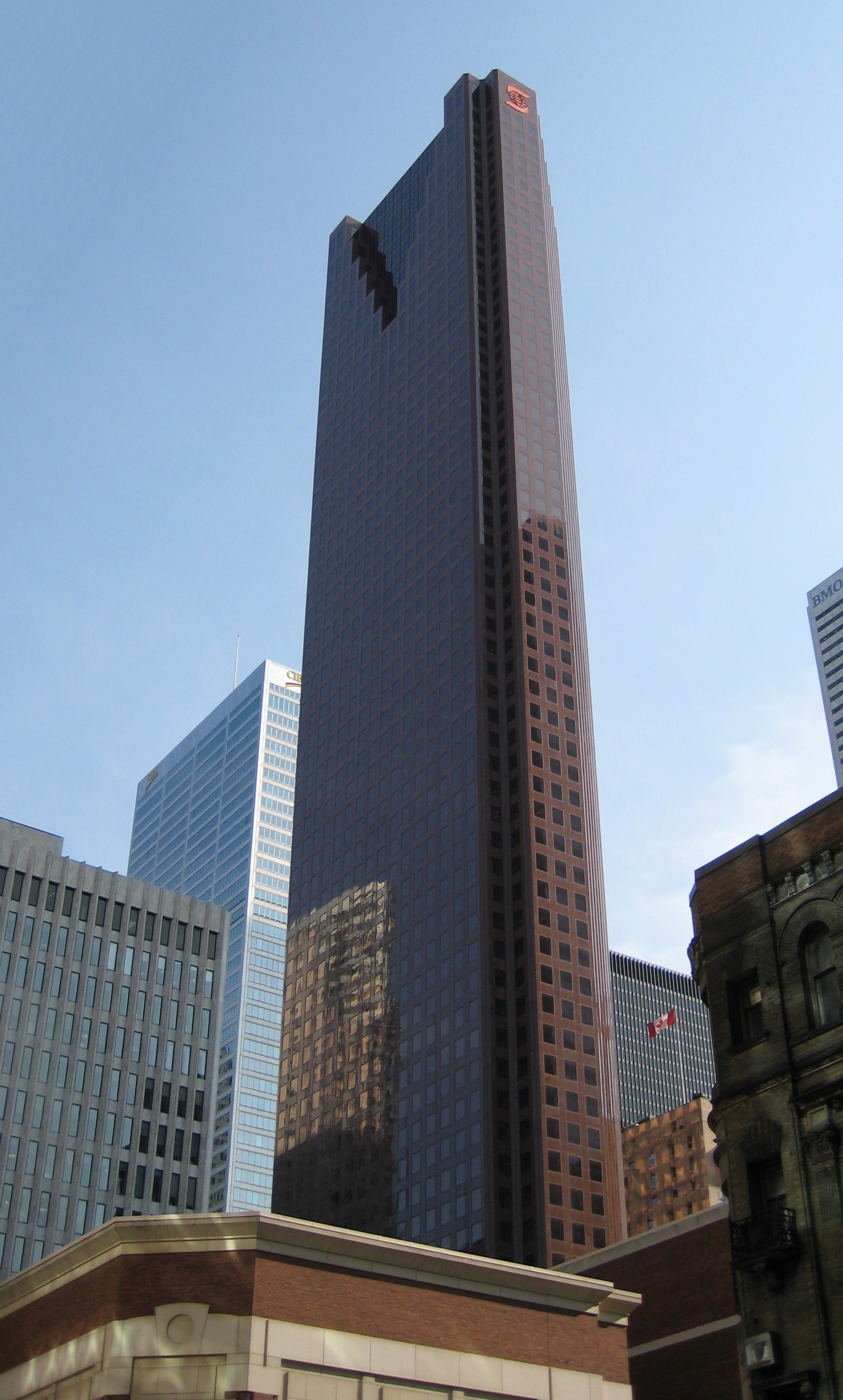
On the topic of colour and (and sterile architecture) ... hard to believe they designed two of the most beautiful skyscrapers on the continent, including this one in 1985.
I guess there's been some staff turnover in the last 37 years.
 wiki
wiki
And the gorgeous gold-infused serrated curtain-wall of Royal Bank Plaza of course.
On the topic of colour and (and sterile architecture) ... hard to believe they designed two of the most beautiful skyscrapers on the continent, including this one in 1985.
I guess there's been some staff turnover in the last 37 years.
And the gorgeous gold-infused serrated curtain-wall of Royal Bank Plaza of course.
Last edited:
Bjays92
Senior Member
Wait this is WZMH!?^ have to agree after reading your (dirty) laundry list/recap of WZMH's recent blunders.
On the topic of colour and (and sterile architecture) ... hard to believe they designed two of the most beautiful skyscrapers on the continent, including this one in 1985.
I guess there's been some staff turnover in the last 37 years.
wiki
And the gorgeous gold-infused serrated curtain-wall of Royal Bank Plaza of course.
Funny how I look at a building like Scotia Plaza and often go, if only we still had architects like that today.
Well now I'm just sad on a Sunday morning lol.
70Challenger
Active Member
They have good designs, just that they shouldn't erase existing heritage to build them.
Northern Light
Superstar
Piece in the Globe and Mail about this proposal, not behind the paywall at time of posting:

 www.theglobeandmail.com
This bit from the article got my attention:


New downtown Toronto building razes the roof to add new floors
Cutting-edge construction technique to be used for additional 50 storeys
This bit from the article got my attention:
cd concept
Senior Member
Love the height but I hope they redesign the fasade! TOO BLAND!