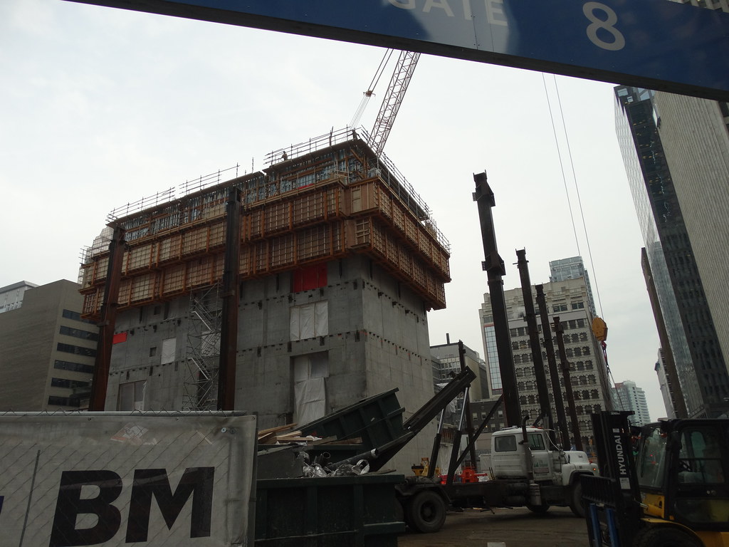
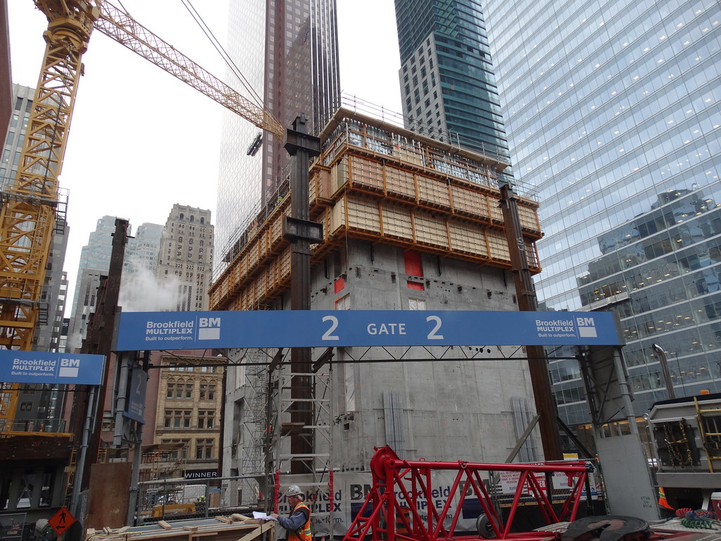
Toronto Bay Adelaide Centre | 217.92m | 51s | Brookfield | KPMB

Oh the conservative Torontonian. And people wonder why Toronto has an image of unadventurous architecture! You need to get past the idea that "ye-ha-cool shapes" are bad, and pure efficiency somehow add to the public realm, and start to embrace some imagination and excitement.

It's not that minimalism is a bad thing -- I actually am quite fond of our modernist stock -- but that seems to be all we're interested in when designing new buildings. Like you said, we need more imagination and excitement in our architecture. The 60s are dead. This current building boom has provided us with a once in a life time opportunity to be adventurous and try new things, yet we've stuck to the same timid, bland approach to building. I wonder if those that study architecture in this city are brainwashed into loving Mies? It seems that everyone architectural aficionado in Toronto thinks that the TD is the ultimate example of Toronto's built form -- not that it isn't impressive -- but there are far more interesting towers in the city, in my opinion (Commerce Court North, Canada Life, Canada Permanent, etc).
 
It's not that architects are beholden to a certain 'style' or a particular 'hero,' it's that architecture is a business and if you want to be successful - or even break even - you've got to play ball with / for your clients. There's no surely shortage of creativity or vision in Toronto - even Kirkor can do great things in the conceptual phase. The lack of what you might label as 'creativity' (eg. 'ye-ha-cool-shapes') stems from the fact that at the root, developers want to make money and spending a whole lot on buildings that look 'cool' but aren't optimal for their tenants is just bad business. What's so amazing about what firms like aA or Hariri Pontarini do isn't that they can draw interesting things, it's that they're able to convince developers that delivering a unique product is worth the investment.
 
Construction guy on site this morning said the current crane on the east side and the one they are putting together on the west side will both be climbing cranes that will grow with the tower.

I think that will look pretty cool!
 
Dec 5
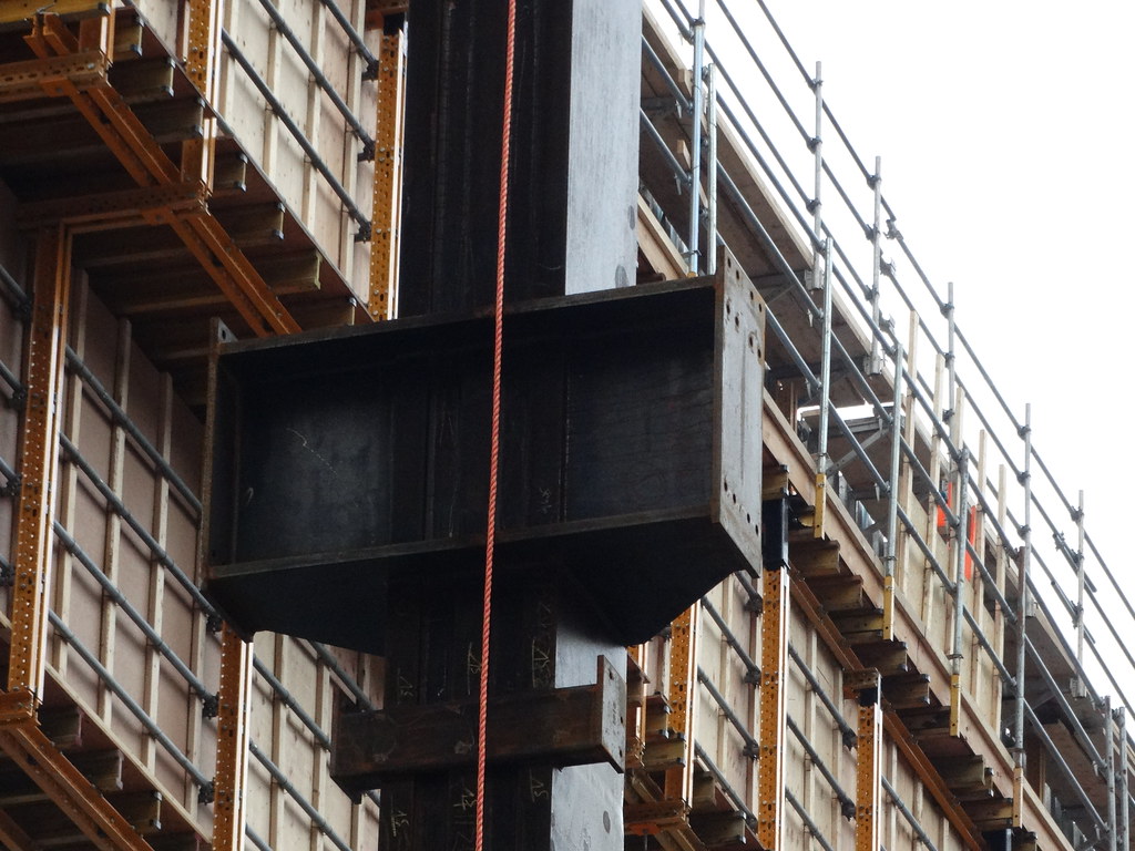
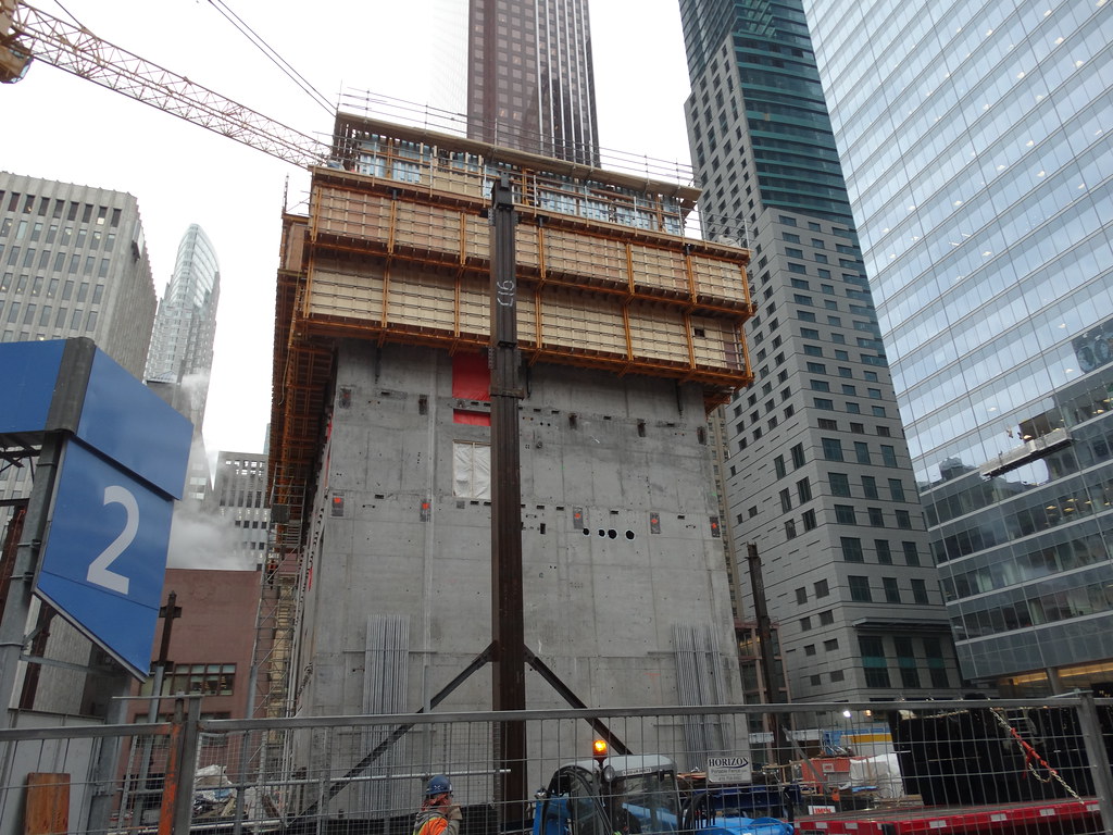
16 main steel columns in place at this time and are about 14WF600 with reinforcement plates on the flange. No columns at the corners.
11230527065_36f0bd52be_b.jpg


11230629693_1b3fec3af8_b.jpg


11230540204_136e796537_b.jpg


11230514585_6250e81785_b.jpg


11230621003_fa8829bb4e_b.jpg
 
Construction guy on site this morning said the current crane on the east side and the one they are putting together on the west side will both be climbing cranes that will grow with the tower.

I think that will look pretty cool!
Interesting. I wonder why they went with those this time around.
 
Well no. That in itself embodies the general shift away from hierarchical office spaces to ones more egalitarian in nature. Offices, though still highly-striated, don't want to draw distinctions between positions as hard as they did in the past and the move towards more 'boring' and less 'imaginative' floorplates is reflective of that. The idea of having 18, self-contained, 'corner offices' is far less appealing to a business today than it was in the era of Patrick Bateman, but if you still want to live in the past, I'm sure Crayons or Arcadia won't take your reservation.

The corners won't be used as offices in all likelihood; they will be used for meeting rooms. In addition, the offices along the external walls (unless the floor is open concept) will all be the same size. This will allow the tenants to move their people around without worrying about seniority, office size and office location (i.e. in a corner). This is most efficient from a business' perspective - get the people who work together close together. With respect to an earlier comment, the floor plate in Scotia works against this new tendency in office design. It was appealing when it was built to have so many corner offices, but this is now a bit of a thing of the past to many (but not all) businesses. In addition, there is a lot of wasted space in the floor plate. A boxy design of a certain dimension (not too big and not too small) is more cost effective and efficent for professional services firms (look at the tenant list for BAC W). BAC W and E seem to have the correct dimensions that these businesses want.
 
What is happening with that lot across from it? I know it has the gardens/parkette on the one side, but what are those low rise mismatch buildings to the left? Has there ever been a proposal there?
 
What is happening with that lot across from it? I know it has the gardens/parkette on the one side, but what are those low rise mismatch buildings to the left? Has there ever been a proposal there?

The bigger one is the entrance to the underground parking off Richmond, the smaller one is the pedestrian entrance and elevators to it.
 
The site plan for BAC3 shows the tower potentially being in the 28-32 storey range. Is this because of shadowing concerns on Nathan Phillips Square? I would think there would be a desire to build taller when the time comes as the number of sites for new towers diminishes in the financial district?
 

Back
Top