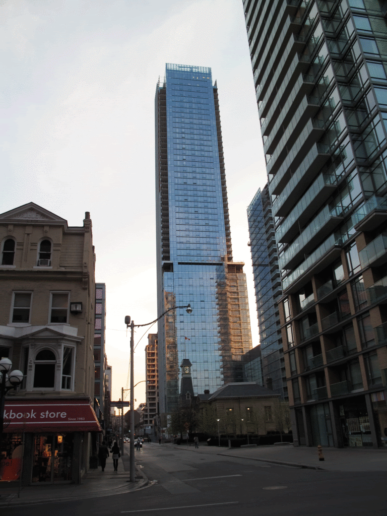
Toronto Bay Adelaide Centre | 217.92m | 51s | Brookfield | KPMB

With no training and virtually no knowledge of architectural theory, I feel I could design this building.

That's a travesty.

Counter-arguments to my first claim are more than welcome, as this is a disappointment.
 
While I understand the frustration over the box thing, I really like the BA West tower, and I think it might work well with a similar one right beside it. It was mentioned above that the glass is nice. It is -- and apparently it's a very comfortable building to work in. Let's not forget that the people inside the building are the most important, not the ones walking by on the street. The food court in the path is also nice, as is the courtyard outside. One of the better public spaces in the financial district.

Too bad we'll lose South of Temperance. Douche-y, yes, but convenient.
 
The outside may be quite unimaginative but I think the lobby of BAC West and now East is stunning. With its gorgeous white stone and wood elevator walk troughs
 
Last edited:
Let's not forget that the people inside the building are the most important, not the ones walking by on the street.

Yeah, lets not forget the...............980,000-square-foot office tower with best-in-class operational, environmental and life-safety systems. Once completed, the East and West towers will represent the forefront of premier office product in Toronto's financial core, encompassing the full Adelaide Street block between Bay and Yonge Streets.
Consistent with Bay Adelaide Centre West and all of Brookfield Office Properties' new developments, Bay Adelaide Centre East will be built to a minimum LEED CS - Gold environmental certification.

Read more: http://www.digitaljournal.com/pr/749770#ixzz1xdH9KUup

Gee, its not that tall, and an average looking box....but the description of the above erases any concerns
 
7dc3c3e9.png
.
 
I can't believe they removed the slightly recessed corners and went with a pure box.. Can someone explain to me the market fundamentals pushing our pension funds to do this? Now I know these guys throw up crap based on their extremely conservative margins, but recessed corners? Really? Too much for Brookfield?

Regardless, Bay Adelaide (the towers and the complex) are designed by accountants for accountants. It's actually quite perfect if you think about it.
 
my thoughts:
glad to see BA2 finally taking off. as for the minor design change, a tad bit awkward considering it's only slightly different than it's neighbour, but i'm fine with that so long as BA3 looks different.

and a win for everyone: finally another steel constructed skyscraper to go up in the city!
 
An office building is definitely better news than any new condos! despite the lackluster design, it is great news.

On the other hand, I still waiting for the news on an office building development on the south east corner of Richmond and Victoria - currently an expensive parking lot - so that the financial district can expand eastward.
 
I was under the impression from the thread title that BAC East is KPMB, even though phase 1 was WZMH?

That's correct.

42
 
wmedia:

My error - actually I am surprised by that one. It will be interesting to see if KPMB actually replicates the qualities of the materials in BA1.

AoD
 
This design is so boring it's Clewesing me to sleep...

What is this obsession with Peter Clewes? Why does he get roped into every thread about every modernist styled building? To me there is nothing about this timid, blandly professional building that is remotely ‘Clewesian’, for the simple reason that there is nothing remotely neomodern about it, which is obviously the Clewes aesthetic.
if anything, it simply demonstrates that high quality materials can't save a somnambulant design. this building is going so far out of its way to avoid drama that it just ends up seeming perverse in its inoffensiveness, which is hardly how one would characterize Peter Clewes.


7f1ef55e.gif


685100ce.jpg
 

Back
Top