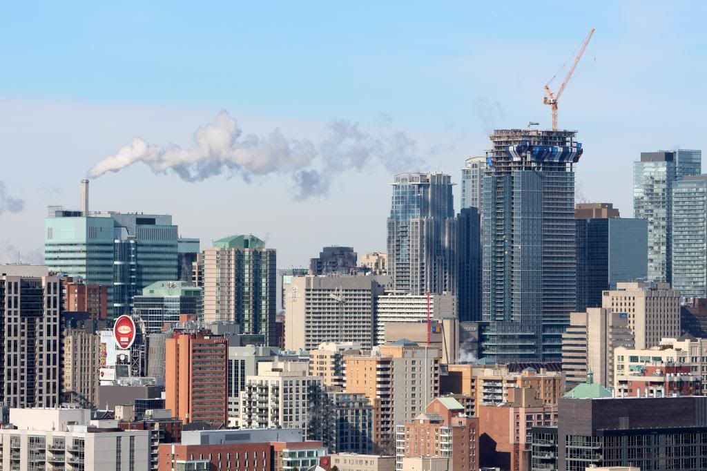
Toronto Aura at College Park | 271.87m | 78s | Canderel | Graziani + Corazza

Today:

7BF4vWF.jpg
 
love the layers in that photo ^
Aura's podium seems much more forgivable in size from that vantage point. It suits well with its surroundings.
SickKids also looks pretty nice (even though a little extra height and/or a more interesting roof feature wouldn't have been so bad). I'm real interested to see what gets built at that parking lot @ Bay/Gerard. the current proposal's design is mediocre at best and I really hope they go higher.
 
Bay and gerard is a rental building correct ? I liked the colour in the project if I'm remembering it. Any updates on that one ?
 
All I have heard about it is that RAW has redesigned it; it's no longer a variation of different tower designs stacked upon one another.
 
Dec. 8 2012 -

Below, Aura today from my POV now visible behind The Met. I'll post regular updates every few months as this goes up


A lot of construction time has been lost in January & February due to winds and weather. Feb. 23 2013
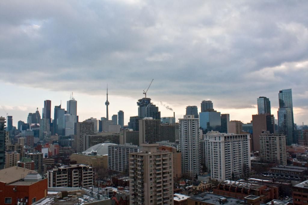
 
Dec. 8 2012 -


A lot of construction time has been lost in January & February due to winds and weather. Feb. 23 2013

you're gonna have one helluva view of Aura! I think Aura's gonna look best at an angle (as seen in your pic) where the upper half will look sleek as hell. The roof slope will be very dramatic.

also, in cruzin4u's last pic. it might just be one of the best photos I've seen of Aura's lower-half cladding. The balcony glazing helps a lot.
I still dislike the 'scrabble block' base material. I also wish the Bedbath/Marshals logos were all placed on one level (above the ground floor), rather than them being stacked awkwardly on one another with no other logos next to them (yet).
 
dt_toronto_geek, It is much better if you copy the img code posted beside the image on photobucket, as the photo is much larger here:

[IMG.]http://i770.photobucket.com/albums/xx341/scullydog259/Aura_Feb23-13_zpsc80ae3e9.jpg[/IMG.] (ignore the periods in the img code, they are put there so you can actually see the code)


Aura_Feb23-13_zpsc80ae3e9.jpg


img_zps68758cb4.png
 
Last edited:
dt_toronto_geek, It is much better if you copy the img code posted beside the image on photobucket, as the photo is much larger here:

Yes, I know that thanks - I've been loading images as thumbnails forever here so as not to slow down the loading of a page but if you prefer that, no problem. Some of my posts when I was able to photograph more used to number in the dozens sometimes!
 
The setback has been looking less awkward the higher they get. The first couple floors looked especially weird from the north because of the way the floor plate tapers back, it made it appear like half the tower abruptly stopped.

What doesn't seem to be improving is the balcony glass. To my eye it's clashing really badly with the curtainwall on the south elevation. It doesn't look so bad on the window wall sections, but I really wish they'd gone with a simple tint to match the dark curtainwall.
 

Back
Top