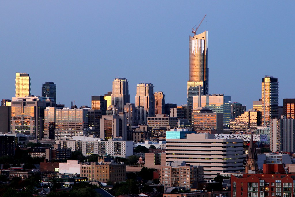
Toronto Aura at College Park | 271.87m | 78s | Canderel | Graziani + Corazza

Oh good god. This is why we can't have nice things.

And by nice things, I'm sure you mean grey glass boxes, with flat glass retail units lining the street.

Oh, to live in a world without colour, texture or design frills would be so wonderful. Why can't we all just enjoy the simplicity of living in glass cubes? What's wrong with grey spandrel? Isn't grey everyone's favourite colour anyway? Fashionistas the world over, can never get enough grey! Imagine Yonge Street lined with only glass and grey spandrel. My god, I think I'm salivating right now. Colour and artistic do-dads, just muck everything up. And any decorative lighting or art, well that is just a travesty. Who needs art, when we have glass cubes with spandrel, as far as the eye can see? I'm sure tourists will come from oceans away, to see the wonderful, futuristic world we have created. It's a world where building more and more of what we already have, just makes us better. There is great beauty in artless, glass cubes and soon the world will realize that. Ah, Urban Toronto, you gotta love it! lol

One man's dream, is another man's nightmare.
 
Oh good god. This is why we can't have nice things.

really? do you really think the standard people hold on this forum actually has any impact on how real buildings are built in this city?

Aura may not be such a master piece but among all the towers we built in this century, how many buildings are better than it (or considered nice by you), and how many are even worse?
 
Oh good god. This is why we can't have nice things.

lolwut?
Do us a favor PE, tell us exactly which building looks better in the photo;

15076602126_87ee950951_b.jpg

Ohhh... let me guess, you'd say Murano wouldn't you?
How could I not take heed of such an iconic structure? Aura clearly stands in its shadow. :rolleyes:

Look, nobody's suggesting that there aren't any other quality buildings within that photo(RCMI, Lumiere, Met, Burano etc.) Many of which indeed look far better then Aura at the street level. But your just deluding yourself if you actually believe that Aura doesn't have a positive impact on the skyline as a whole.
 
Oh man, Aura looks good in that shot! Best looking building by far, probably because the lower portions are not visible. But still, the sculpted top really brings it to another level.
 
Oh man, Aura looks good in that shot! Best looking building by far, probably because the lower portions are not visible. But still, the sculpted top really brings it to another level.

Best looking only because it's the tallest building in that photo and it happens to have some lighting. And as you said, "the lower portions are not visible".
 
Best looking only because it's the tallest building in that photo and it happens to have some lighting. And as you said, "the lower portions are not visible".

Also the sculpted top, which not other building in the photo, including the aA designed Burano tower, can even match.
 
This is not a great building. I sorta don't mind it though, it adds a little drama. It's just the way I roll.
 
This is not a great building. I sorta don't mind it though, it adds a little drama. It's just the way I roll.

I think ProjectEnd and DeepEnd are both dug in so deep (no pun intended) that they couldn't do a U-turn even if they wanted to.

I'm actually more in Tewder's camp. It's a terrible building as a piece of architecture but I in no way mind a mass of its size in that location. In that vein vegeta, I simply don't have the time or desire to list the buildings in that image that are architecturally superior to this one.
 
This is not a great building. I sorta don't mind it though, it adds a little drama. It's just the way I roll.

Well-put. I feel the same way. It adds such drama to the area/city/skyline that I appreciate it from that perspective. But it simply isn't good architecture.
 
Well-put. I feel the same way. It adds such drama to the area/city/skyline that I appreciate it from that perspective. But it simply isn't good architecture.

I think most feel the same way but, take on a more negative tone as so many view this as revolutionary just because it happens to be really tall. Serves me right for letting my curiosity get the best of me and checking out other forums.
 
The more I see Aura, the more I like it.

One of my pet peeves about the Toronto skyline has always been how it sort of looks like a volcano with a whole cluster of tall buildings and then quickly leveling off. It somehow made the skyline look smaller than it actually is. There was the Bloor area with tall building but there was that huge gap in the skyline and Aura has really filled that gap and made the difference between the two areas much smaller.
 

Back
Top