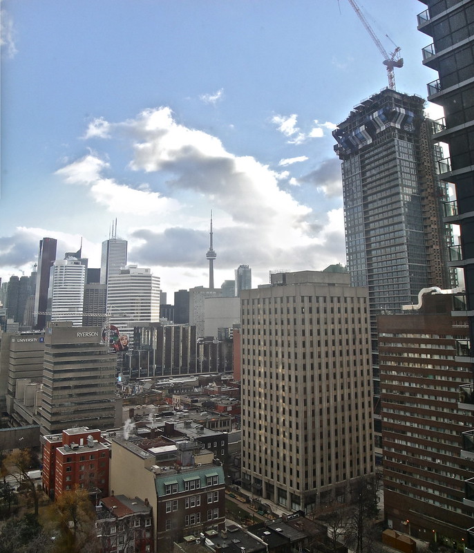
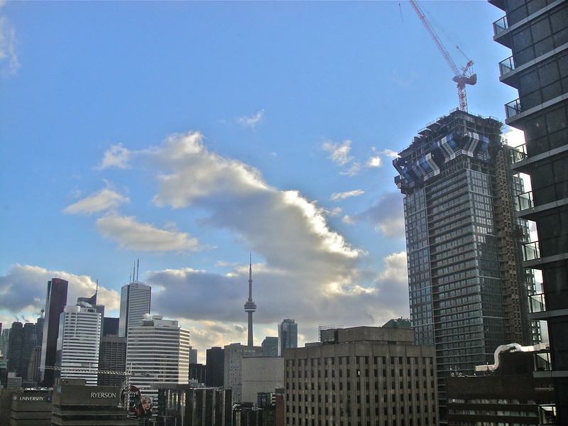
Toronto Aura at College Park | 271.87m | 78s | Canderel | Graziani + Corazza

Being creative with the space will go along way. Just saying, its nothing to complain about. omg a column. put a plant there or if your not into nature.. then a piece of art. just two out of thousand solutions.

A positive post on the Aura thread??

I agree with you. Not that I think this building will come anywhere near outdoing Scotia, but I do think that it looks decent, and will only improve as more curtain wall shows up. As for the basement, I hope that either the units are joined together to allow for larger spaces, or that we get plenty of little niche shops. That should put enough pressure on the city to improve the PATH connection to the basement.
 
Being creative with the space will go along way. Just saying, its nothing to complain about. omg a column. put a plant there or if your not into nature.. then a piece of art. just two out of thousand solutions.

Instead of jumping to defensiveness, maybe you should have considered that my post was not even a critique on this building but rather a genuine curiosity.

Given that spandrel is usually used to hide structural beams or concrete or columns, it seems odd that they would put a small window directly beside an expanse of spandrel, only to place a column BLOCKING it. It's potentially a critique/criticism, but that depends on the rationale behind this detail I've pointed out. I may be seeing things wrong or perhaps there is a good reason the architect did what they did with that detail.

If someone knows the layouts/floorplans for this section of the building (I can't find any!), it might help explain. For example, maybe the kitchen is behind the spandrel on that north-facing section and so the architects wanted some light penetration from a window beside the kitchen. That would explain half the story, but I still wonder why that column had to be right there in front of that one small window.
 
Last edited:
Spire. I Apoologize, I did'nt even realise that the darker sections/stripes were not opaque or, see through. I guess I didnt quite realise what spandreal ment. My bad man. I feel bad/ dumb now. So I see your point now. I thought the darker sections here were just a tinted glass not cmpletely blocking out light. Like little walls. shows what i know . ill shut up now. thats why i didnt get your comment.

I just went back through the thread and realized they are blocking the light. Thanks to those amazing people who have been posting the pictures. I don't know how i missed that.
 
Last edited:
It's okay, man. You'll learn more terms like "spandrel" over time, as well as their use and various applications. If you ever want me to clarify what I mean, or explain it differently/using different terms, just ask or PM me and I'll try my best! :)
 
Pano

Vertical panorama from four pictures taken by SkyJacked on Friday:

8442341383_761c430321_o.jpg
 
^^ Is this now at around the same height that Five, just up the street, will be when finished? Yonge Street is going to look very big city, when all these towers are finished.
 
Instead of jumping to defensiveness, maybe you should have considered that my post was not even a critique on this building but rather a genuine curiosity.

Given that spandrel is usually used to hide structural beams or concrete or columns, it seems odd that they would put a small window directly beside an expanse of spandrel, only to place a column BLOCKING it. It's potentially a critique/criticism, but that depends on the rationale behind this detail I've pointed out. I may be seeing things wrong or perhaps there is a good reason the architect did what they did with that detail.

If someone knows the layouts/floorplans for this section of the building (I can't find any!), it might help explain. For example, maybe the kitchen is behind the spandrel on that north-facing section and so the architects wanted some light penetration from a window beside the kitchen. That would explain half the story, but I still wonder why that column had to be right there in front of that one small window.

Catching up today on the Aura thread. I've got the plans for all levels, it's a bathroom window there -

 
So now that i see this floor plan it looks (at least to me) that its not a column but perhaps the doors open for the bathrooms. if you look really close you can almost see door knobs. Again I could be wrong
 
Last edited:
Thanks, dt_toronto_geek! You found exactly what I was looking for! :)

The mystery is solved.
 
Will the final height of the building be around the tallest point of the crane in udo/skyjacked's amazing photo a few posts earlier? Maybe a little bit shorter?
 
Will the final height of the building be around the tallest point of the crane in udo/skyjacked's amazing photo a few posts earlier? Maybe a little bit shorter?

I'd estimate that it will top out at the tallest point of the crane if the crane were about 40% taller.
 
Looking at the Aura Webcam, it seems that they have completed 3 of the set-back floors.

MMRPEBj.jpg


The curve will look a lot more prominent from this angle once glass gets that high.
 
A few days ago I was whining that they had slowed right down to a crawl. Well, they're back up to speed for sure. Exciting!
 

Back
Top