Toronto Atrium on Bay Expansion | 114m | 34s | KingSett Capital | Hariri Pontarini

Or de-evolve like the Eaton Centre's large signs. The colourful lights aren't even on anymore. The ones that are on the sides of the large H&M ads.
 
Well, the new media screen has been up now for a little while now, and I'm less than impressed with what they have decided to do. Esthetically, the screen looks awkward and unfinished. They're filling maybe 75% of it, with a black bar on top, bottom, and on the side, with this little tiny Samsung logo on the right. The screen SHOULD be filled from top to bottom, left to right. Move the Samsung logo to the TOP, above the screen, as a separate sign altogether., It doesn't have to be big, but something separate that clearly shows the screen below it is from Samsung. The way it is now, esthetically as I said, looks awkward and unfinished. And esthetics plays a huge part in presentation. There is HUGE potential with this screen to really bring impact and power to the square. But the way it is now leaves me thinking.. "why make that big in the first place" I've already tried contacting Samsung and Clear Channel for a explanation. Fill the screen!!
IMG_20140507_185154.jpg
 

Attachments

  • IMG_20140507_185154.jpg
    IMG_20140507_185154.jpg
    92 KB · Views: 2,212
Last edited:
It's sad that we can't even get one media screen right and pretends to be Times Square Canada.
 
Because notwithstanding the rhetoric, it is never about recreating Times Square - it's about selling ads, minimizing costs and increasing profits.

AoD
 
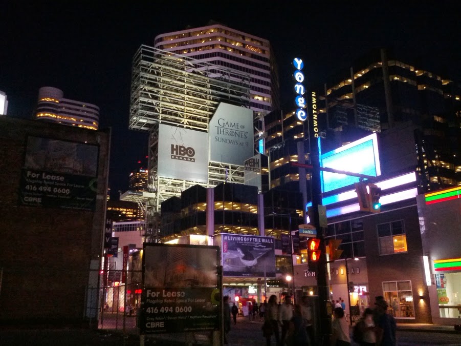
Nothing about that tower is well thought out. Take a look at it from the north side and it's a complete disaster, design wise. This is the most unprofessional looking media tower I have seen anywhere and that includes some third world countries I've been in. This tower has looked unfinished from the day it was put up. For the city to allow such a poorly designed media tower to go up in the first place, says a lot about Toronto. We seem to see the big picture but nobody cares about the details. (like the fact that larges parts of this structure is just left open and visible, for no apparent reason, except to save a few bucks) It's pretty pathetic really because for a small amount of money, this tower could look so much more professional and sleek.
 
I remember seeing a presentation by a rep from ClearChannel and I found him to be a very scuzzy businessman type. Not remotely convincing that he takes any pride in his work, just spewing schtick about how outstanding their digital ad work is and how they are a cut above the competition. I have little faith in what they will do around Dundas Square in the long-term.
 
Folks, this is how it SHOULD be. Esthetically it looks better. It's more powerful, it has more impact. And at night, it would look great! It should look, at the very least, something like this.
HOW IT SHOULD BE.jpg
 

Attachments

  • HOW IT SHOULD BE.jpg
    HOW IT SHOULD BE.jpg
    92.1 KB · Views: 2,101
I think the media tower posts should be moved to a separate thread, since they don't really have anything to do with the proposed addition to this building....
 
Looks like renovation work is beginning on the north facing side of the Media Tower.

I don't know of any variance or building applications.

From just now

IMG_20140702_145559.jpg
 
Last edited:
On Thursday in Council there was a debate about several large multi-media signs along highways in Etobicoke, which Doug Ford welcomes with open arms. Whatever. Kristyn Wong-Tam stood to talk about the new media sign and all the complaints (and complexities) in managing these signs. In the Distillery District alone, 1.5km away from this sign, there were over 30 complaints from people having their suites filled with flashing light. Anyway, she went on about light pollution, lumen measurements from signs and such and around the end of her speaking time she indicated that the brightness on the new sign has indeed been successfully lowered.
 
Wow... this sign really represents the worst of the advertising world. Completely imposing itself onto the square at any cost, as big as possible, and with no sense of design or aesthetics. Blechhh.

The LG sign is dead. Long live the LG sign.
 

Back
Top