News   Nov 22, 2024
 706     1 
News   Nov 22, 2024
 1.3K     5 
News   Nov 22, 2024
 3.3K     8 

Toronto Architecture From The 1960's and 70's

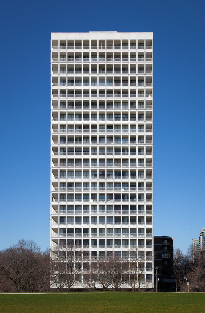
For such a seemingly prominent building on campus (due to the tower), Maclennan's had a strangely "anonymous" rep--maybe for being the southernmost element of U of T's "west campus" which long had a generic-60s stigma to live down; and maybe because its moated setting became *really* urbanistically dated, *really* soon, and maybe for lacking the functional centrality of Sid Smith. Considering all of that, it's a miracle that it remains a 60s time capsule for the taking...
 
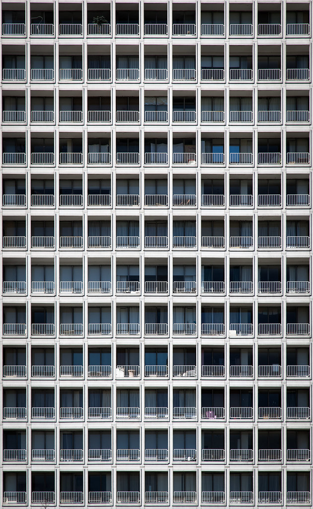
I'm surprised those rail balconies haven't been replaced with generic glass. They must be in pretty good shape to have avoided the trend of replacing original balcony treatments glass.
 
I'm surprised those rail balconies haven't been replaced with generic glass. They must be in pretty good shape to have avoided the trend of replacing original balcony treatments glass.
Unfortunately, its twin around the corner suffered the exact atrocity you mention.
 
The original glass box proposal for the reference library would have been far more interesting in a Hi-Tech, Centre Pompidou-ish sort of way (though one'd imagine it would look far, far better with late 20thc glazing tech - ultra low iron glass, etc)
6a00e5509ea6a18834017c31b57483970b-800wi

(From TPL: http://torontopubliclibrary.typepad.com/trl/toronto-reference-library-renovation-project/page/2/)

It would have the significance and interest like Foster's Willis building.

AoD

That would have been incredible.
 
It would be interesting to see this tower from ground level without those carbuncles on the corners. They detract from the illusion that the tower is levitating.

Though said carbuncles are original, remember.

Another point worth noting: the original elevators have recently lost their Star Wars/Close Encounters "zip" through renovation.
 
The elevators used to have this thin illuminated tubing (red or green, I can't remember) lighting the inside, which really lent a 70s space-pod aura (cue "Close Encounters" five-note theme). But the lighting was so inadequate, it was all retrofitted away on behalf of white "top-lighting" not long ago. (Otherwise, the basic elevator-cab aesthetic and finishes was retained.)
 
IMG_1846 copy.jpg


IMG_1840.JPG


IMG_1841.JPG


IMG_1844.JPG


IMG_1850 copy.jpg
 

Attachments

  • IMG_1850 copy.jpg
    IMG_1850 copy.jpg
    2.9 MB · Views: 1,064
  • IMG_1840.JPG
    IMG_1840.JPG
    2.1 MB · Views: 976
  • IMG_1844.JPG
    IMG_1844.JPG
    2.1 MB · Views: 995
  • IMG_1841.JPG
    IMG_1841.JPG
    2.6 MB · Views: 947
  • IMG_1846 copy.jpg
    IMG_1846 copy.jpg
    2.8 MB · Views: 1,119

Back
Top