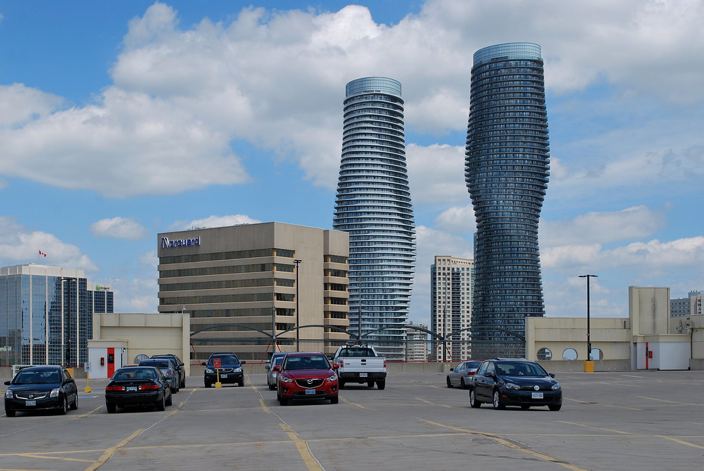
Mississauga Absolute World | 169.77m | 56s | Cityzen | MAD architects

one more

IMG_5681[1].JPG
 

Attachments

  • IMG_5640[1].JPG
    IMG_5640[1].JPG
    371.7 KB · Views: 957
  • IMG_5681[1].JPG
    IMG_5681[1].JPG
    213 KB · Views: 1,785
Last edited:
I finally made it out to Mississauga as well to take some photos of Absolute. I still wish those bottlecap tops would be replaced with a darker grey, at least the south tower, since it doesn't have the white frit balconies that the north tower has.

Absolute World by Marcus Mitanis, on Flickr
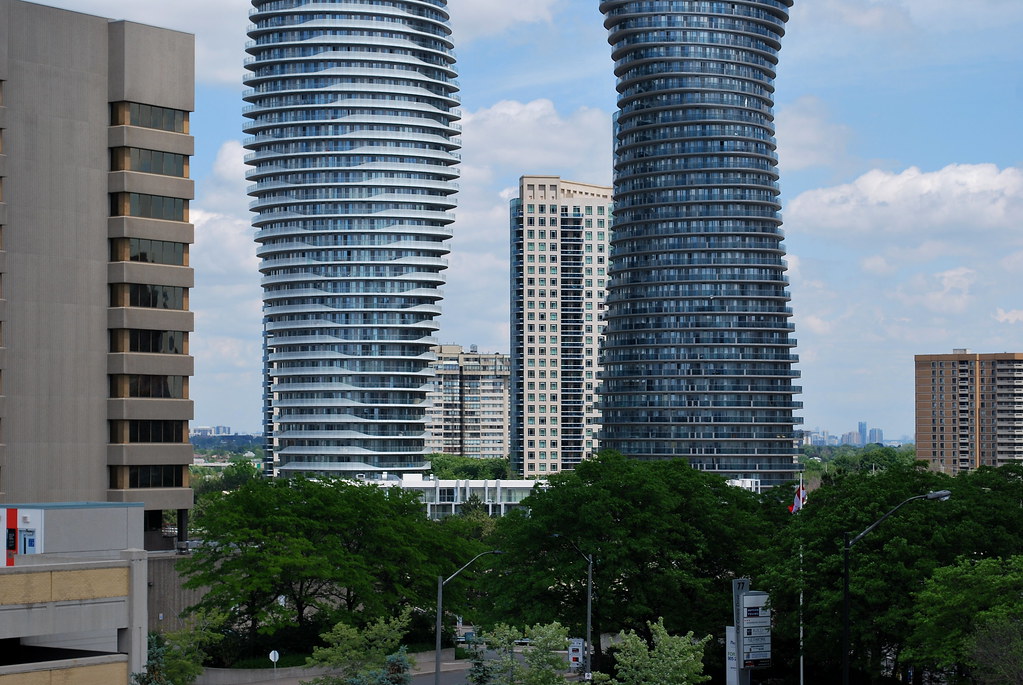
Absolute World by Marcus Mitanis, on Flickr

Absolute World by Marcus Mitanis, on Flickr
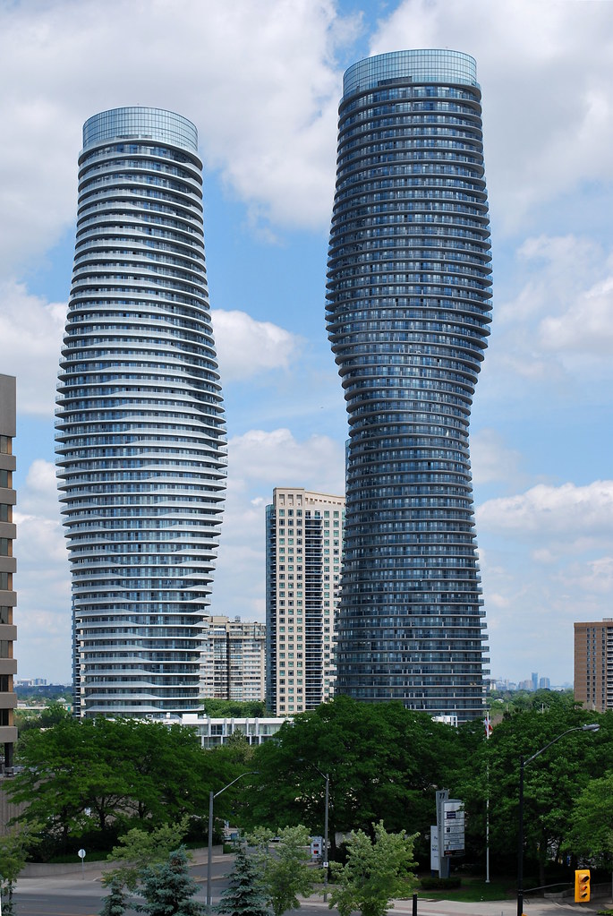
Absolute World by Marcus Mitanis, on Flickr
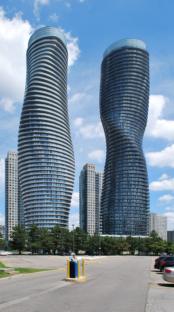
Absolute World by Marcus Mitanis, on Flickr
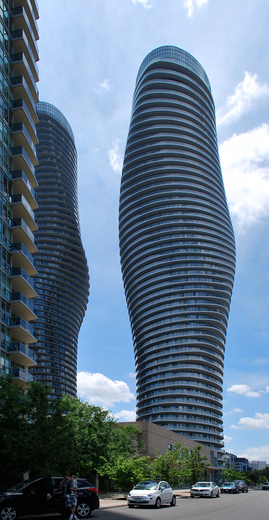
Absolute World by Marcus Mitanis, on Flickr
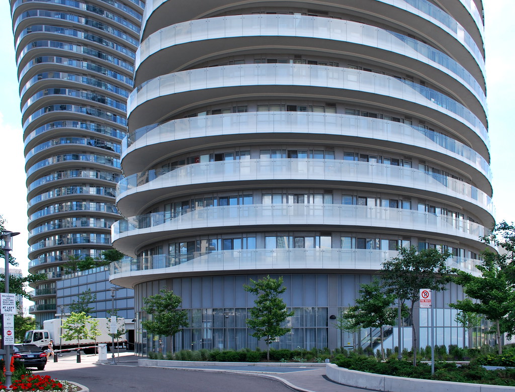
Absolute World by Marcus Mitanis, on Flickr
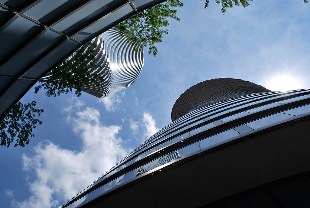
Absolute World by Marcus Mitanis, on Flickr
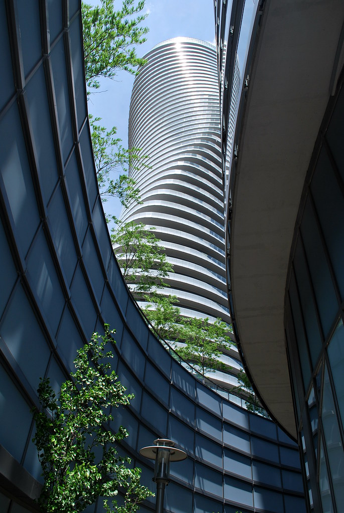
Absolute World by Marcus Mitanis, on Flickr
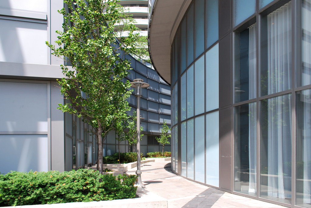
Absolute World by Marcus Mitanis, on Flickr
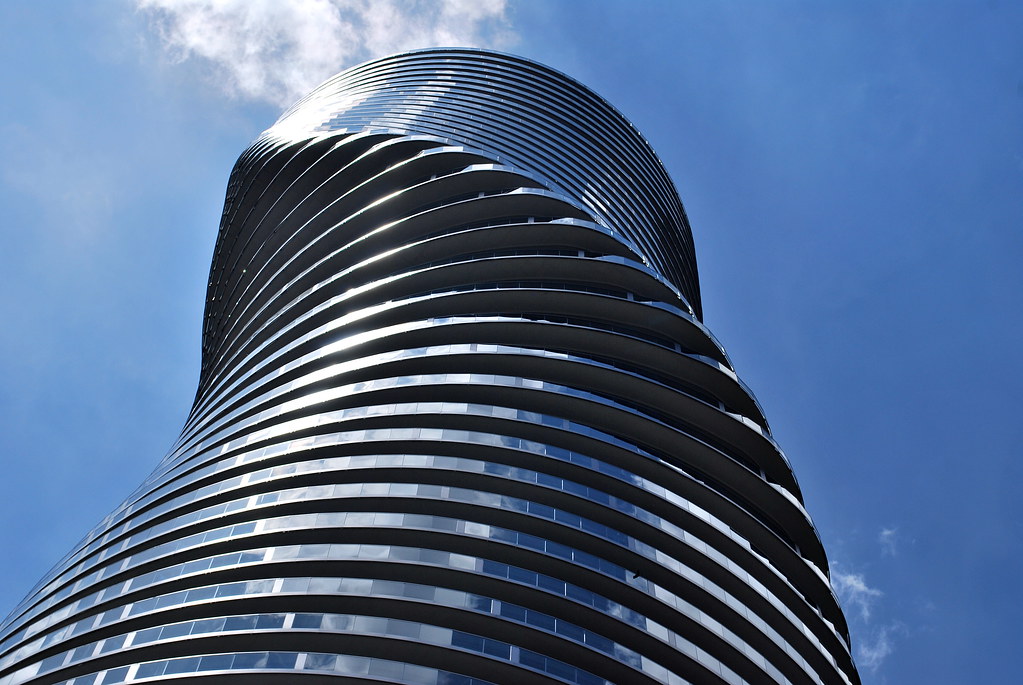
Absolute World by Marcus Mitanis, on Flickr
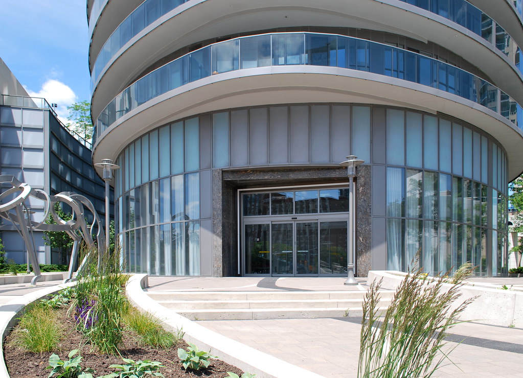
Absolute World by Marcus Mitanis, on Flickr
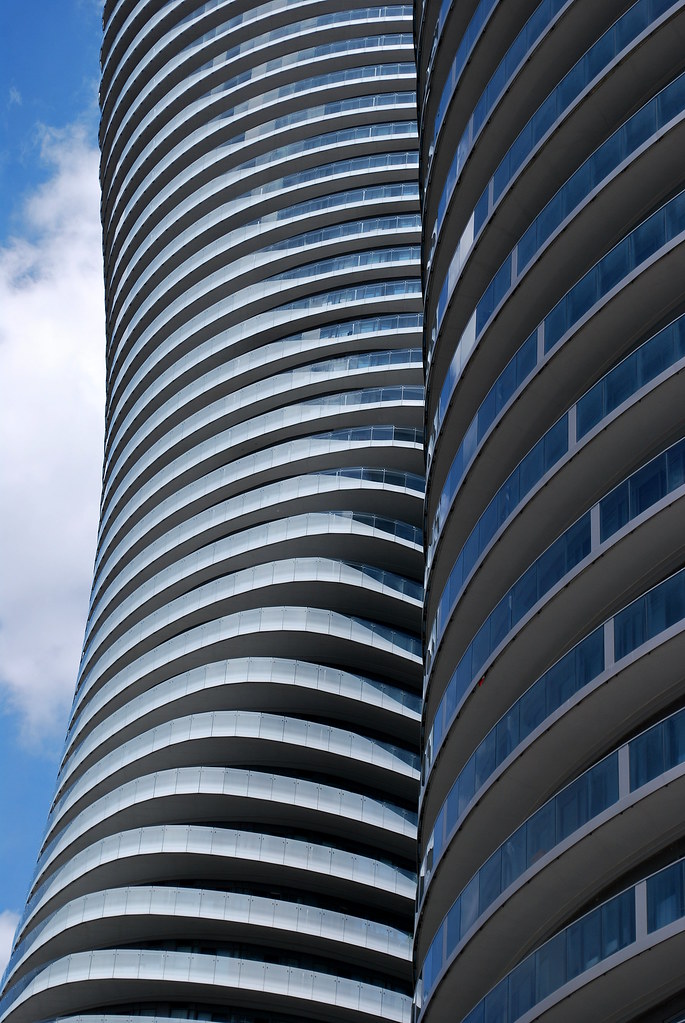
Absolute World by Marcus Mitanis, on Flickr
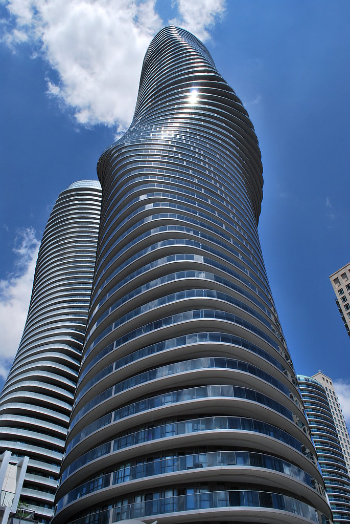
Absolute World by Marcus Mitanis, on Flickr
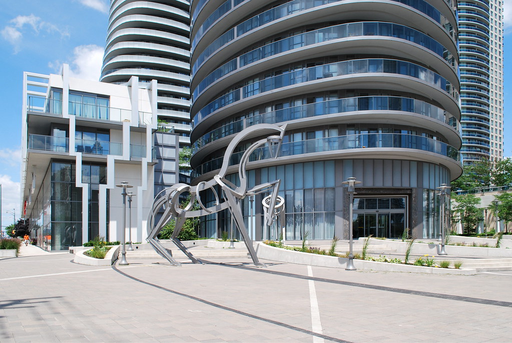
Absolute World by Marcus Mitanis, on Flickr
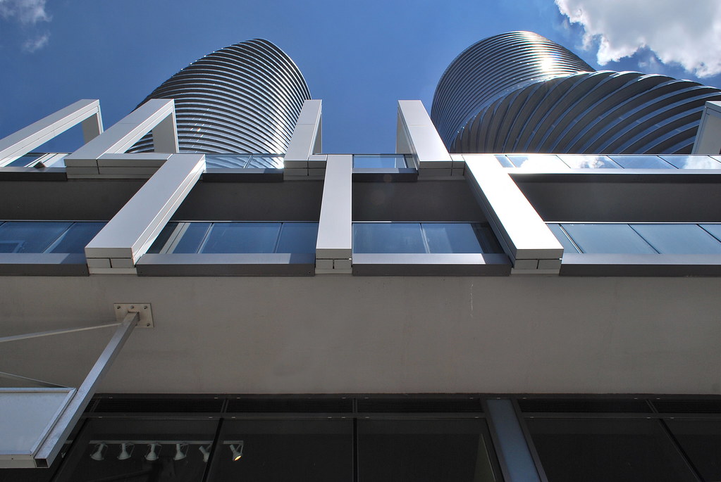
Absolute World by Marcus Mitanis, on Flickr

Absolute World by Marcus Mitanis, on Flickr
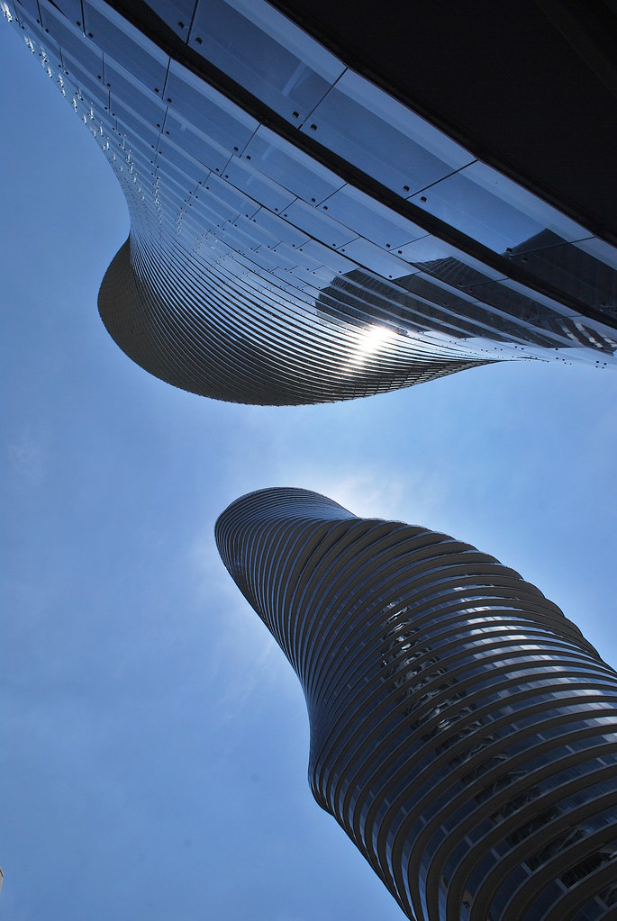
 
^ Right. But remember, design and quality don't always go hand-in-hand. This also isn't a 'luxury' property by any means. Yes, they held an international design competition, but everything is still done on a budget. Smaller details like the materials used are often up to the developer more than anything and they will try to cut corners wherever they can or find materials that 'finish' the job or do justice to the architects vision (justice is a very broad term). The actual form of the building is quite stunning, but, just like L tower, details and execution get overlooked. 'Living in an icon' is one method developers use to market their units by using design. Making it seem like a more prestigious building than it actually is. Nonetheless, I still think Absolute World looks fantastic, and much better executed than L tower.
 
Agreed with steveve. The material used for the building is rather average and nothing too lavish. The bottle cap tops are also a huge disappointment, considering the initial renderings for the building showed one consistent form. Where this really fails for me is at the street level. The townhomes facing Burnhamthorpe are completely out of place. They should have been retail units instead. The retail podium along the Hurontario corridor somehow doesn't really anchor the buildings well. The entrances to the actual tower is also a bit of an awkward mess. Having said that, the buildings themselves are stunning....and have much more impact on the skyline and identity on the community than any high rise built in Toronto in the last 30 years (in my opinion). A lot of the haters are probably mad about this being in a suburb instead of in downtown Toronto.
 
Last edited:
These towers are amazing. I don't mind the bottle cap tops at all. Wish Toronto could get something this interesting
I agree with the amazingness of the towers, and also with most of the gripes (and even more of them, since I live here).

The biggest one for me in terms of appearance is the LED lighting, which is a fail. Many fixtures have been misaligned due to snow or ice or just being poorly installed, so the consistency of the light his hot and cool spots. It's even worse during color changes. Also, whoever programs the lights has no sense for what looks good and what doesn't. Anything other than the defaul blue hues looks cheap and tacky in terms of programming the groupings, speed, etc...

Also - the Town & Country Market is now open which in and of itself is fine, but it's hugely disappointing that several of the windows are stocked with smoking paraphernelia like hookahs. It looks terrible, really.
 

Back
Top