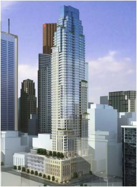
Toronto 88 Scott Street | 203.9m | 58s | Concert | P + S / IBI

Larger version of the render:

6355697465_f73d239de3_o.jpg
 
Hmm. I don't think we can expect real limestone out of the tower portion, which is a shame. The prospect of precast is always a dubious one. So - how it works with the base through the middle section will be the real test for this building.
That said, the shape of it looks great, the top, especially, resolves really well as mass and silhouette - and the height is pleasing. That's great, because it's going to be quite visible from the east. Maybe it will help take some of the edge off seeing Brookfield Place's tower tops just sitting there, and soften the lead-up to the banking cluster. I'm glad the architects have tried to come up with some, in Ada Louise Huxtable's words, "romantic rationalism".
 
Last edited:
I like it too - think it will fit in nicely in the nabe, and no, it doesn't remind me of Las Vegas in the least....this is a big city tower..
 
What a welcome reprieve from the all too common 'minimalist Toronto highrise box'. Having said that I would not go so far as to say its perfect; I still find those elevated boxes unnecessary and I'm not sure about the proportions of the top most floors, which I surmise are mechanical, relative to the overall massing.

While it may not make use of limestone or a curtain wall, I am hopeful that the materials and cladding will not be substandard. This is not a bland swath of precast i.e. Uptown. Or a tower that shows off its disproportional floor heights i.e Trump. Baring poor execution of the design, I look forward to seeing this addition to the urban landscape.
 
Robin and I are very excited about 88 Scott: it looks perfect for a day out on the bat-ropes, with all those setbacks thrown about pretty much randomly. If I were a betting superhero, and Citizen, I'll have you know that Robin and I discourage gambling in all its forms, so I am not, but if I were

Holy semantics Batman!

Steady, Chum. If I were a betting superhero, I would expect this 88 Scott might attract some supervillains, or their hired henchmen at least, and then my trusty sidekick and I would be forced to climb this vertical lair.

What do you think Batman? Do we climb the route up Joker's Ridge on the south flank? Or do tackle Riddler's Bluff on the east face?

We have to be ready for both, Robin, we have to be ready for both.

Holy architectural quagmire Batman!

Holy architectural quagmire indeed!
 
Steady, Chum. If I were a betting superhero, I would expect this 88 Scott might attract some supervillains, or their hired henchmen at least, and then my trusty sidekick and I would be forced to climb this vertical lair.

... am I given to understand that Sheldon Cooper is posting here now??

Sheldon-Cooper-smiling-500x374.png


Also, am I detecting in this design a slightly pomo influence? Is it time for a retro pomo backlash against retro modern minimalism? Tune in next time, same bat-channel, same bat-time!
 
It's a beauty. It's nice for me not to have to go off on an anti-box rant! I personally do hope that we are seeing the beginnings of a neo-PoMo backlash against neo-modernism. Also those elevated boxes do seem to make more sense now there are more of them visible. AND it's not grey, although that could be reflections of the sky, but I'll quit typing while I'm happy! :)
 
Last edited:
I am a bigtime neo-modernist myself, but I respect the need for diversity in architecture. Just because it's not what I would design, doesn't make it bad.

In fact, this tower is quite handsome... it's different for Toronto, too, and something I'd more expect to see in Chicago. (In terms of its style.)

:cheers:
 
I see an enormous spectacularly-pedantic debate looming on the horizon over whether the term should be "Neopostmodernism" or "Postneomodernism" ;)
 
I think the building would look handsome either way. I was really opposed to the 'box' when the rendering showed just one, but as an element repeated throughout the building, I think it actually works extremely well. I think it creates an optimal bit of distance from the historical precedents this building is based on and makes it feel fresh.
 
I have a feeling we'll see lotsa precast and green glass.

Maybe this could be an opportunity for precast cladding to redeem itself after the unfortunate application The Uptown.

I'm also hoping no green glass and I'm really hoping for highly reflective glass. Some recent buildings look kinda lousy in direct sunlight due to their mass of poorly-reflecting windows.

I'm guessing highly reflective windows are much more expensive? Maybe someone can answer that for me...
 
Every bit as dithery and equivocating as the early rendering suggested it would be - as befits the Dithery District ( London on the Esplanade, Berczy, 1 King West ), where generic historicism collides with mannerist Modernism.
 

Back
Top