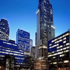
Toronto 88 Scott Street | 203.9m | 58s | Concert | P + S / IBI

This afternoon:

IMG_2998.jpg
IMG_3000.jpg
 

Attachments

  • IMG_2998.jpg
    IMG_2998.jpg
    1.1 MB · Views: 1,560
  • IMG_3000.jpg
    IMG_3000.jpg
    905.7 KB · Views: 1,528
The sections with precast between every floor look 256% better than the bits where the precast only runs vertically.

42
 
Suddenly imagining that ribbed motif from the panels on the heritage building on the new precast tower panels and thinking that could have been a nice detail.
 
Suddenly imagining that ribbed motif from the panels on the heritage building on the new precast tower panels and thinking that could have been a nice detail.

And that's my issue in general with historicist buildings. They're perpetually disappointing, even when they aren't bad. It seems like that ribbed motif would have been a simple detail that could've been done without breaking the bank but it wasn't even considered. Modernist buildings might be dull but firms like aA very obviously pay attention to the little things whereas a building like 88 Scott (which isn't bad, might I note) just throws these things together. When this is considered good, it says a lot about the lack of attention to detail in my opinion.
 
And that's my issue in general with historicist buildings. They're perpetually disappointing, even when they aren't bad. It seems like that ribbed motif would have been a simple detail that could've been done without breaking the bank but it wasn't even considered. Modernist buildings might be dull but firms like aA very obviously pay attention to the little things whereas a building like 88 Scott (which isn't bad, might I note) just throws these things together. When this is considered good, it says a lot about the lack of attention to detail in my opinion.

Care to provide some examples?
 
Care to provide some examples?

Architecture isn't my really my thing (I'm here for the urban issues first, building design second) but look at the U Condos development and @Benito's recent posts showing the continuation of the black band motif from the balconies to the ground. There's no need for that and I imagine continuing the black bands below the balconies was probably an extra expense but it completes the design nicely. Or Karma and the slight indent/bump out at the midpoint. That one is less attention to detail as much as it is an interesting design choice but again, aA makes the effort whereas firms like P&S just throw stuff together. I get that aA can be bland and simple but I'd rather simple but well-designed and considered towers than a pile of dreck and the occasionally acceptable tower (since let's be frank, the Delta and, to a lesser extent, 88 Scott are rarities with P&S, not the norm).
 
Today:

IMG_3250.JPG
IMG_3251.JPG
IMG_3252.JPG
IMG_3254.JPG
IMG_3258.JPG
 

Attachments

  • IMG_3250.JPG
    IMG_3250.JPG
    513.4 KB · Views: 957
  • IMG_3251.JPG
    IMG_3251.JPG
    183.4 KB · Views: 945
  • IMG_3252.JPG
    IMG_3252.JPG
    321.3 KB · Views: 936
  • IMG_3254.JPG
    IMG_3254.JPG
    290.9 KB · Views: 950
  • IMG_3258.JPG
    IMG_3258.JPG
    564.8 KB · Views: 940

Back
Top