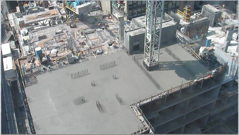
Toronto 88 Scott Street | 203.9m | 58s | Concert | P + S / IBI

Today:
IMG_6982.jpg
IMG_6983.jpg
IMG_6984.jpg
IMG_6986.jpg
 

Attachments

  • IMG_6982.jpg
    IMG_6982.jpg
    815.9 KB · Views: 1,850
  • IMG_6983.jpg
    IMG_6983.jpg
    943.4 KB · Views: 1,884
  • IMG_6984.jpg
    IMG_6984.jpg
    1.1 MB · Views: 1,868
  • IMG_6986.jpg
    IMG_6986.jpg
    1.3 MB · Views: 1,862
This thing looks like it will be great. You need to check your attitude.

As long as the materials are decent this has a lot to offer, it will pull the skyline east from the CBD and it pays tribute to the existing architecture of the east side of the CBD. The podium ties in at street level to its neighbours, and the crown echos that of brookfield, bay-wellington and 1 king west.
 
You need to check you observational skills. Aside from the Delta, when was the last time P+S used quality materials? They and Kirkor are the dollar store of architectural firms in this city. This tower design looks about 30 years old, and it will no doubt be covered in cheap window wall and spandrel.
 
^^

You need to check your attitude. Maybe others here know something you don't, like that it's the developer who determines the budget for a building and not the architect.

This isn't my favourite tower design, but 1) I'm hopeful that the rebuilt limestone facade will look terrific at street level and 2) it doesn't "look about 30 years old", it harkens back to the age of stepped Art Deco skyscrapers, on purpose. Who knows how well they'll end up accomplishing that, here's hoping they do it well.
 
2) it doesn't "look about 30 years old", it harkens back to the age of stepped Art Deco skyscrapers, on purpose. Who knows how well they'll end up accomplishing that, here's hoping they do it well.

Yep. I see it as clearly referencing the Deco era and I don't mind that at all. We'll see how it goes as it climbs. Predicting it's going to suck at this point strikes me as abysmal pessimism.
 
^^

You need to check your attitude. Maybe others here know something you don't, like that it's the developer who determines the budget for a building and not the architect.

This isn't my favourite tower design, but 1) I'm hopeful that the rebuilt limestone facade will look terrific at street level and 2) it doesn't "look about 30 years old", it harkens back to the age of stepped Art Deco skyscrapers, on purpose. Who knows how well they'll end up accomplishing that, here's hoping they do it well.
Developers that care about the city and leaving behind a beautiful building generally hire quality firms; not P+S. How can anyone be excited for a project designed by them when they have one of the worst reputations in the city for design standards and notoriously create crumby buildings? What makes anyone think this building will be any better than the plethora of garbage they have marked the city with? I understand that the tower is trying to mimick deco/pomo, but how often does that translate into good (think Uptown)? P+S constantly delivers a mediocre product, so I don't see why they should be given the benefit of the doubt. Even with excellent cladding, the tower will still look awful because the design is a mess; especially the excessive amount of protruding balconies.
 
Last edited:
It's hard to disagree with Armour if you're blind to the fact that (IIRC), the Delta was the best Toronto building of 2014 according to the year end UT survey.

My point is that the results have more to do with the developer than with the architect. Another example? Wallman's 300 Front for Tridel looks terrible, while his Tableau for Urban Capital is looking great. UC is spending the money that Tridel didn't. If 300 Front had full-length windows and half the mullions, or better yet, curtain wall, it could have been a looker. But no, Tridel cheaped out and it looks terrible. Not Wallman's fault, he's clearly capable of terrific design.

I agree, perhaps it also illustrates how some architects are better at working the budget to include quality materials, and some might not be as good at budget crunching and manipulation. I definitely think many on UT suffer from various forms of bias, including recallability bias to name just one. Not saying all architects are equal, but being a layperson, I am under the impression the budget has a lot to do with the end result.
 
Exactly. Far better to gauge how this will turn out by Concert's portfolio than anything else. Personally, this leaves me excited about the podium and nervous about the window wall.
 
I am under the impression the budget has a lot to do with the end result.
I'd say it has everything to do with the end result. An architect can design the greatest building in the history of ever, but if the client decides to nickle and dime every aspect of it, the results will underwhelm.
 

Back
Top