The are owned by a pension fund so why would they need outside money?
You are using an out of date browser. It may not display this or other websites correctly.
You should upgrade or use an alternative browser.
You should upgrade or use an alternative browser.
Toronto 88 Scott Street | 203.9m | 58s | Concert | P + S / IBI
- Thread starter yyzer
- Start date
DtTO
Active Member
Really glad to hear that. This is probably my favourite proposal in the area. I think it might just give Libeskind a run for his money 
Grimace
Active Member
I think it might just give Libeskind a run for his money
Um, no.
DtTO
Active Member
Um, no.
Oh ok. Sorry, I hadn't realized that we had members from the future who already know exactly how every building will turn out on this forum. That would be the only logical explanation of how you know *for a fact* that the notion of this building possibly giving the L Tower a worthy rival is absolutely untrue. Thanks for clearing that up, we all appreciate your wisdom.
Ramako
Moderator
Oh ok. Sorry, I hadn't realized that we had members from the future who already know exactly how every building will turn out on this forum. That would be the only logical explanation of how you know *for a fact* that the notion of this building possibly giving the L Tower a worthy rival is absolutely untrue. Thanks for clearing that up, we all appreciate your wisdom.
His preference for L Tower over 88 Scott is likely based on architectural style rather than the execution of that style.
DtTO
Active Member
His preference for L Tower over 88 Scott is likely based on architectural style rather than the execution of that style.
Yes, but my comment was for the final product in both cases. Architectural style is only one factor, and there are many cases of beautiful architecture being completely devastated by poor material choice (ROM, anyone?) and vice versa.
Ramako
Moderator
Yes, but my comment was for the final product in both cases. Architectural style is only one factor, and there are many cases of beautiful architecture being completely devastated by poor material choice (ROM, anyone?) and vice versa.
But it's rarely the case that mediocre architecture can be saved solely by materials and attention to detail.
DtTO
Active Member
But it's rarely the case that mediocre architecture can be saved solely by materials and attention to detail.
Really? Tell that to aA...
Ramako
Moderator
Really? Tell that to aA...
I wouldn't consider aA's designs to be mediocre, but if you're a big fan of PoMo stuff like 88 Scott and Trump (which I don't mind when well executed - see 1 St. Thomas) I could see why you would think they are.
innsertnamehere
Superstar
Four seasons is probably the best example of mediocre architecture turning out well with good materials, and heck, almost any aA building. Their designs are in no way cutting edge, but with aA you are going to get at least a half decent building, regardless of the design.
Ramako
Moderator
Four seasons is probably the best example of mediocre architecture turning out well with good materials, and heck, almost any aA building. Their designs are in no way cutting edge, but with aA you are going to get at least a half decent building, regardless of the design.
I like aA's designs because of reasons other than just materials and attention to detail. Their stuff, though simple, tends to be really well proportioned and symmetrical, with clean, sharp lines. There are few abrupt stops or gaps, or awkward planes in aA's designs. Nothing seems like an afterthought and everything just flows and resolves really well.
Don't get me wrong. I like PoMo stuff too. I'm holding out hope that 88 Scott will turn out all right, but given that this is a P+S job, I know it's going to be slathered in spandrel. I'm also concerned that it looks a little too busy. I really hate randomly placed columns of protruding balconies. They look so cheap. North York is rife with them.You'll notice that aA designs literally never have them.
Grimace
Active Member
L Tower is turning out to be a very well executed building by an internationally recognized architect. 88 Scott is by a middle of the road Toronto firm. I'm hoping for the best since I will have to look at it every day from work but they just aren't the same league. Don't think there's much more to say than that.
innsertnamehere
Superstar
This will be the most expensive building that P+S has ever designed. This is a low level luxury building, not a budget investor condo. For that simple reason I expect a good use of materials.
Ramako
Moderator
L Tower is turning out to be a very well executed building by an internationally recognized architect. 88 Scott is by a middle of the road Toronto firm. I'm hoping for the best since I will have to look at it every day from work but they just aren't the same league. Don't think there's much more to say than that.
I think you're being quite gracious in calling Page + Steele "middle of the road".
LowPolygon
Senior Member
"Nowadays, postmodernism no longer stimulates the interests of the current architectural vanguard. Modernism experienced a revival during the 1990’s, while the digital revolution has ushered the rise of biomorphism or ‘blobitechture’ while also breathing life into deconstruction. Postmodernism is now looked on as a clumsy effort to respond the conceptual dead end of late Modernism, suffering from its lack of timelessness and its indifference to actually being beautiful. To young designers, seeing a postmodern masterpiece from the seventies and eighties often causes them to cringe."
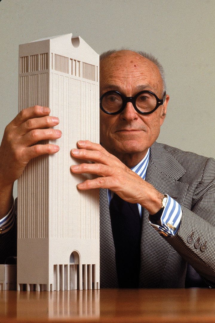
“It is now nearly a quarter of a century since Postmodern architecture — which proposed to make historical references respectable once again — was declared officially dead by none other than its most capricious establishment advocate, Philip Johnson. His exhibition Deconstructivist Architecture (co-curated in 1988 with Mark Wigley) at New York’s Museum of Modern Art brought an abrupt end to a trend that had lasted just over two decades. In hindsight, Postmodernism at its worst can seem like a bad dream, or a bad joke. Yet during its brief heyday, PoMo possessed such potent commercial allure that even the mighty Skidmore, Owings & Merrill, high priests of Modernism, precipitously recanted the long-held faith and converted to beliefs once deemed heretical.â€
“…A zombie idea is a proposition that has been thoroughly refuted by analysis and evidence, and should be dead — but won’t stay dead because it serves a political purpose, appeals to prejudices, or both.â€

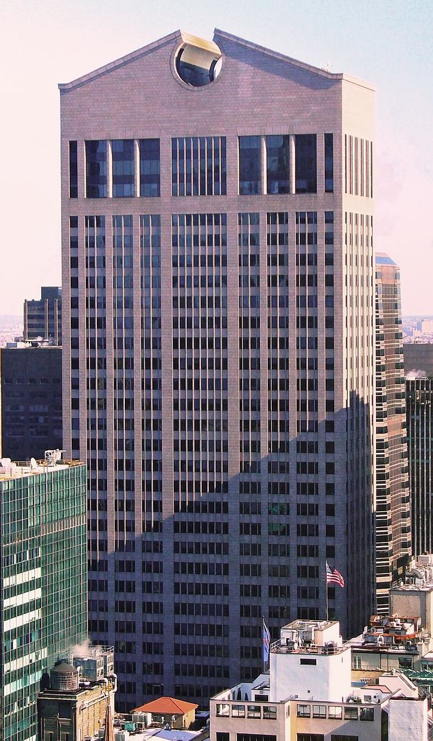
“Post-modernism in architecture came to the public eye when, in the late 1970s, The New York Times printed on its front page the astonishing image of Philip Johnson’s model for the proposed AT&T (now Sony) building in midtown Manhattan. What Johnson designed was an ostentatious f-you to postwar corporate modernism’s steel-and-glass, rectilinear reserve that simultaneously played right into the hands of corporate conservatism, which was only too happy to pursue legitimation by reference to historical precedent. Here, Johnson offered up a Chippendale cabinet, blown up to a ridiculous 37 stories, and clad in a paper-thin, pink masonry verneer.â€
“Johnson’s AT&T Building elicited excitement among some and, among others, disdain, but its deferential stylistic bow to Town and Country taste became a harbinger of an era when many architects relinquished their long-held conviction that interventions in the built environment could help advance modernization and improve modern life. In the following decades, American architects increasingly indulged their corporate and wealthy patrons’ branding and status-enhancing impulses with interpretations of Johnson’s comforting and comfortable aesthetic of looking to the past.â€

“The eye adjusts, in this case to the bad as well as the good. By the 1990s, landscapes across the globe had been despoiled with nostalgic, historicist monstrosities such as Michael Graves’s Portland City Hall and Aldo Rossi’s Quartier Schützenstrassein Berlin. More unsettling still was that the historical precedents from which these architects drew could not be satisfactorily reproduced or even recalled—their materials, their hand-crafted ornaments, their careful details—because the artisanal traditions and material-building practices on which they relied had become rare and prohibitively costly to accomplish. So post-modernism replaced old-fashioned craftsmanship and materials with scenographic illusions: flat, decorative passages meant simultaneously as authentic recollections and ironic riffs on the past.â€
“Post-modern historicism—let’s call it the McMansion aesthetic—still holds architects in the developing world, as well as contractors and builders in the United States and Europe, in its sorry clutch, substantiating the truism that many people will opt for the familiar no matter how poorly it may serve them.â€

FURTHER READING:
Post-modernism: Style and Subversion 1970-1990, V&A
It seemed exciting at first, yet was soon synonymous with the most vacuous side of modern culture. But what exactly was post-modernism, and how did it come to be so hated?
http://www.telegraph.co.uk/culture/...ism-Style-and-Subversion-1970-1990-VandA.html
