Gphorce
Active Member
Looks like it is going to come down to the precast. I'm not usually a fan of precast, so I'm really hoping to be surprised here. Those party rooms look pretty cool.
Great videos - but I like this one even better.
Does anyone know if it is going to connect to the PATH?


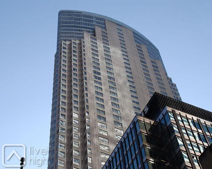
The step pyramid shape might have been 'ok' in its time (it wasn’t) but HELLO it’s 2012….