Toronto 88 Scott Street | 203.9m | 58s | Concert | P + S / IBI

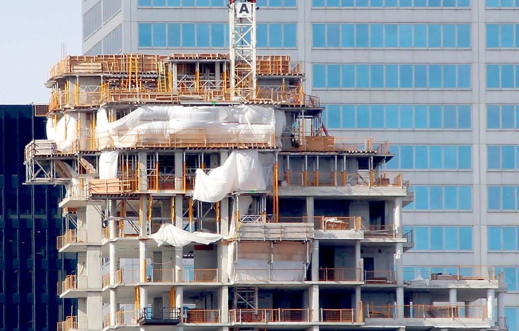
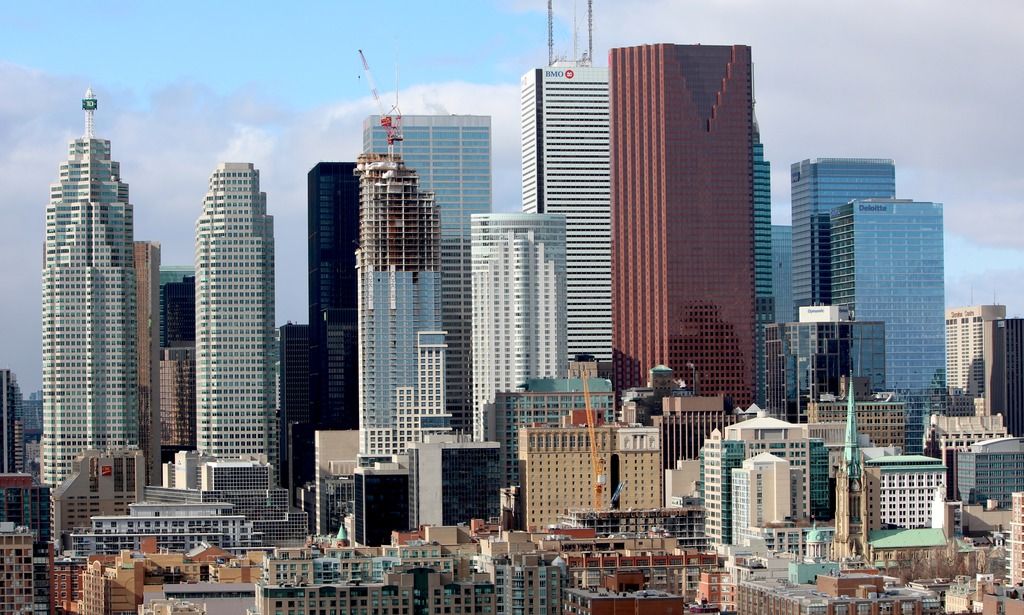
The profile of this building really lends itself perfectly in context to its surroundings, namely the setbacks of Brookfield Place and the layered facade of 1 King West. From certain vantage points, the roofline is appears much steeper and more dramatic than I had expected, which is adds a lot of character. IMO, many of the design choices for this project were deliberately tasteful. We need more like this.

Its late Postmodern architecture harmonizes nicely with the likes of Brookfield Place and 1 King West.
 
This afternoon:
image.jpeg
 

Attachments

  • image.jpeg
    image.jpeg
    154.3 KB · Views: 755

How cool is it going to be a few years from today looking at our downtown from the very same spot after Pinnacle and Tridel and Menkes and Concert and First Gulf and Daniels and Castlepoint add all they are planning or are building today. What a transformation from when Robert Campeau built Harbour Square and downtown rolled up the sidewalks at 6:00. It would be interesting to add up the potential number of homes combined.
 
First two from last week;
DSC_0832.jpg

Been a while since I was last out on the patio and noticed something else now rising from this vantage point ^
DSC_0833.jpg

And this past weekend:
DSC_0906.jpg

DSC_1042.jpg
 

Attachments

  • DSC_0833.jpg
    DSC_0833.jpg
    155.7 KB · Views: 464
  • DSC_1042.jpg
    DSC_1042.jpg
    231.6 KB · Views: 435
  • DSC_0832.jpg
    DSC_0832.jpg
    202.2 KB · Views: 456
  • DSC_0906.jpg
    DSC_0906.jpg
    244.4 KB · Views: 454
It's not about a street canopy. It's about the Sears catalog design of it on the facadism. I disagree it is needed or adds value but, if it's absolutely necessary for one, this was not the way to go. It's just a vain attempt to tie the facadism into the glass addition. Why?

I kind of agree with this. I love a canopy on a building entrance etc... but given the more historical look of the bottom of 88 Scott, the developer should have done the more traditional throwback to New York city canopies with metal and glass and emblems etc. Keep the street level classic and timeless and keep the above modern.
 
You're competing with foreign buyers who don't care about any of that stuff so don't expect any changes until the market dies down and builders start marketing towards end users and not investors who won't even be living in the building.

As far as condos being incomplete at the point of occupancy, it's an unfortunate reality and why I will never buy new again. Been through it 3 or 4 times and it had progressively gotten worse with the amount of things developers tried to pull off. I love how Tridel, Daniels and some other developers do it. When you get your place, everything is ready to go.

But in Toronto, about 5% of condos are owned by foreign investment according to the many stats that come out. We're not a Vancouver. Foreign investment is low here. Most of the investment money is National

It won't be until the condo act changes and/or additional governance comes out to provide better structure in this market. My last condo I did my PDI in - I walked in with holes in the wall, unfinished shower tiles, a broken toilet etc. But Daniel's does have its stuff together. I walked into that purchase move-in ready.
 

Back
Top